Colour
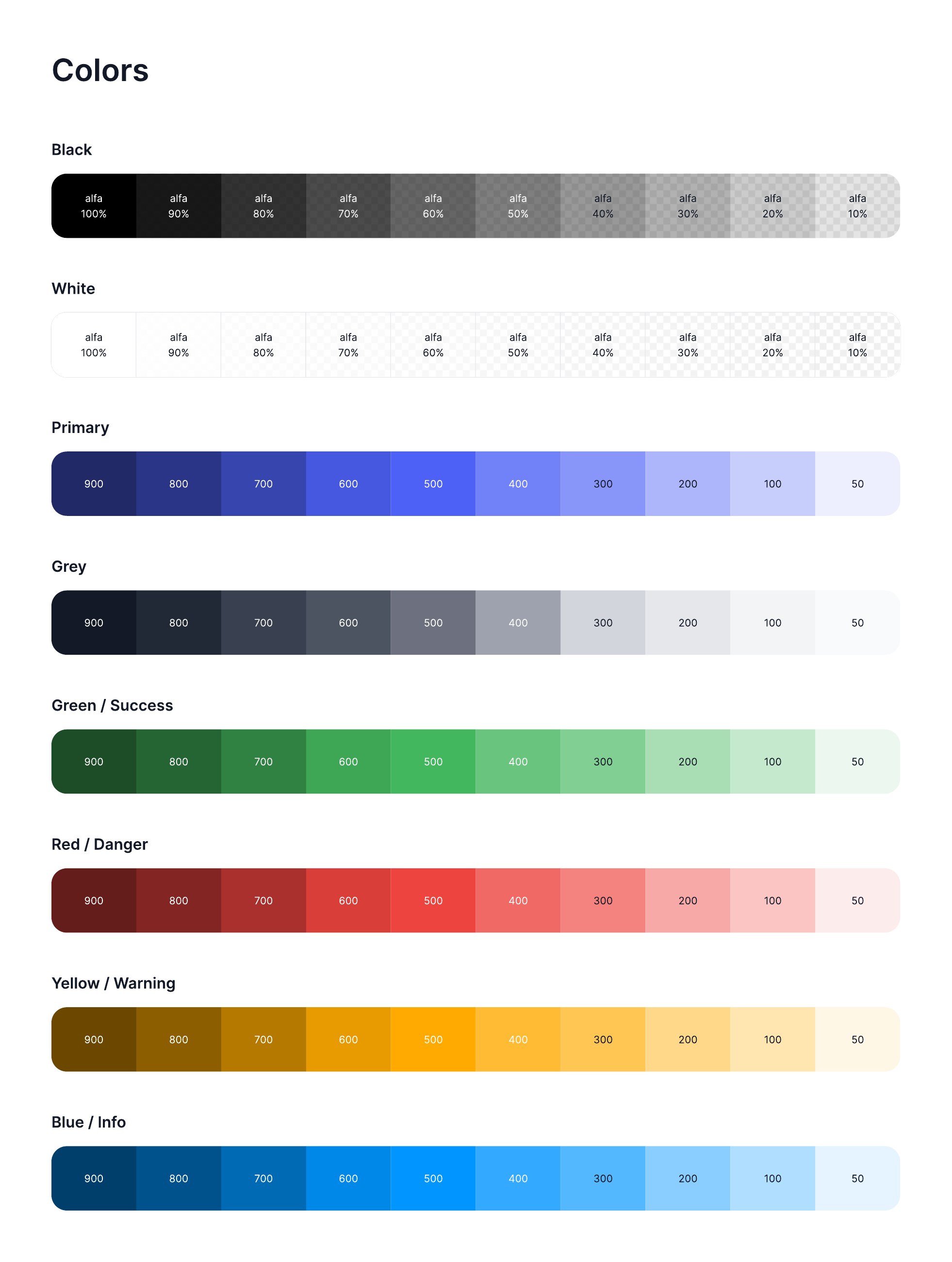
Ten-step ramps from 50 to 900 across primary, grey, success, danger, warning and info, plus black and white alpha scales for overlays and dividers.
View full sheetBRAND & IDENTITY
Explore the brand guidelines and presentation work that give interfaces a consistent visual voice.
The decisions everything else inherits. Colour is a ramp with semantic roles rather than a set of favourites; type, elevation and iconography are documented so two designers reach the same answer without asking each other.
Ten-step ramps from 50 to 900 across primary, grey, success, danger, warning and info, plus black and white alpha scales for overlays and dividers.
View full sheet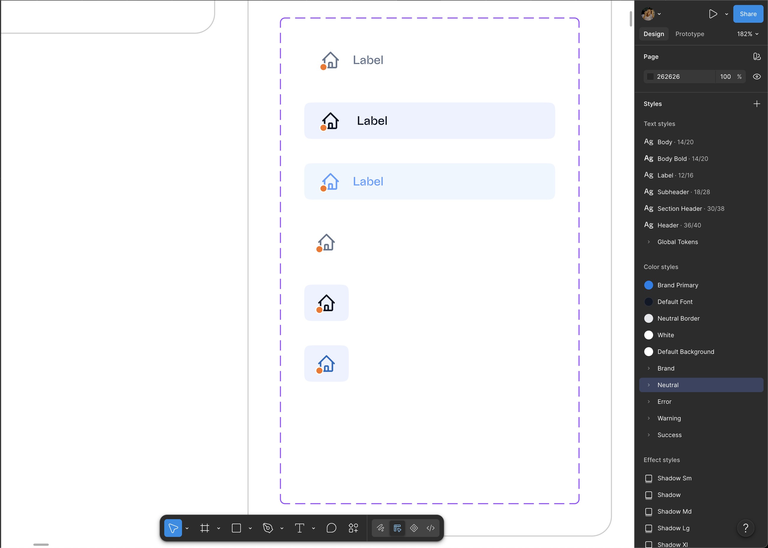
The published styles as they exist in Figma: Brand Primary, Neutral, Error, Warning and Success as groups, a Body to Header text scale, and Shadow Sm through XL.
View full sheet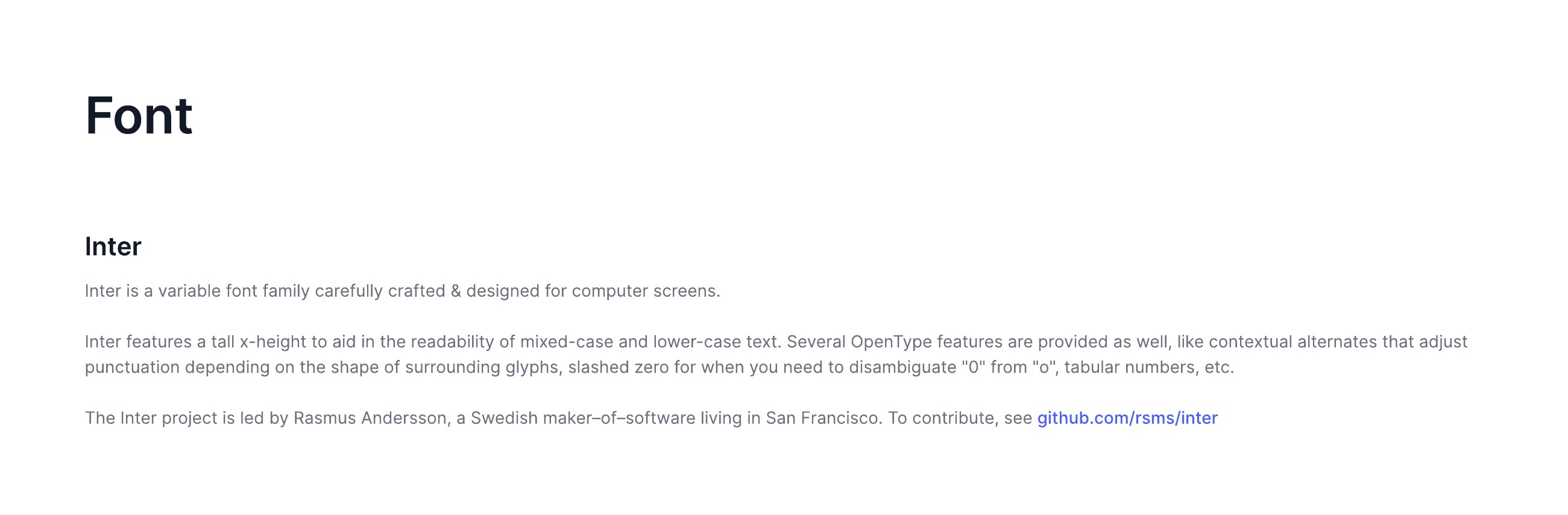
Inter, with the reasoning recorded, variable weights, tall x-height, tabular numerals and a slashed zero for interfaces that display figures. Credited to its maker in the sheet.
View full sheet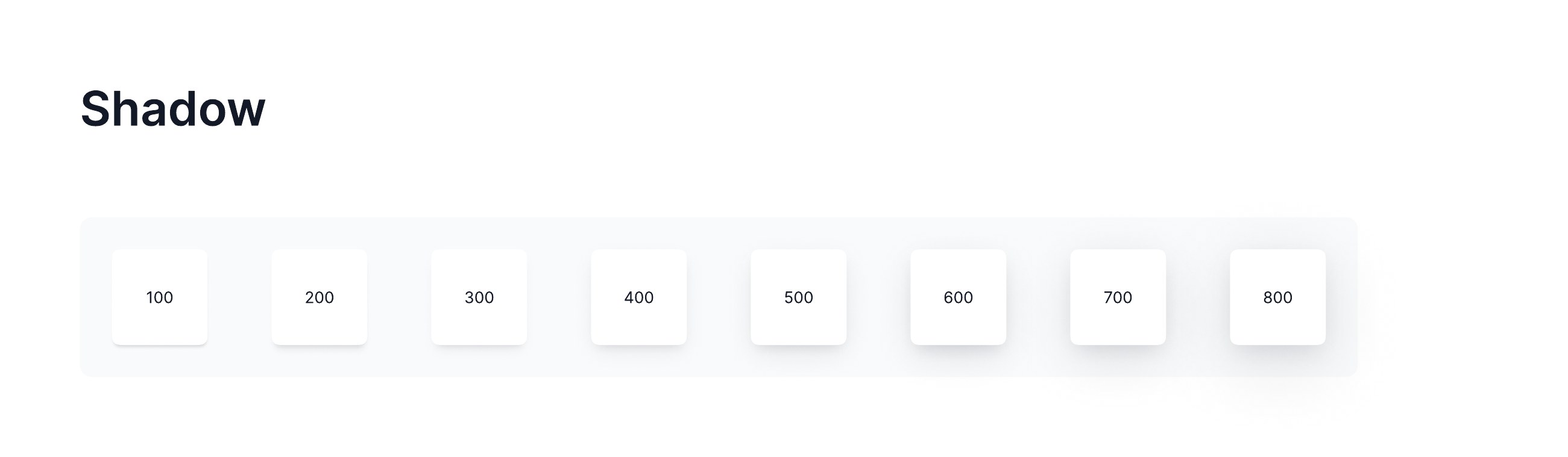
A shadow scale used as depth hierarchy, so a dropdown, a card and a modal never sit at the same visual altitude.
View full sheet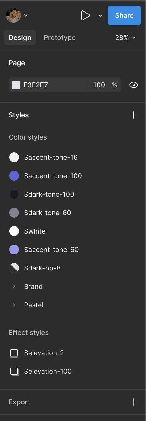
The colour and effect styles as named tokens, accent, dark and opacity tones on a numeric scale, with elevation as its own set.
View full sheet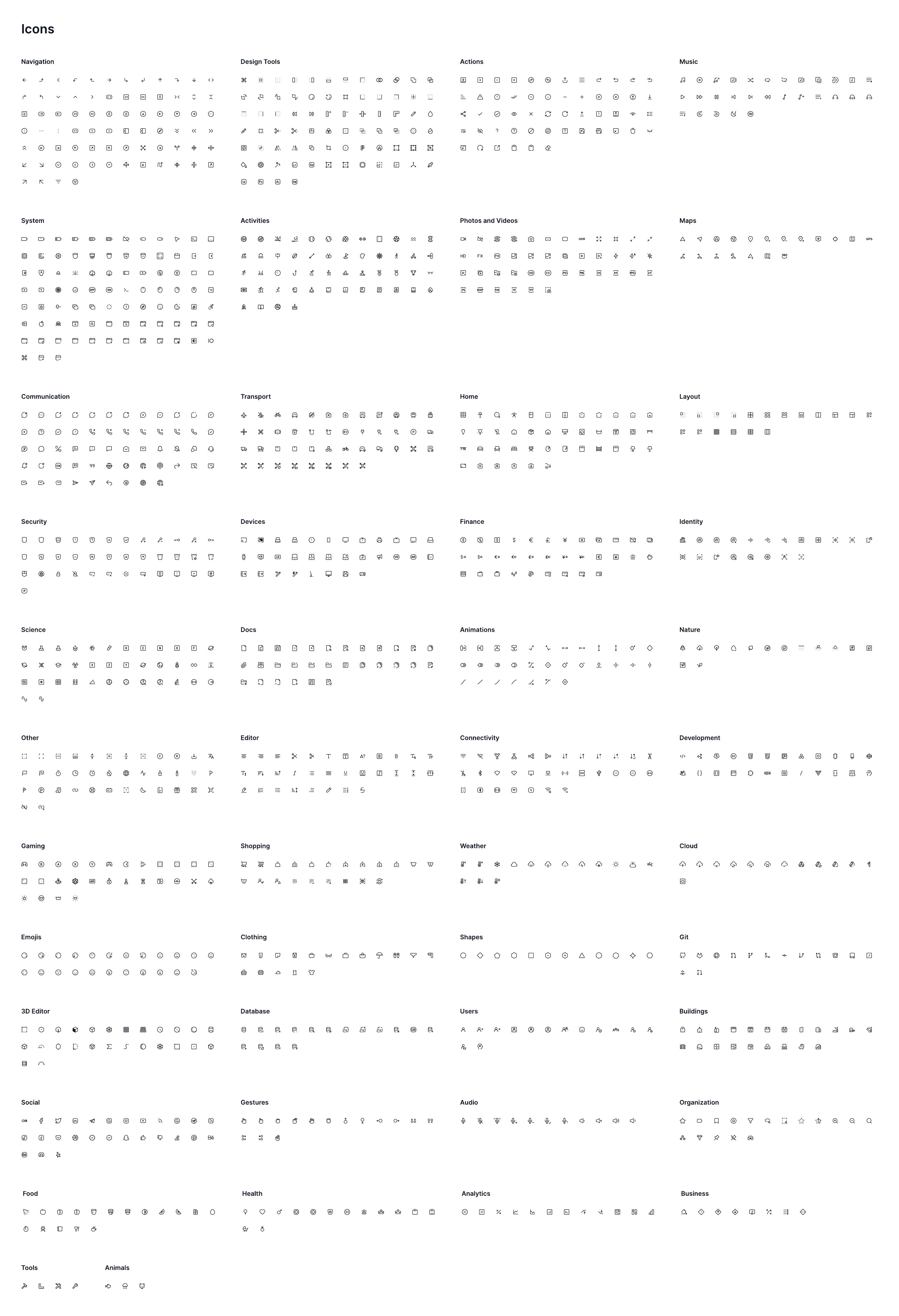
The icon set organised into semantic categories, navigation, actions, media, design tools, so an icon is chosen by meaning rather than by scrolling.
View full sheet
Stroke weight, bounding box and optical sizing held constant across the set.
View full sheetEach component is documented as a matrix, not a picture: every state crossed with every size. A developer should be able to build from these without asking what the disabled state looks like at the medium size.
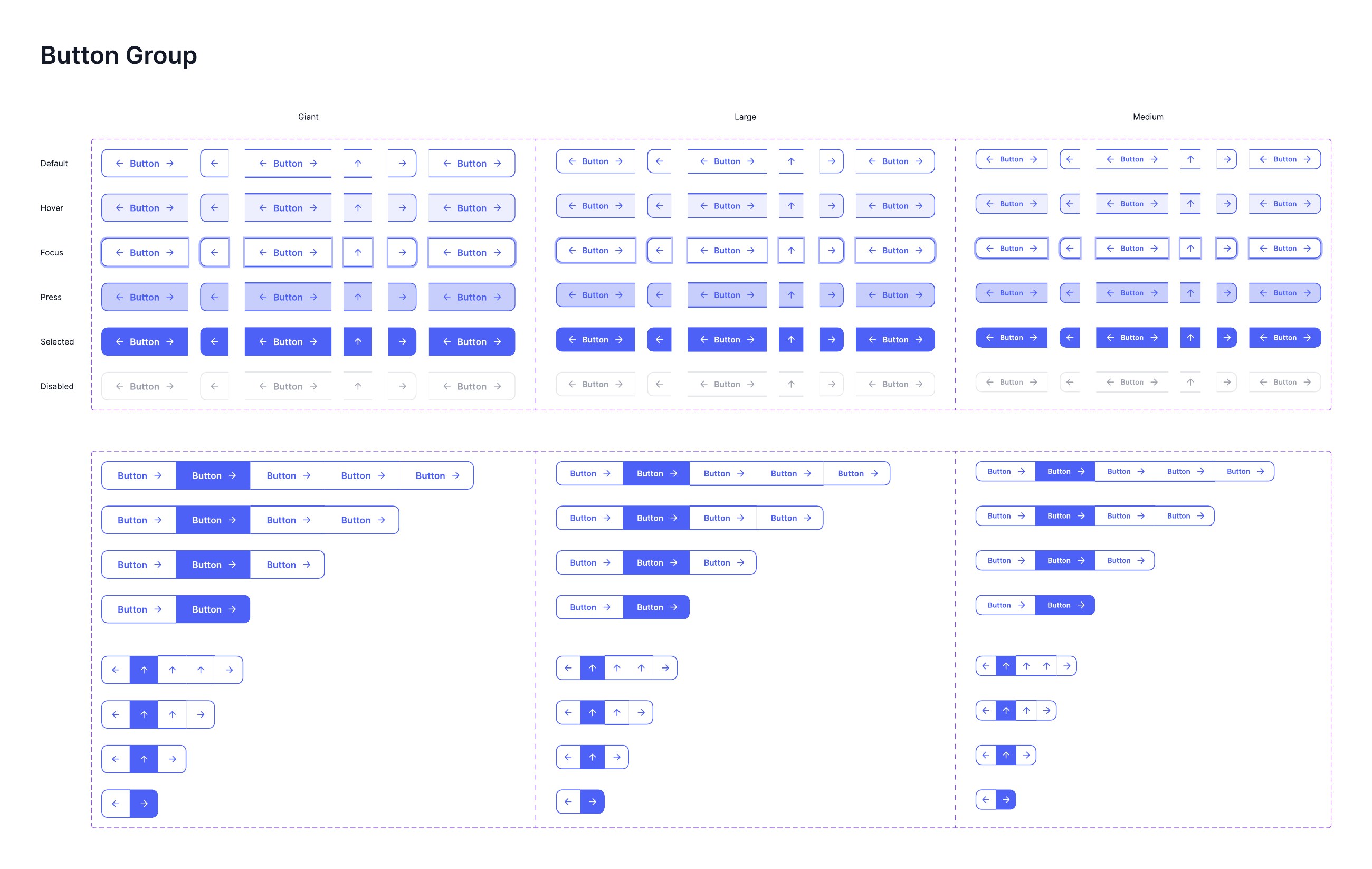
Default, hover, focus, press, selected and disabled, crossed with giant, large and medium, plus segmented groups from five items down to two, and icon-only variants.
View full sheet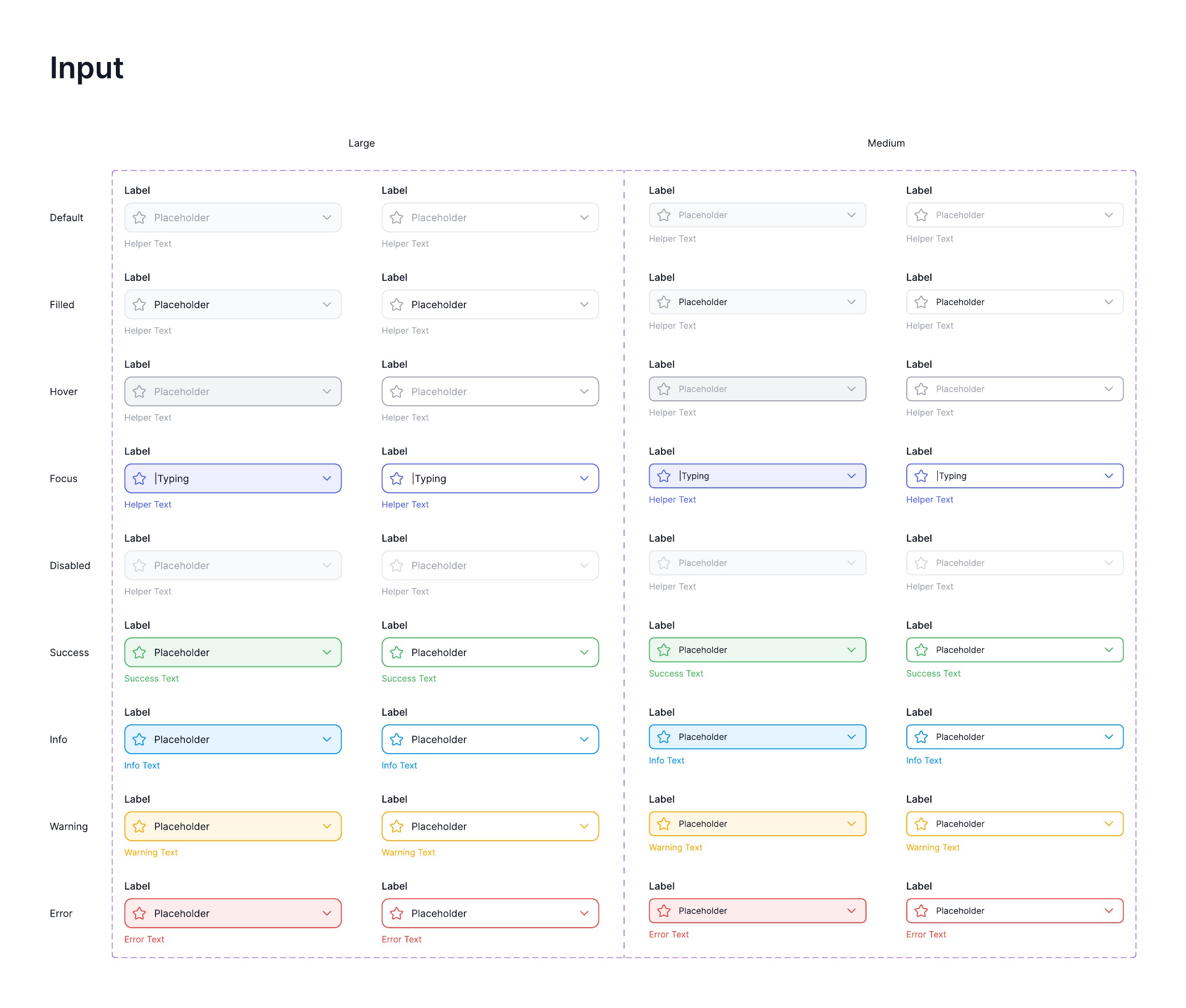
Empty, placeholder, focused, filled, success and error, each with label and helper text, so validation is designed rather than bolted on.
View full sheet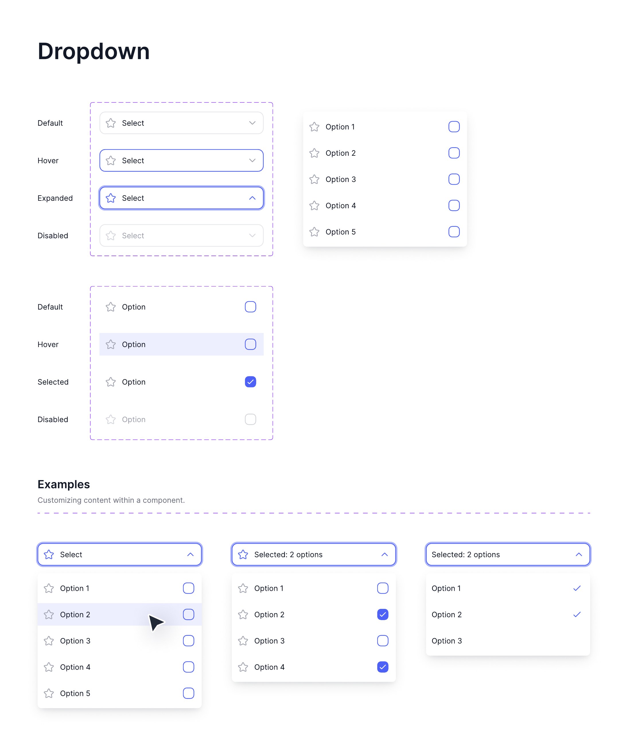
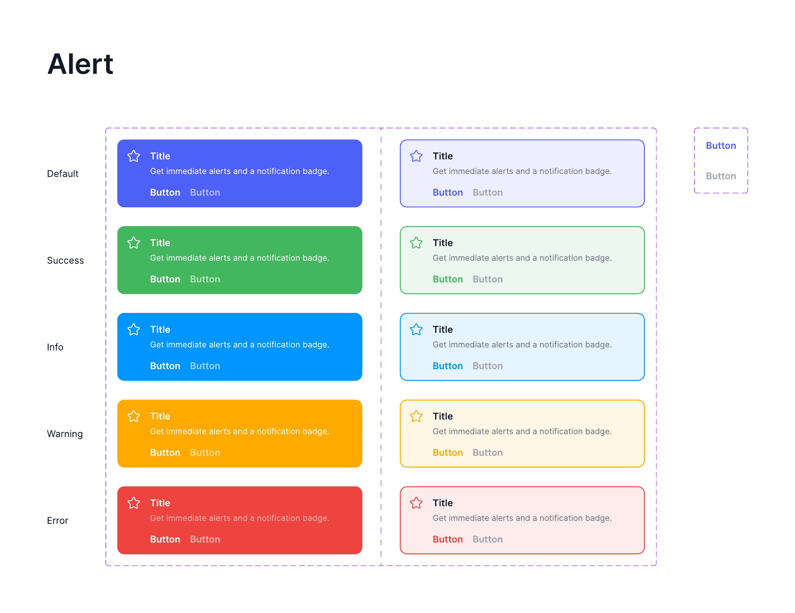
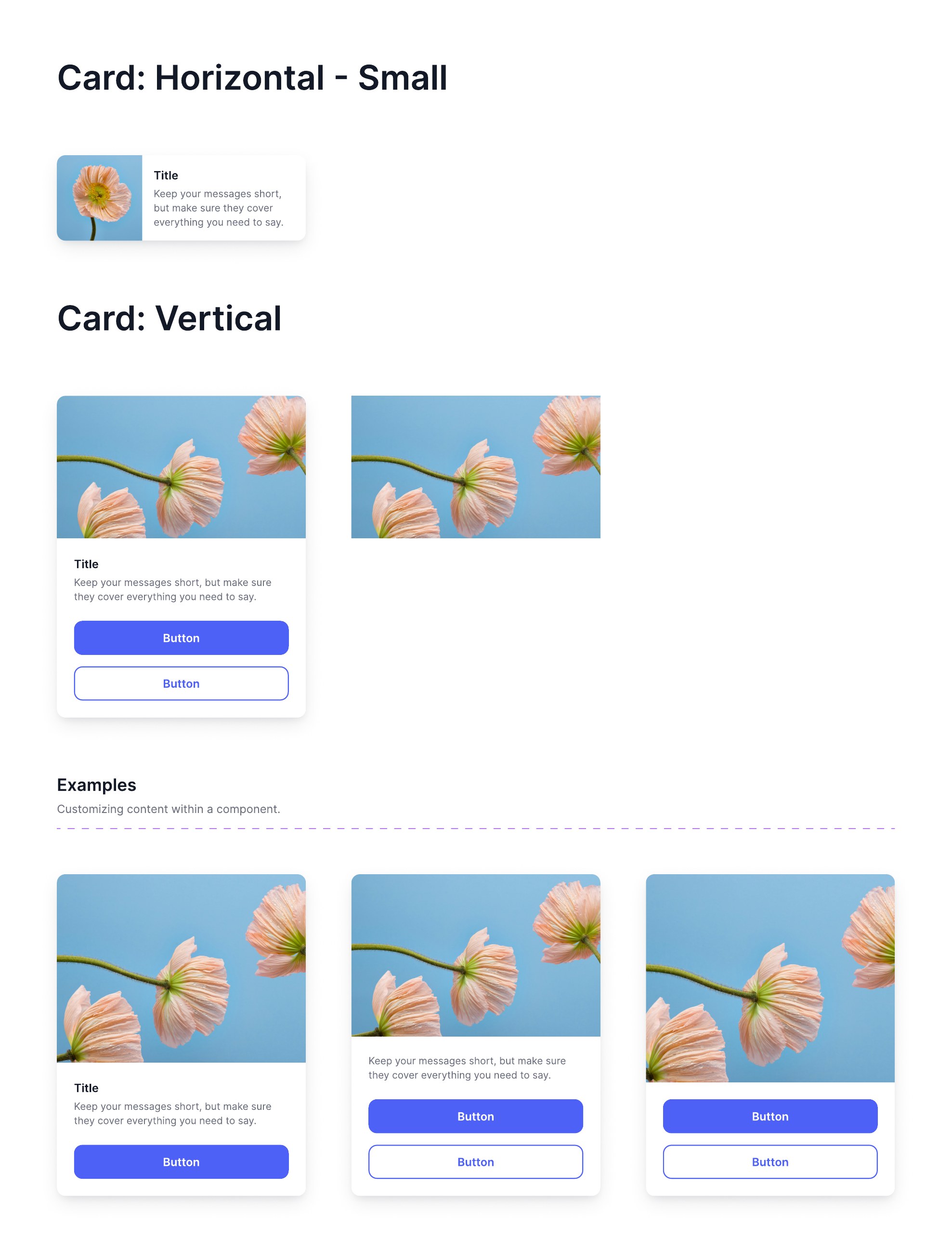
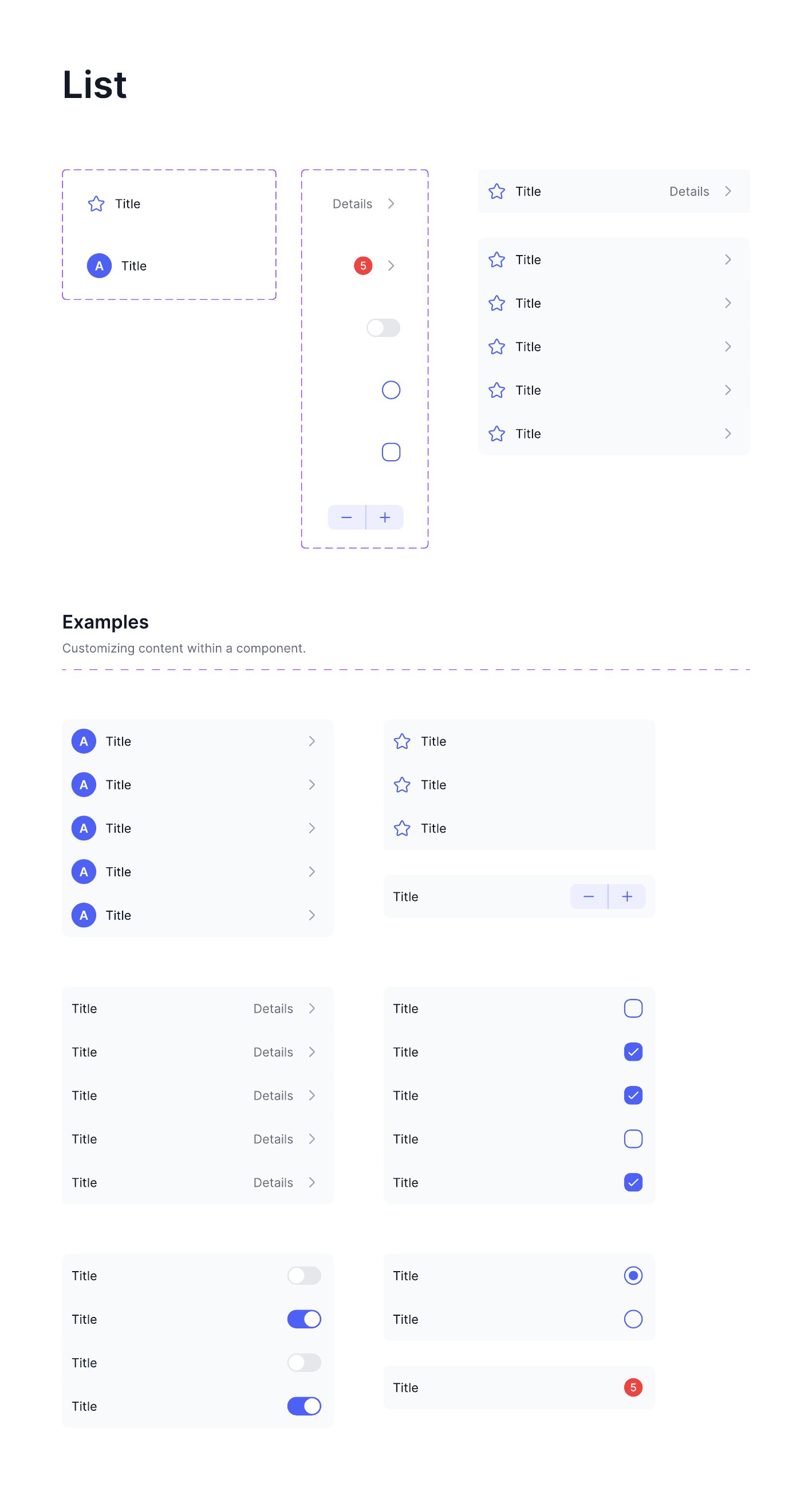
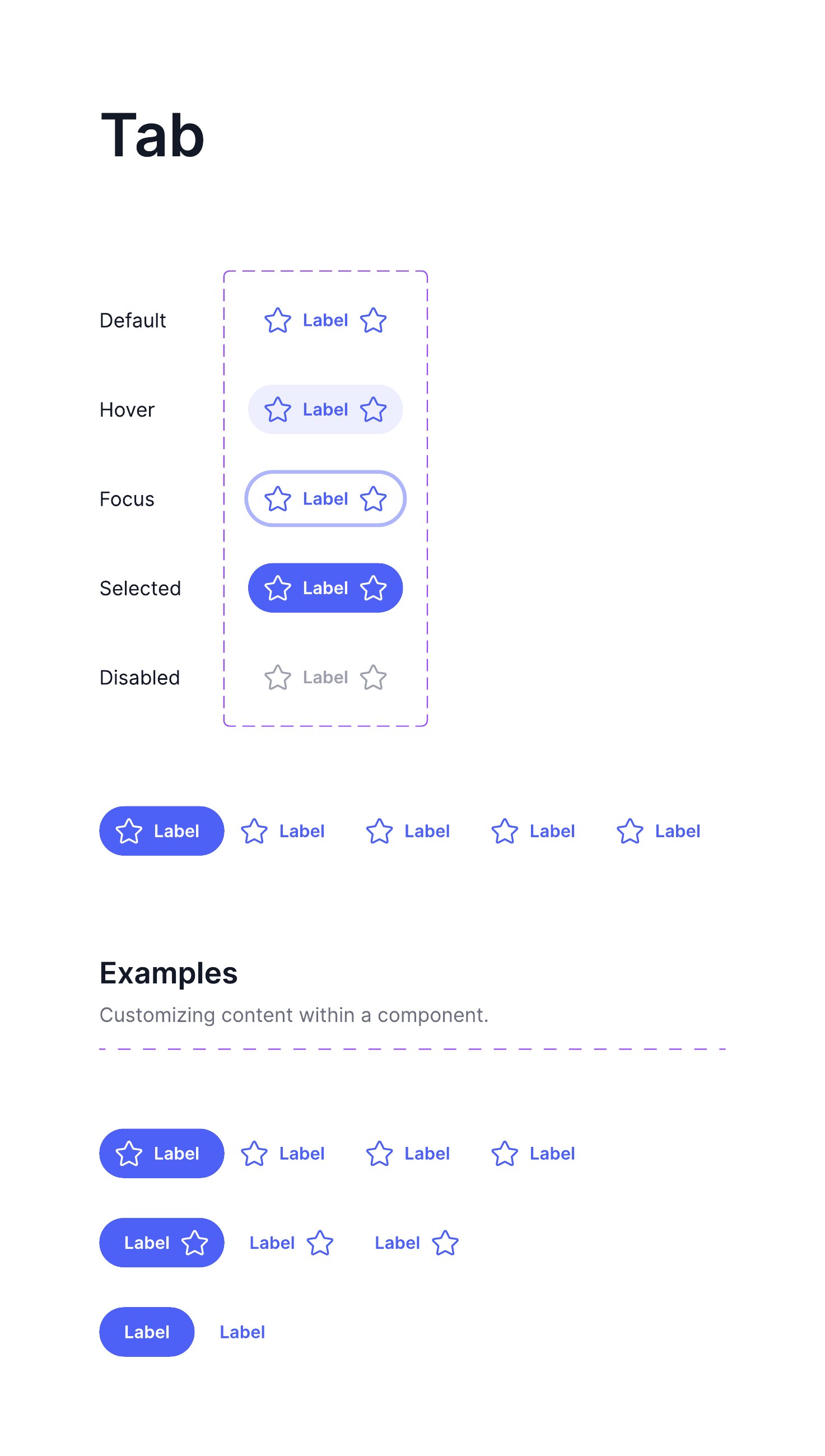
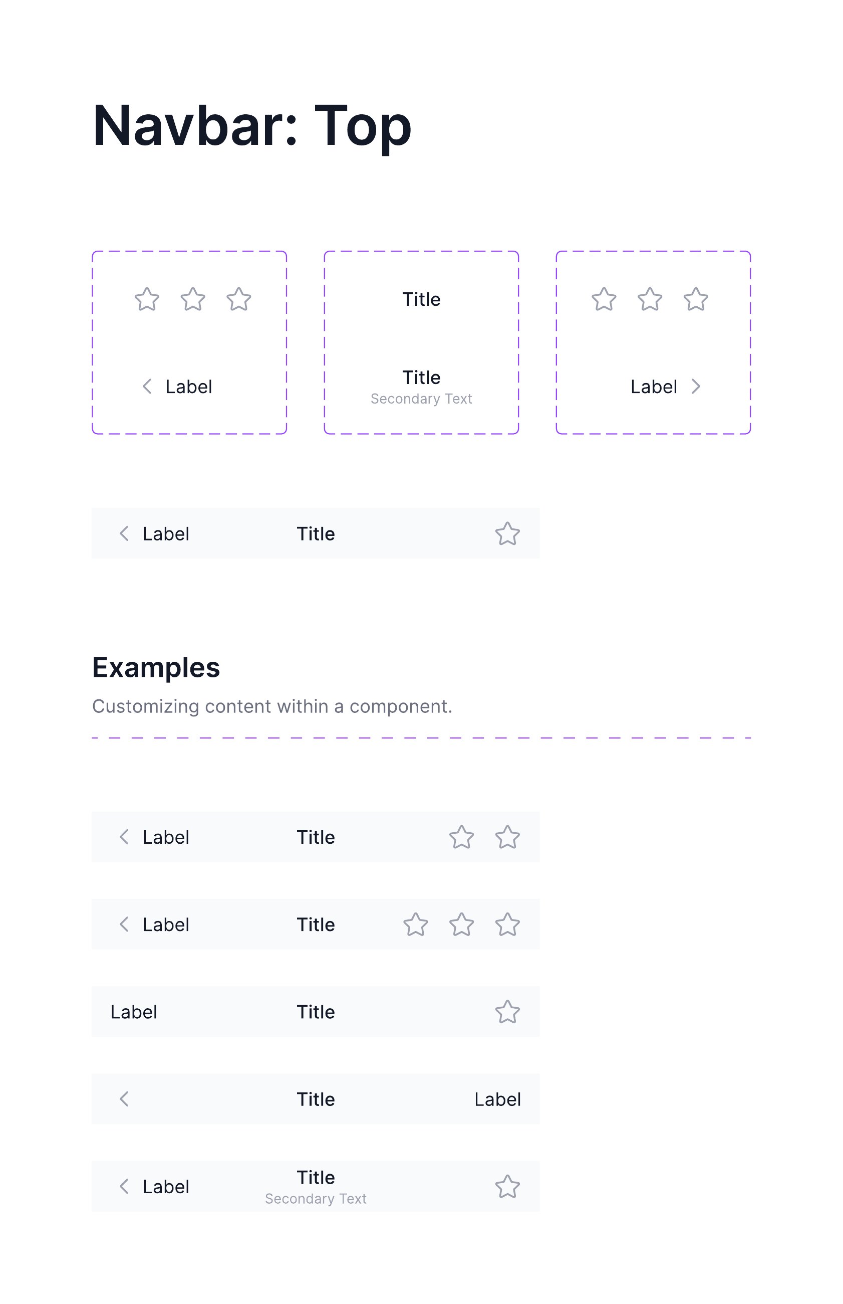
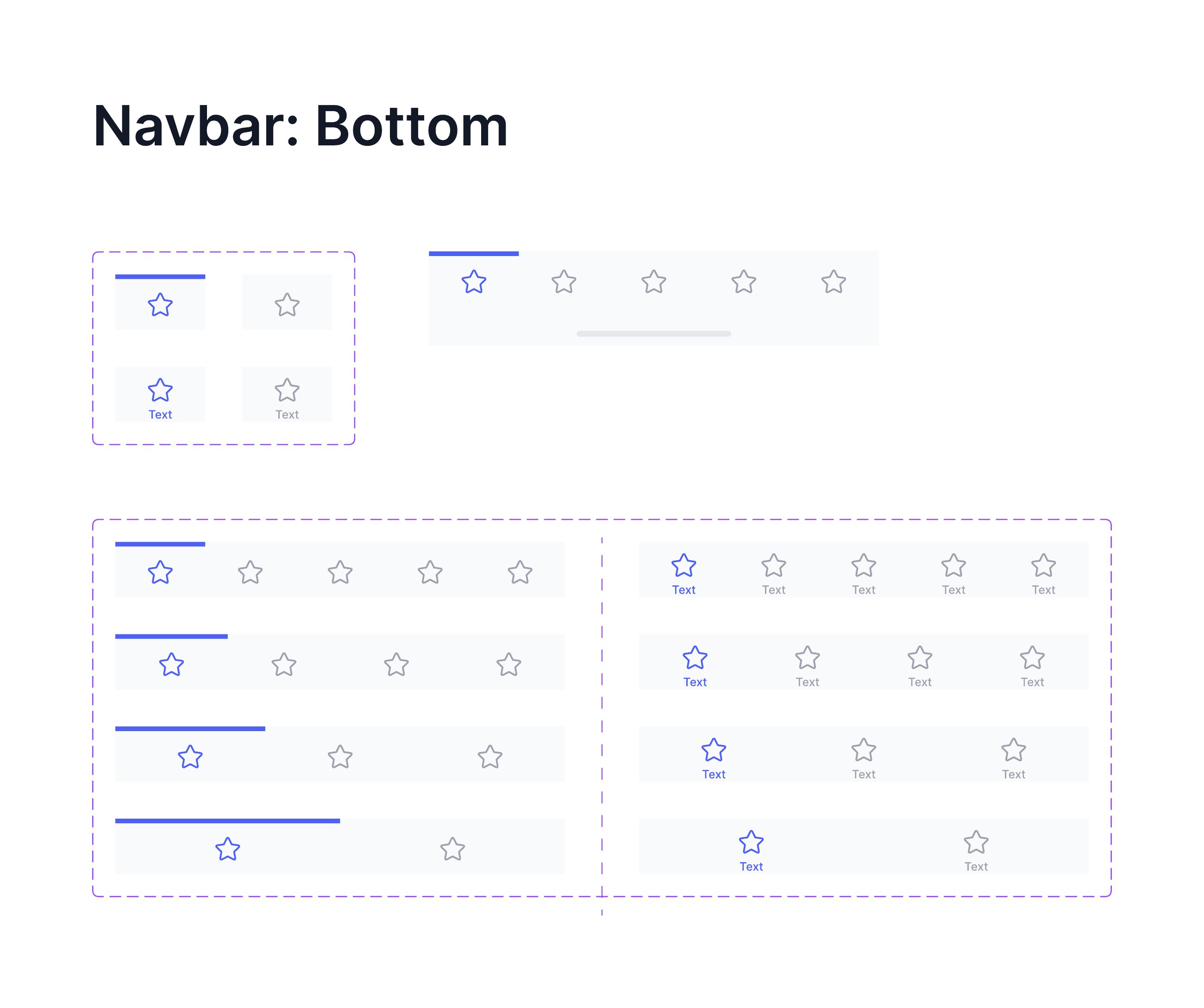
Mobile bar at three, four and five items, with active and badged states.
View full sheet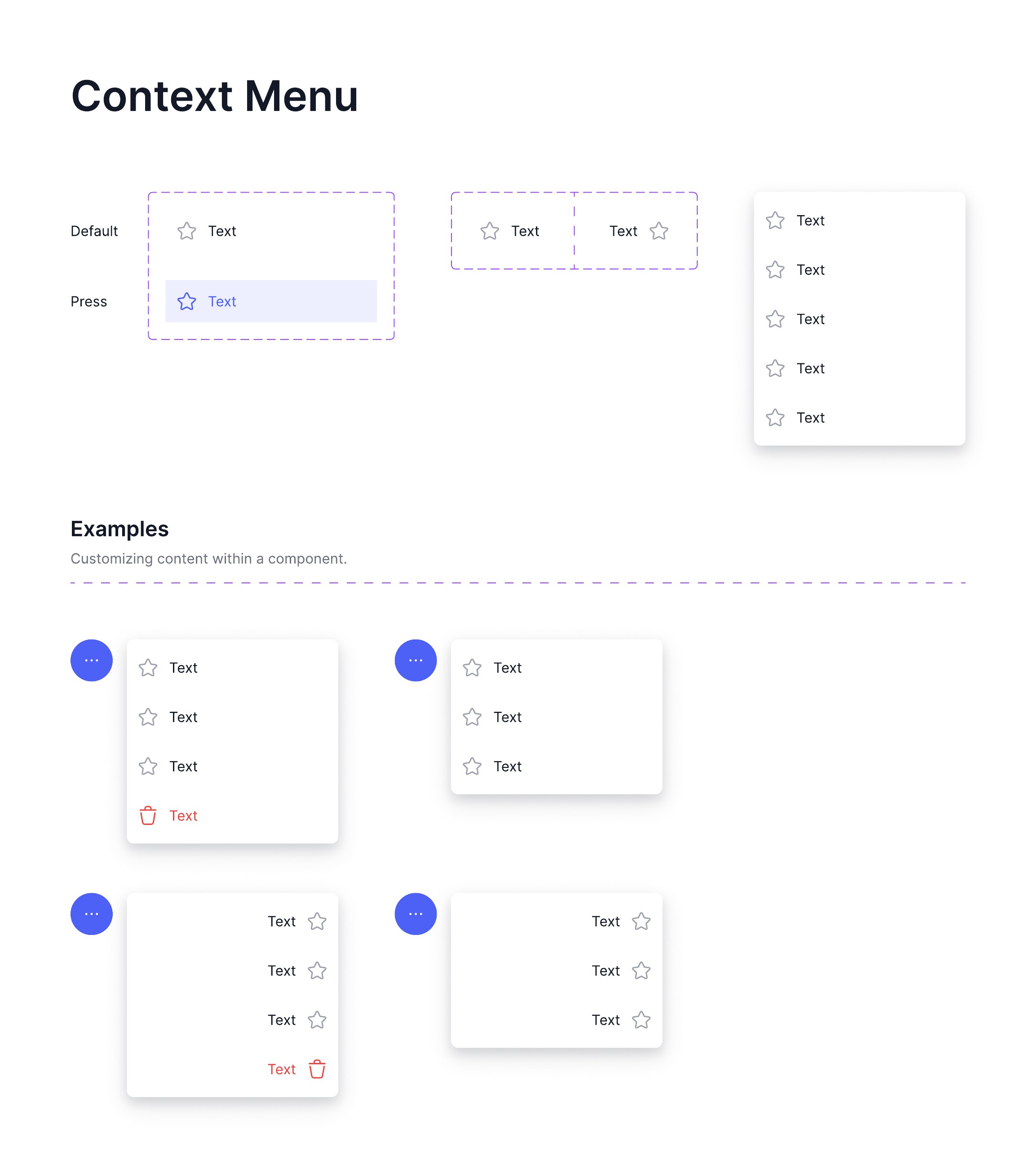
Grouped items, dividers, icons, shortcuts, submenus and destructive actions.
View full sheet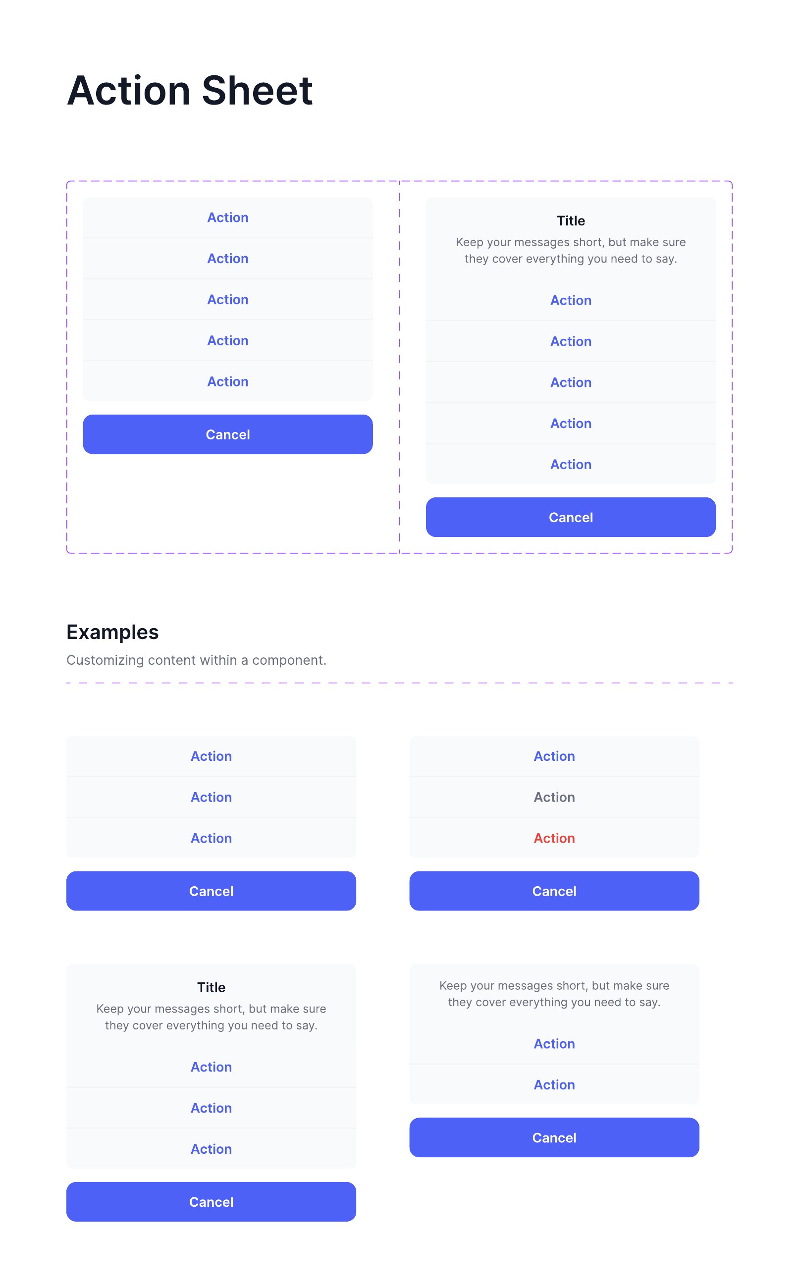
Mobile sheet with grouped and destructive actions and a cancel affordance.
View full sheet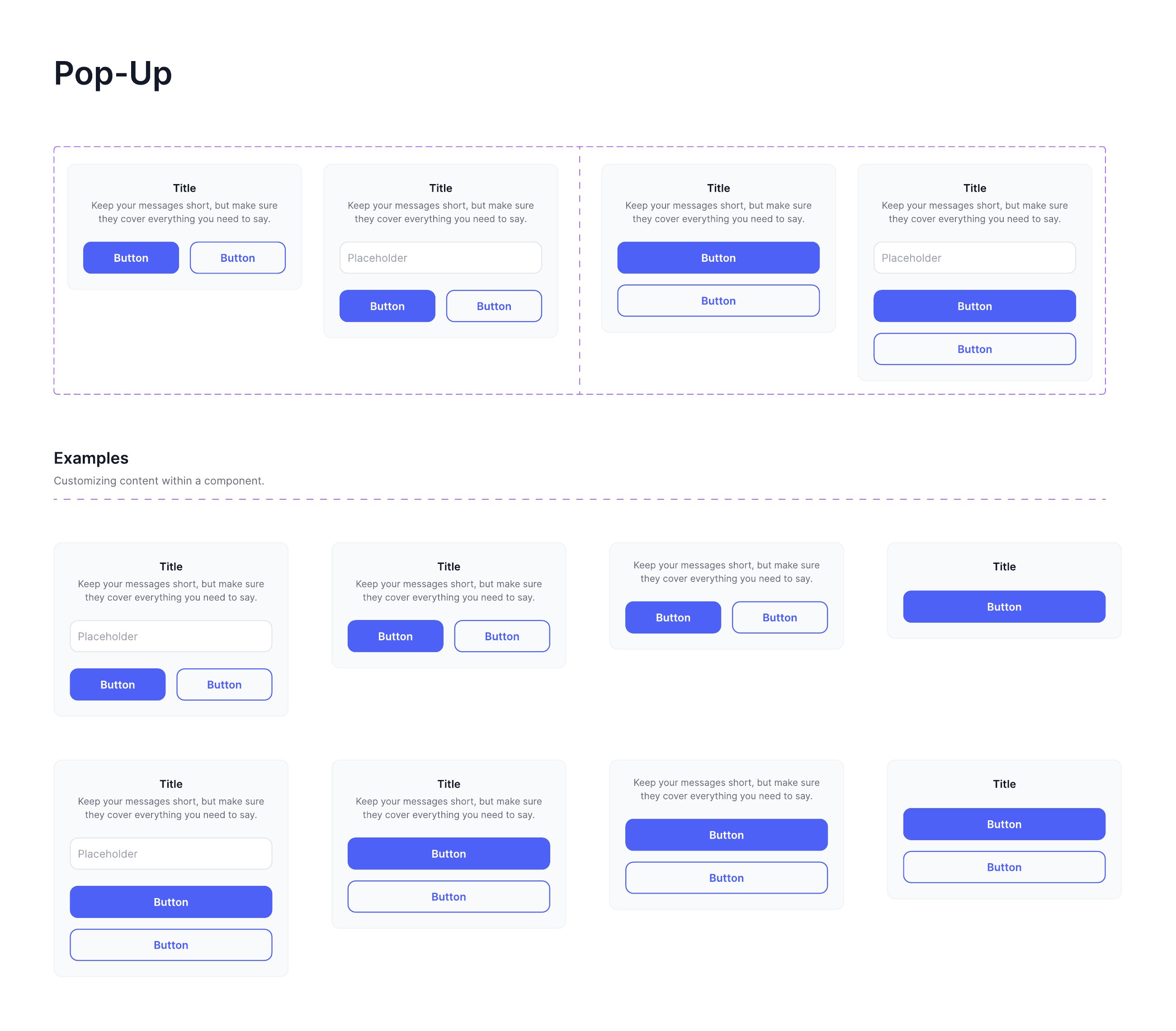
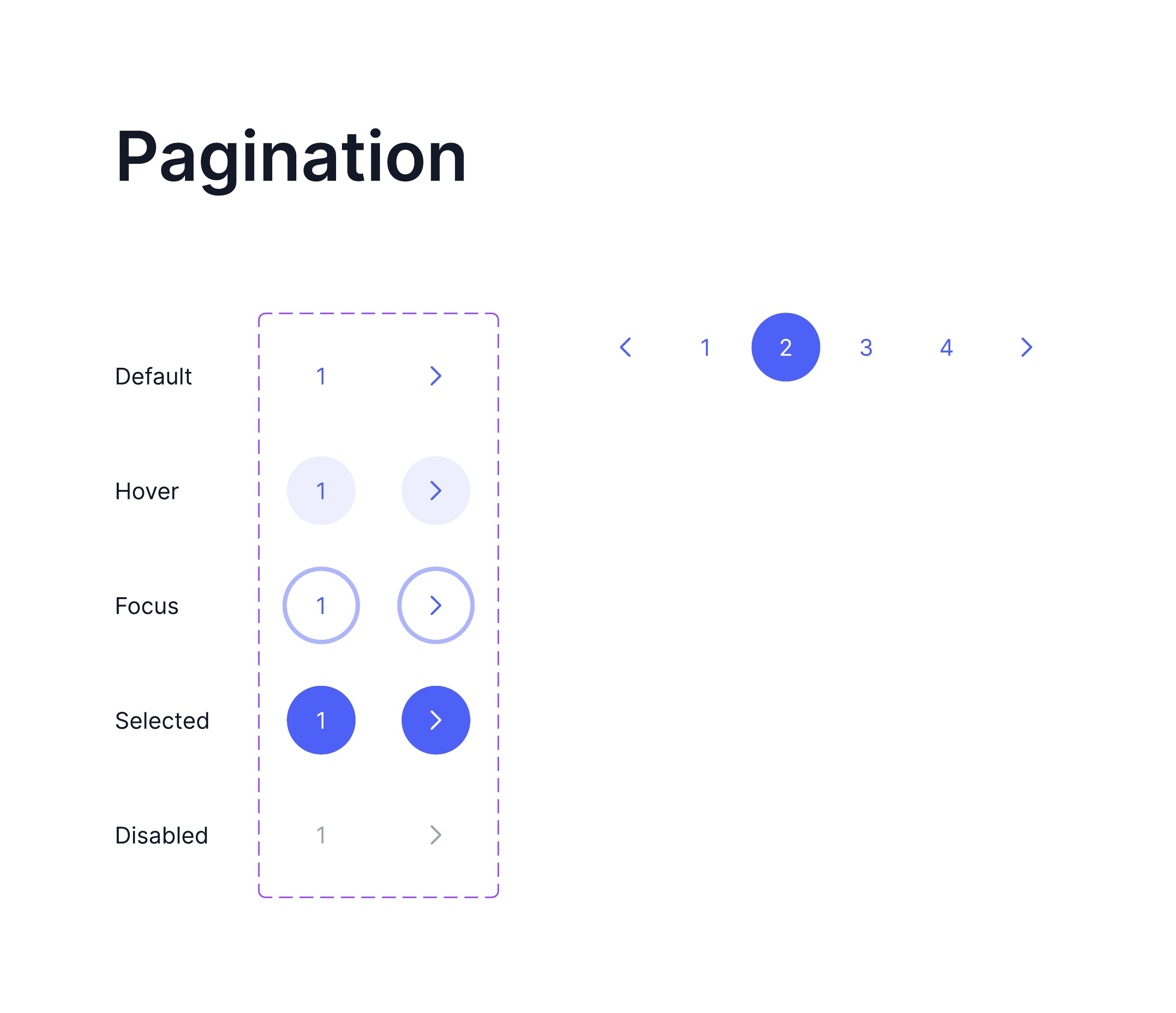
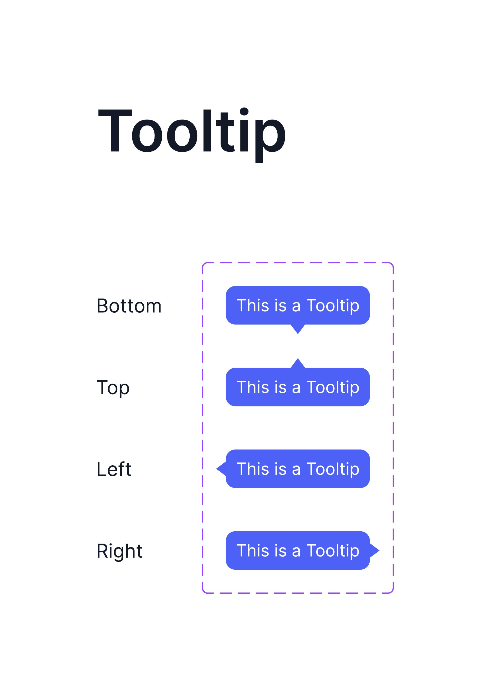
Numbered, truncated and compact variants with first, last and disabled edges.
View full sheet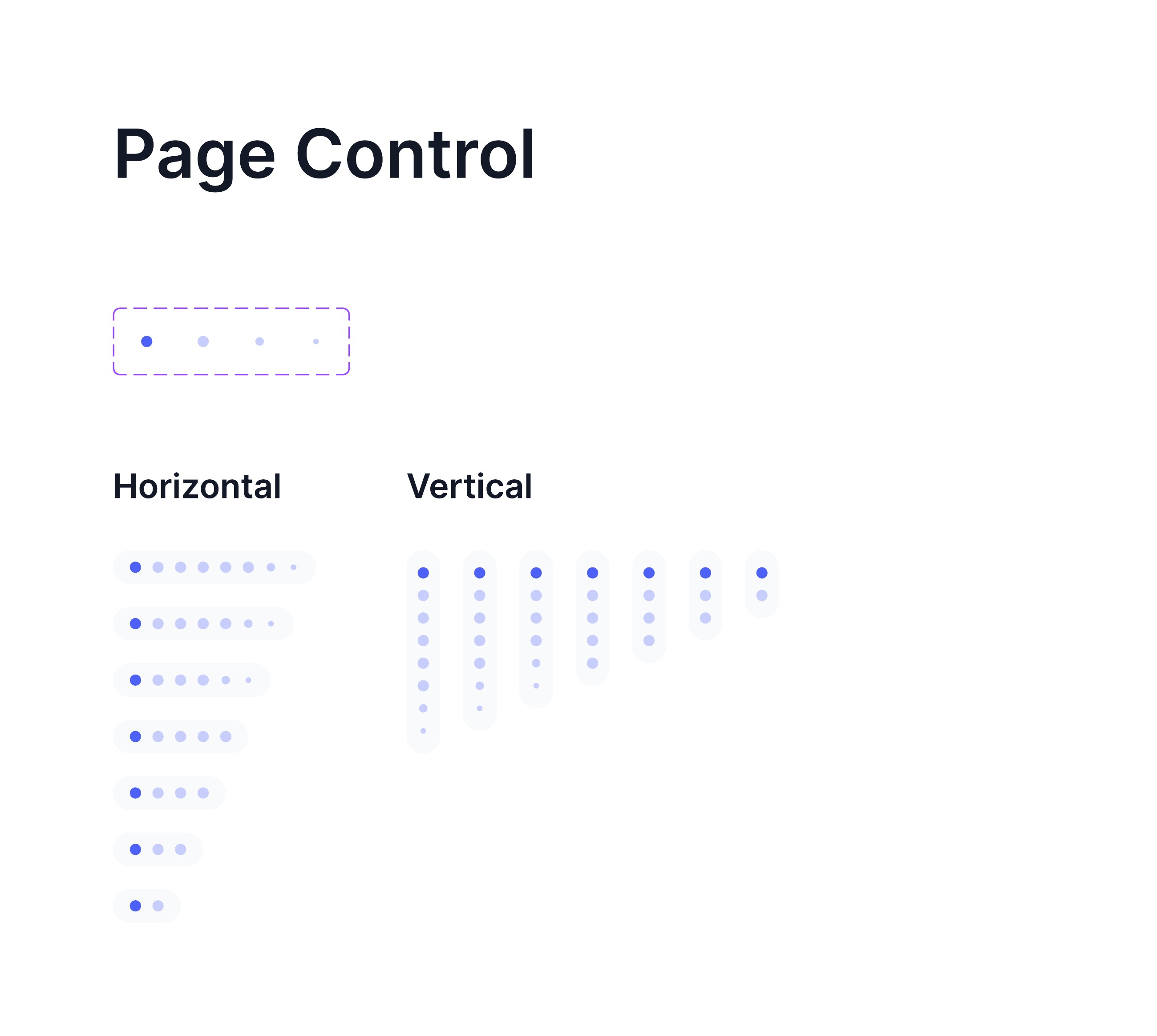
A library only earns its keep once a real product is built on it. These are the systems I set up inside client work, where the constraints were someone else's brand, someone else's engineers and someone else's deadline.

Handoff documentation rather than a component sheet: an overview, the components in play, numbered interaction specs, empty and error states, responsive behaviour across mobile and desktop, and a prototype link. Written so the build matches the design without a meeting.
View full sheet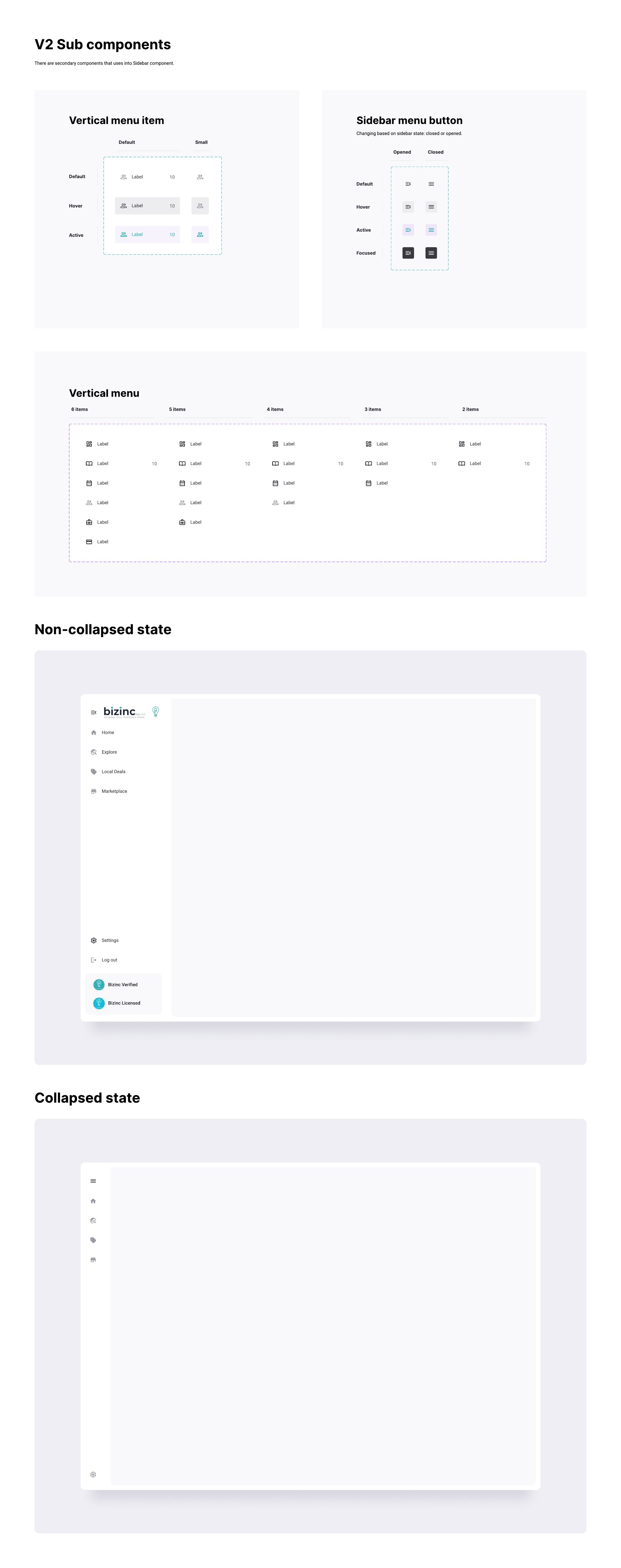
V2 sub-components: vertical menu item and sidebar button across default, hover, active and focused, the menu at six through two items, and the collapsed and expanded states of the whole shell.
View full sheet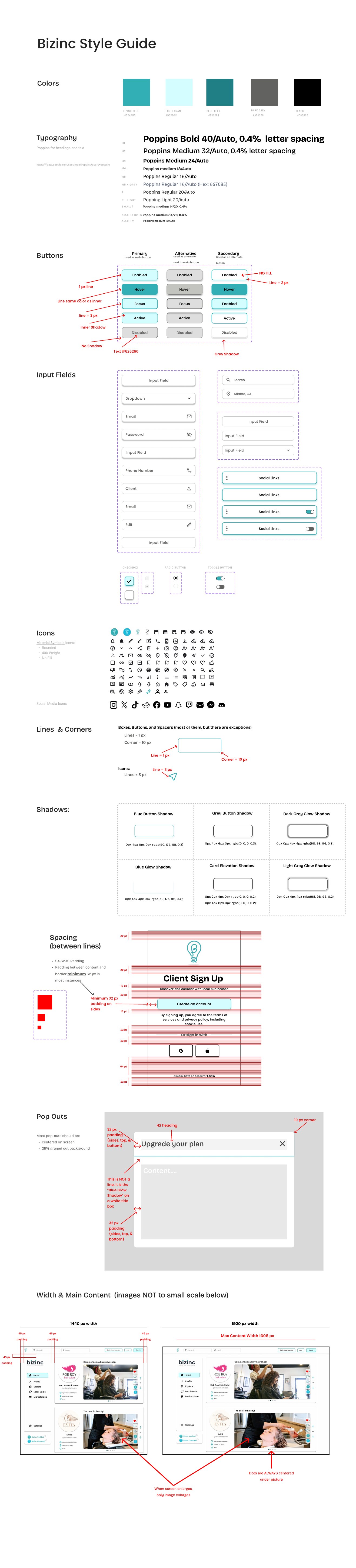
The product's own foundation: brand colour with hex values, a Poppins scale from H1 to small, and button variants annotated with border weights and fill rules for the developers building them.
View full sheet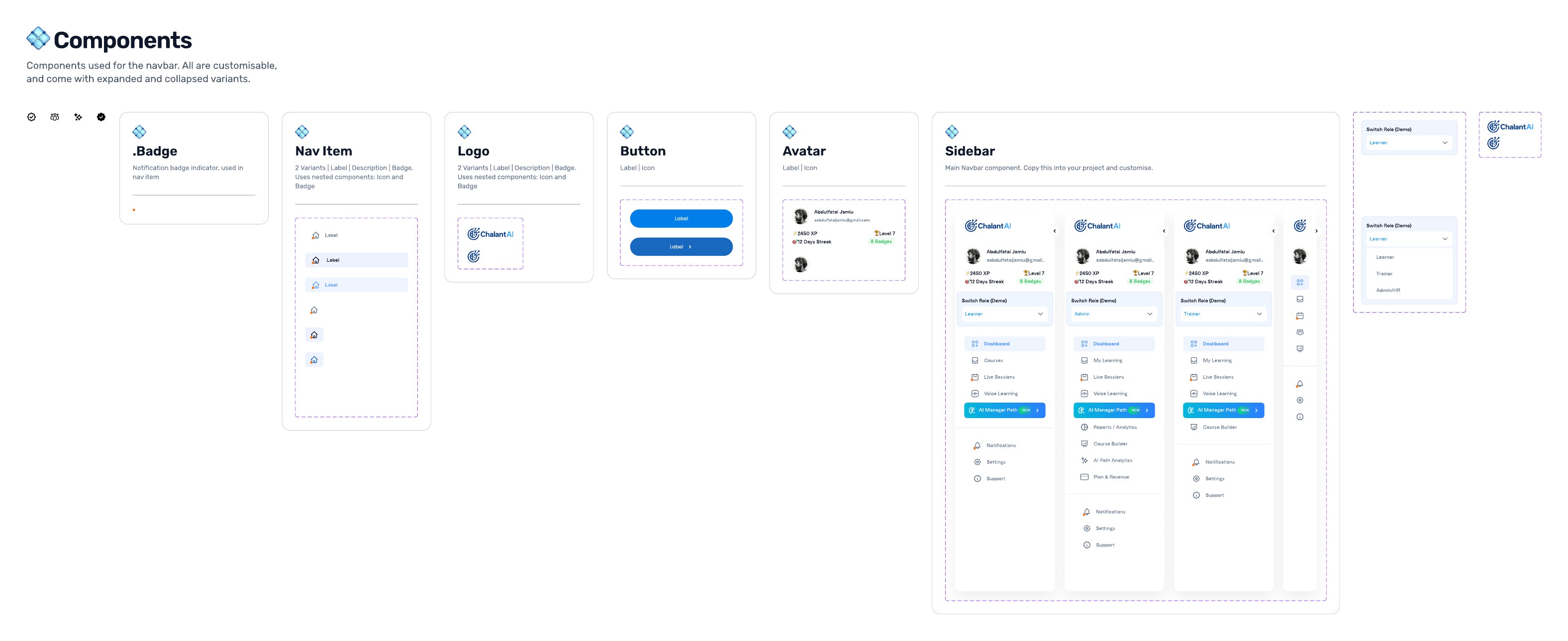
Badge, nav item, logo, button, avatar and sidebar, each with expanded and collapsed variants, and the sidebar resolved three times for the learner, trainer and admin roles from one component.
View full sheet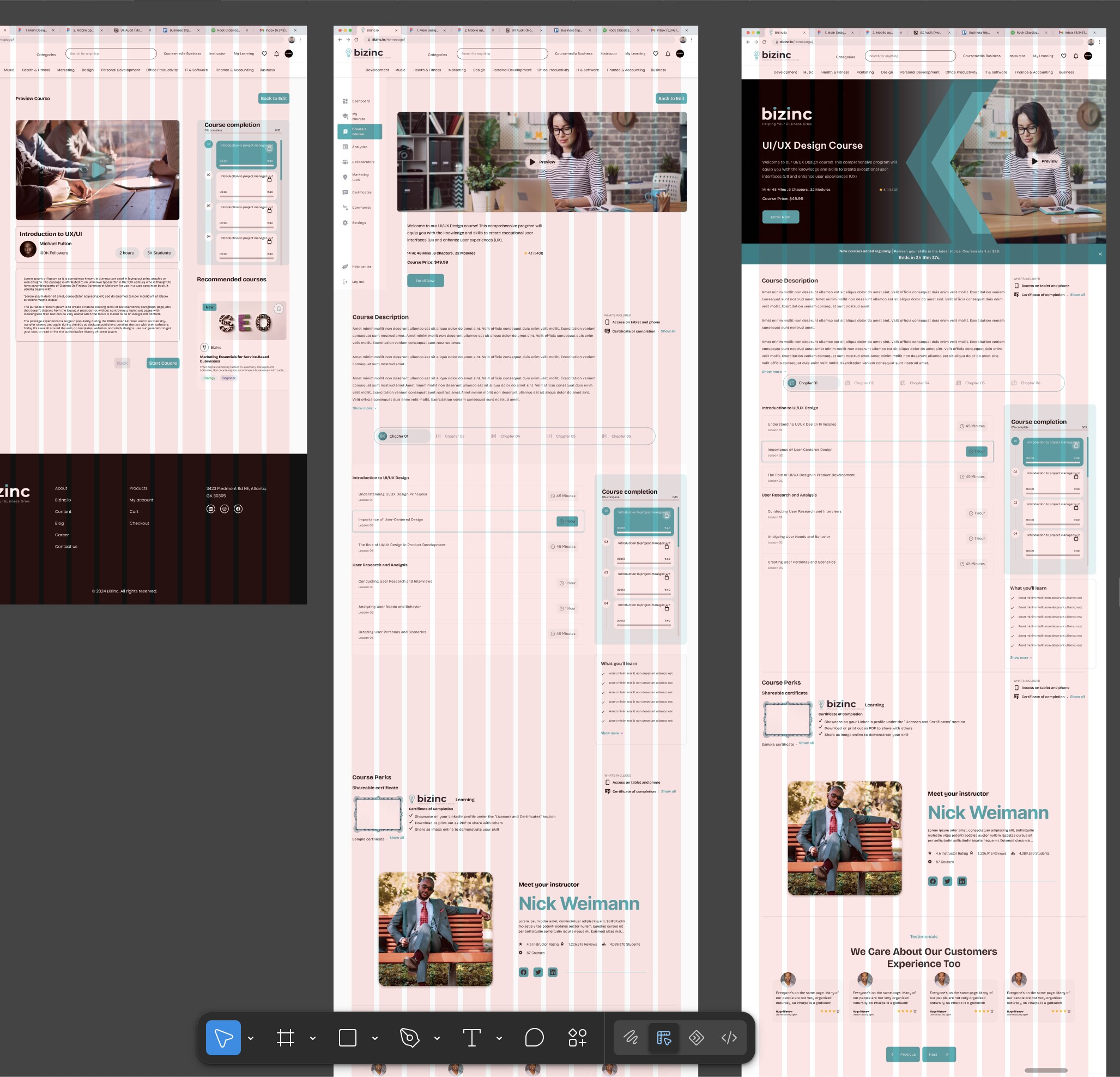
The same page checked against the published web grid at three widths. Columns are a rule the layout is measured against, not a decoration.
View full sheet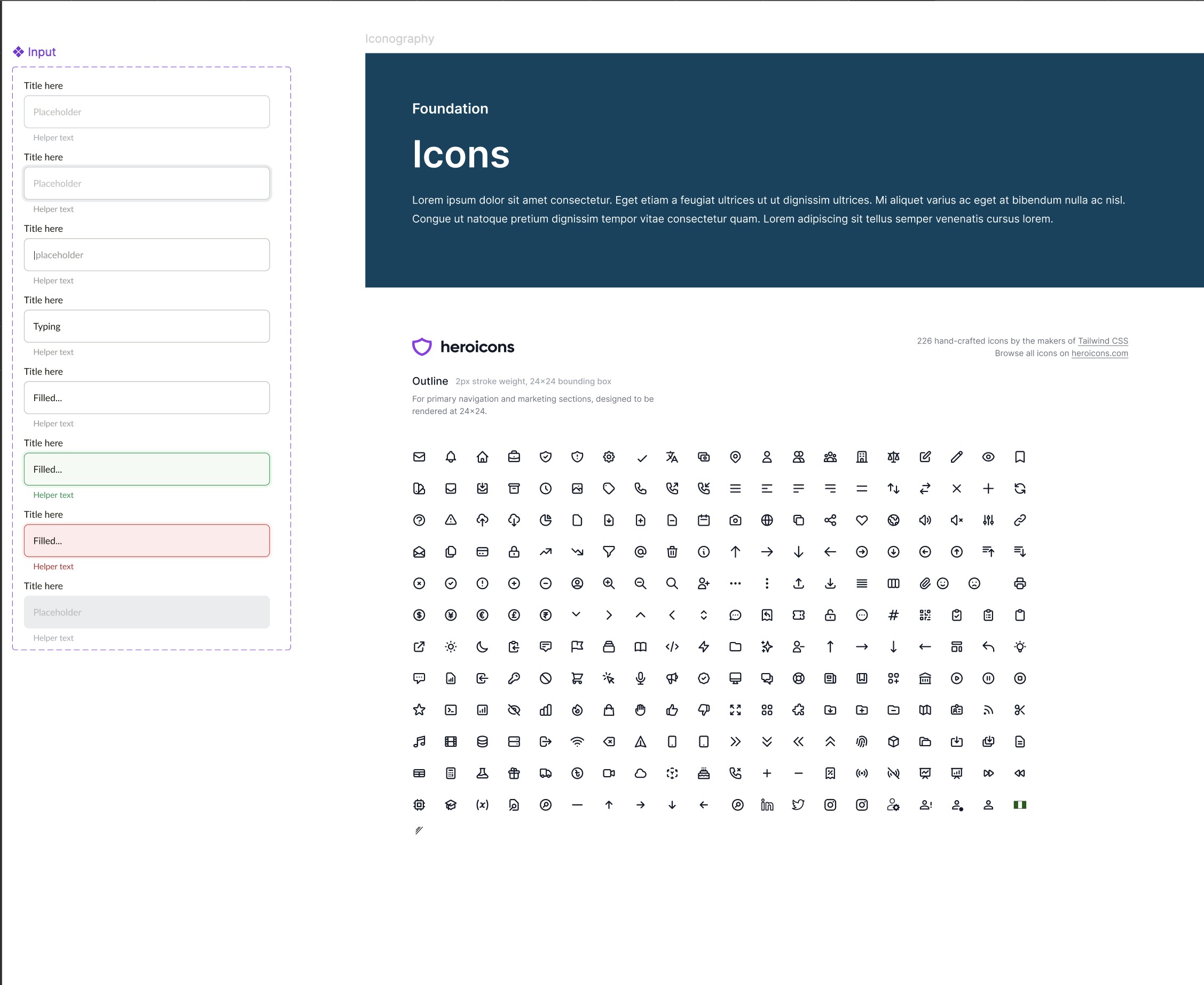
Input documented through placeholder, typing, filled, success and error, alongside the iconography foundation, heroicons, specified at 2px stroke and a 24×24 box with usage rules.
View full sheet