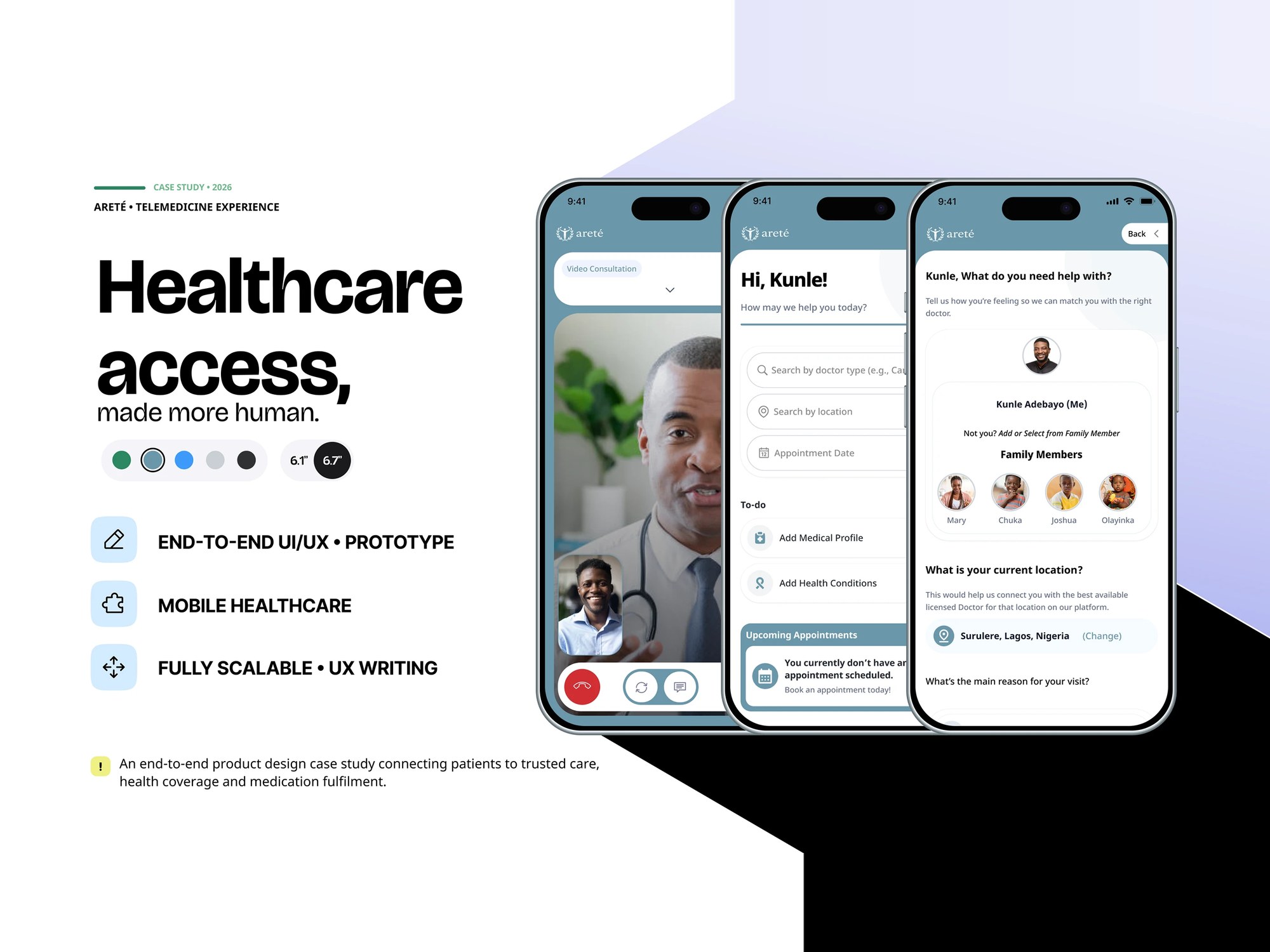
MY ROLE · End-to-end healthcare UX/UI, flows, design system and prototype
Arete
I designed Arete as a connected care journey, from finding a provider to getting a prescription filled. I wanted to work through the handovers that can make a healthcare experience confusing.
01What I wanted to solve
I worked across patient access, consultations, HMO coverage and pharmacy fulfilment. The design also needed clear status language, recovery paths and consideration for localisation and poor connections.
02The decisions that mattered
Continue past the appointment.
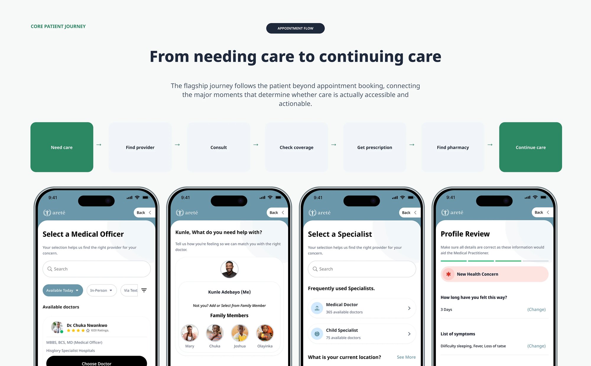
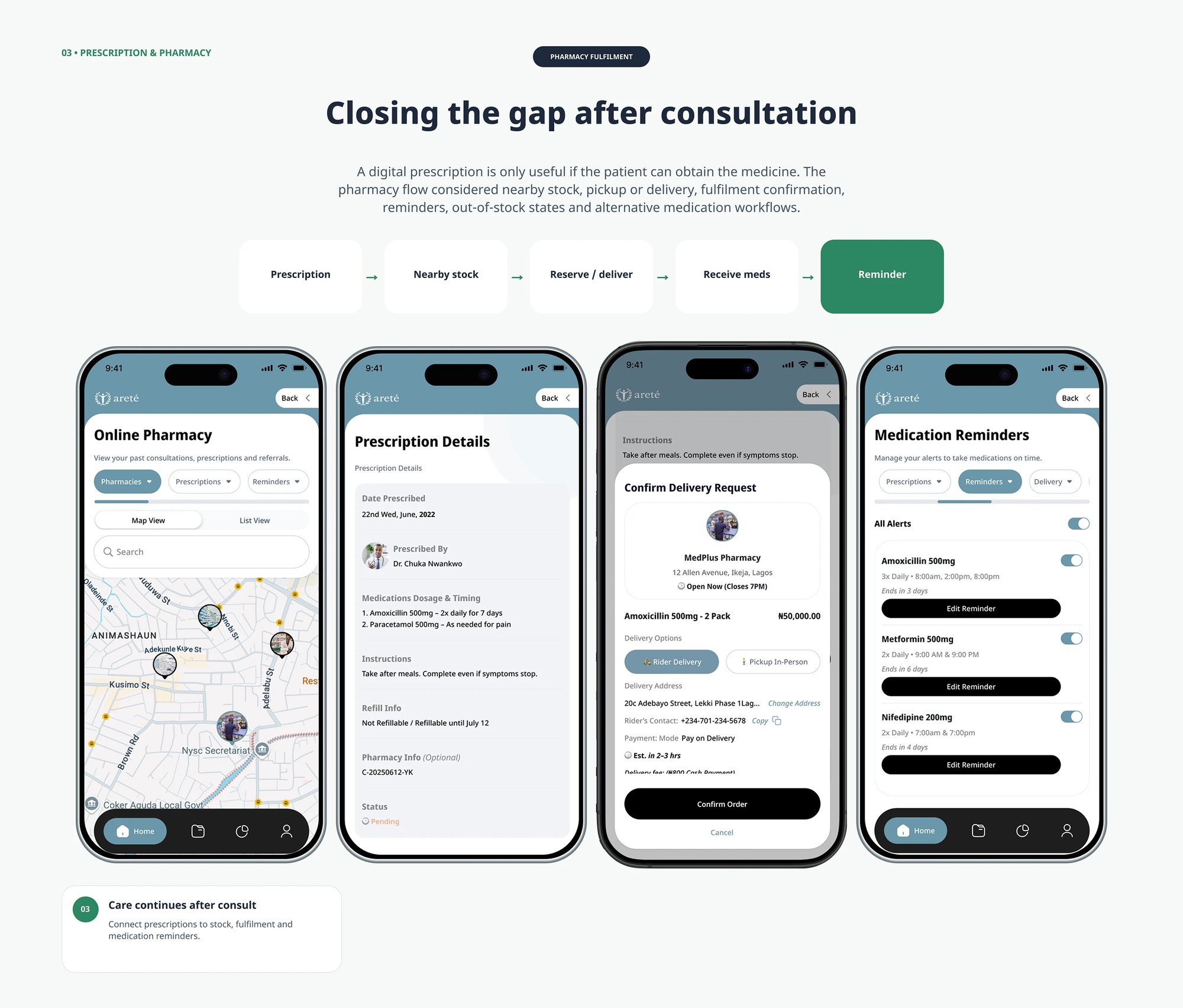
I mapped the journey through coverage, prescriptions, pharmacy availability and continued care.
Explain coverage before commitment.
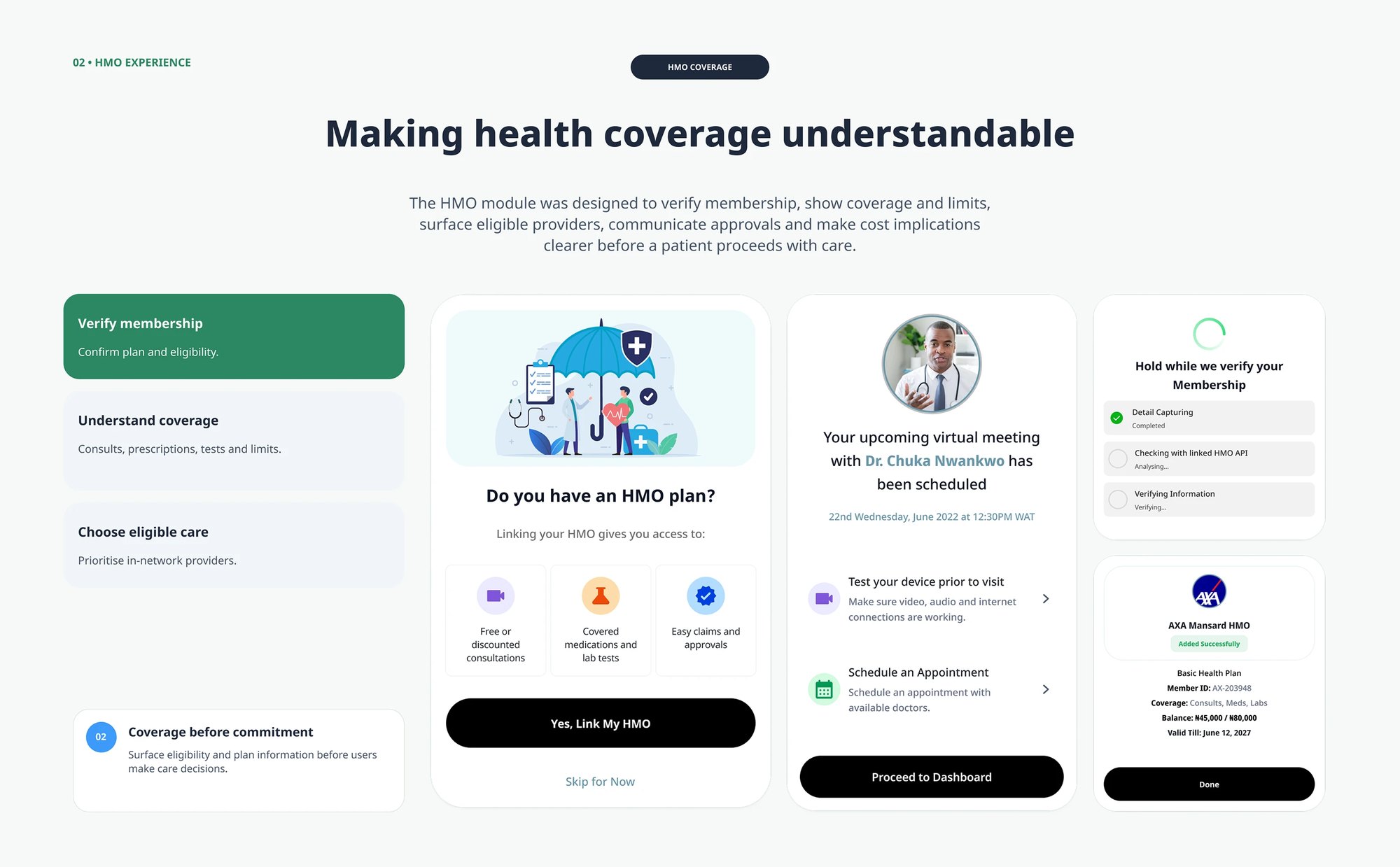
I made membership and plan limits visible while keeping Skip for Now available to uninsured patients.
Design the difficult states too.
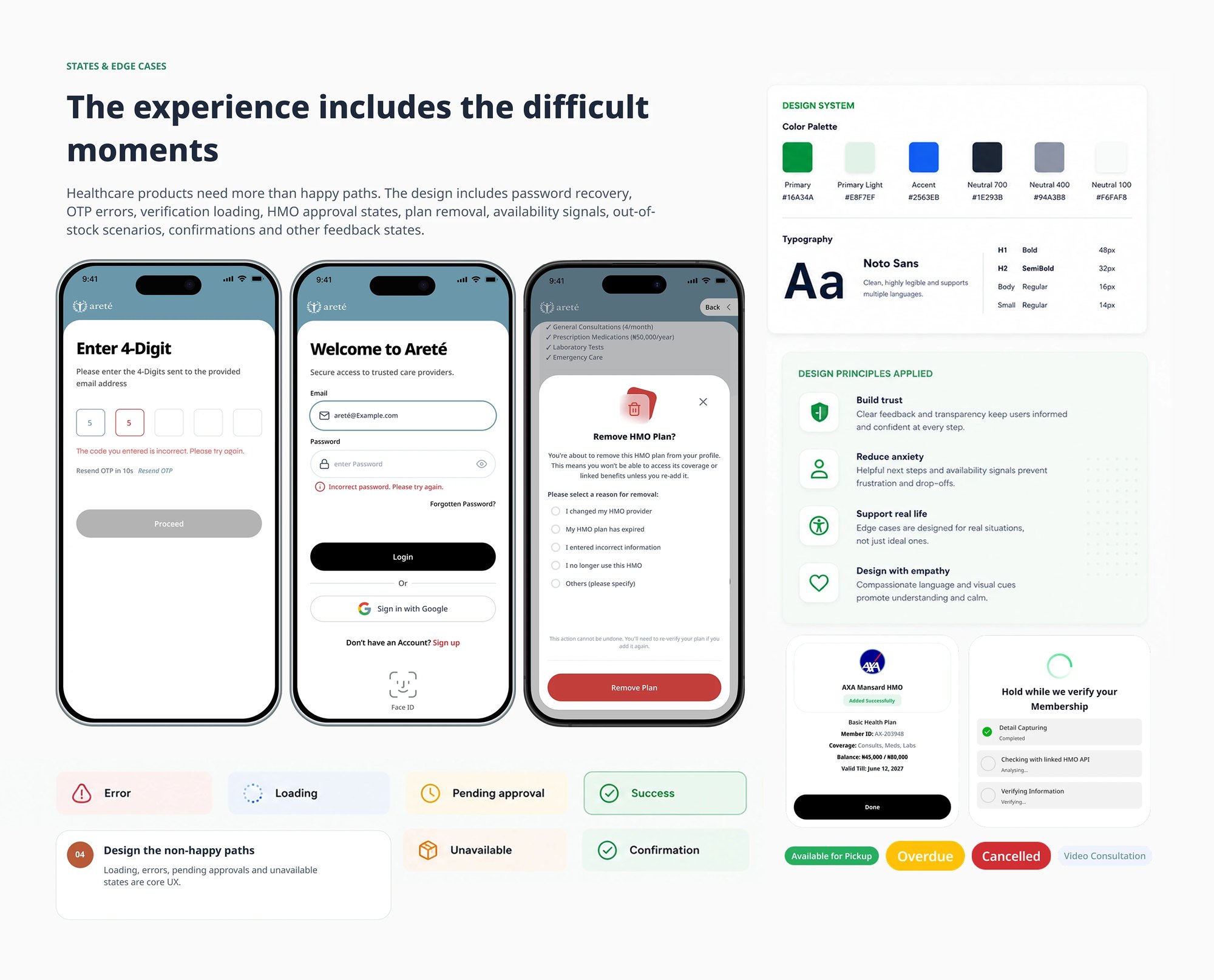
I included verification errors, pending approvals, unavailable stock and recovery steps alongside the happy path.
03See the work
The screens below show how those decisions came together.
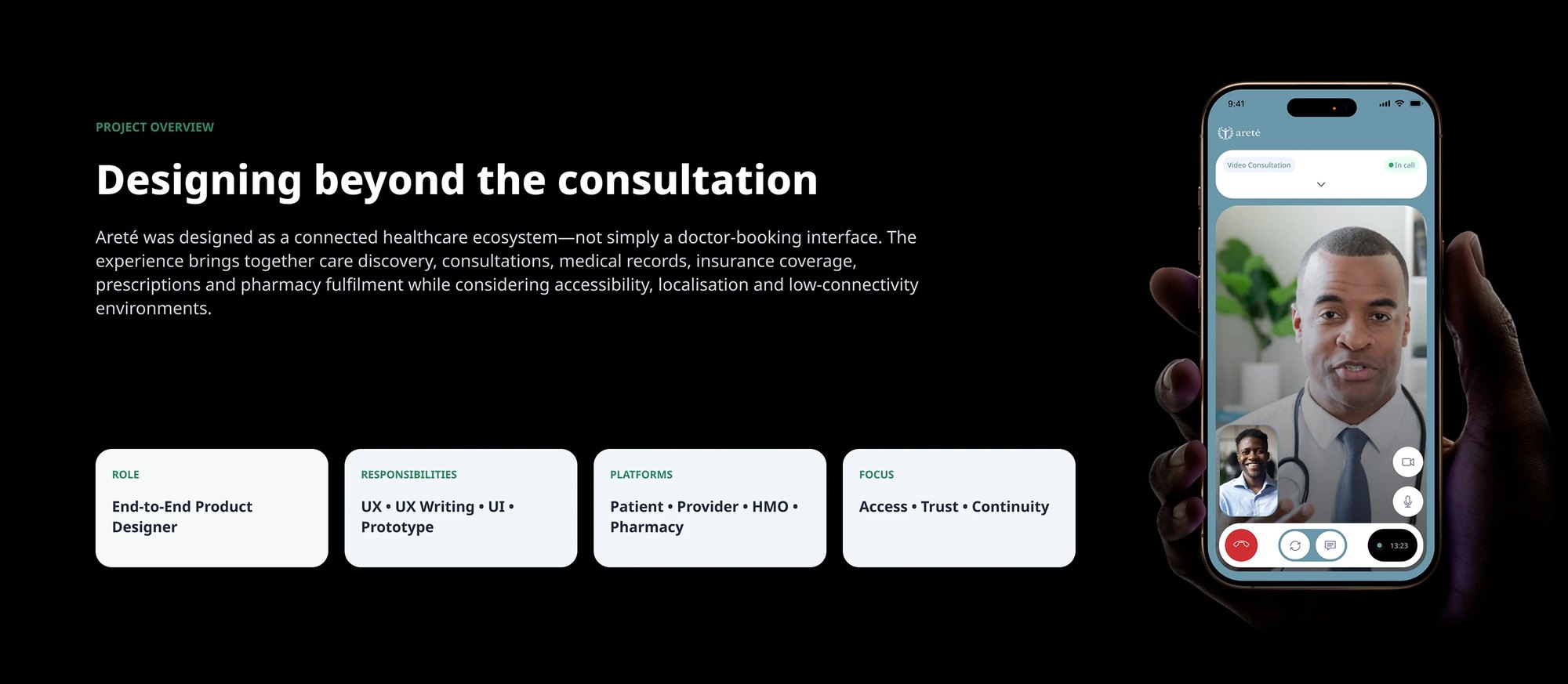
View full sizeThe project framing: an end-to-end product design role across the patient, provider, HMO and pharmacy surfaces, focused on access, trust and continuityMore screens and supporting work +
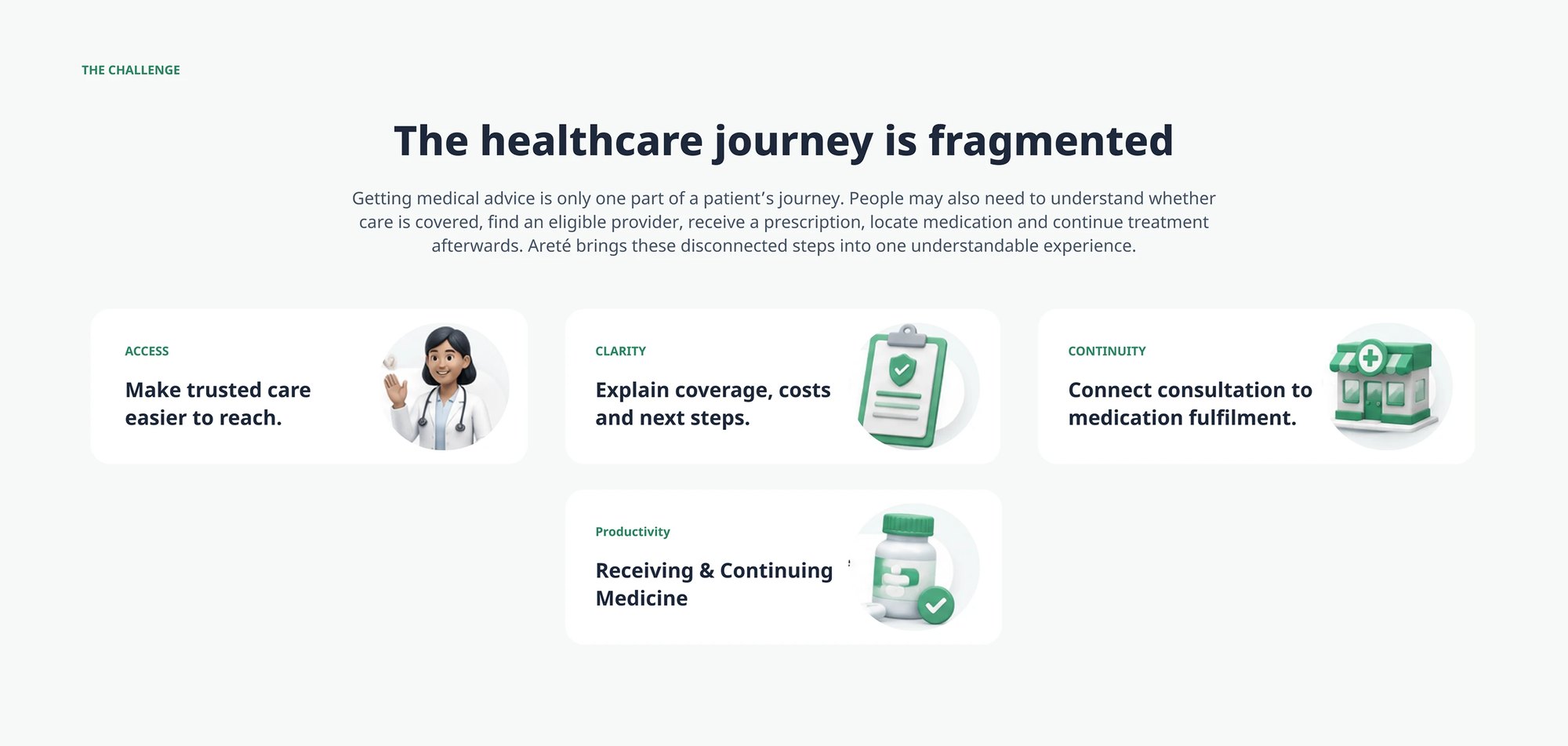
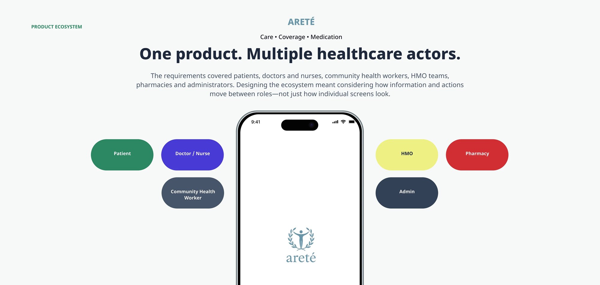
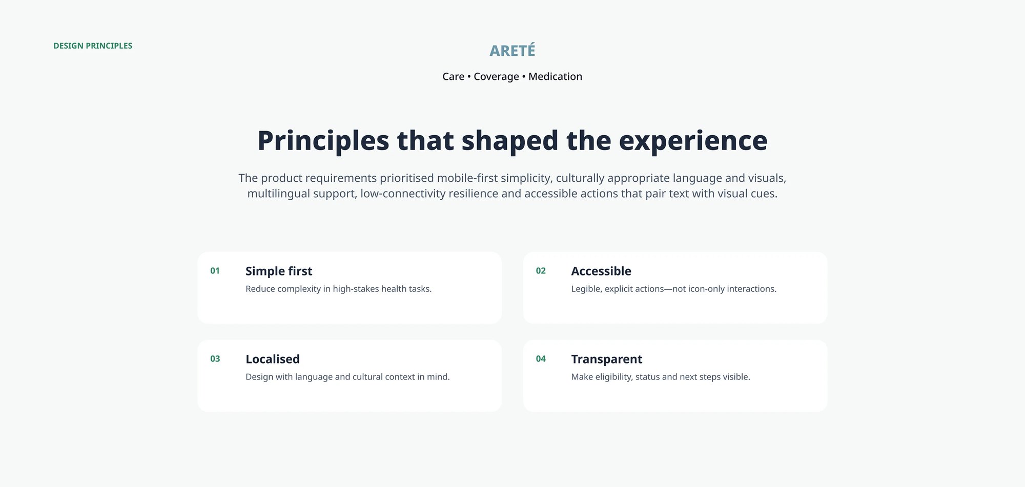
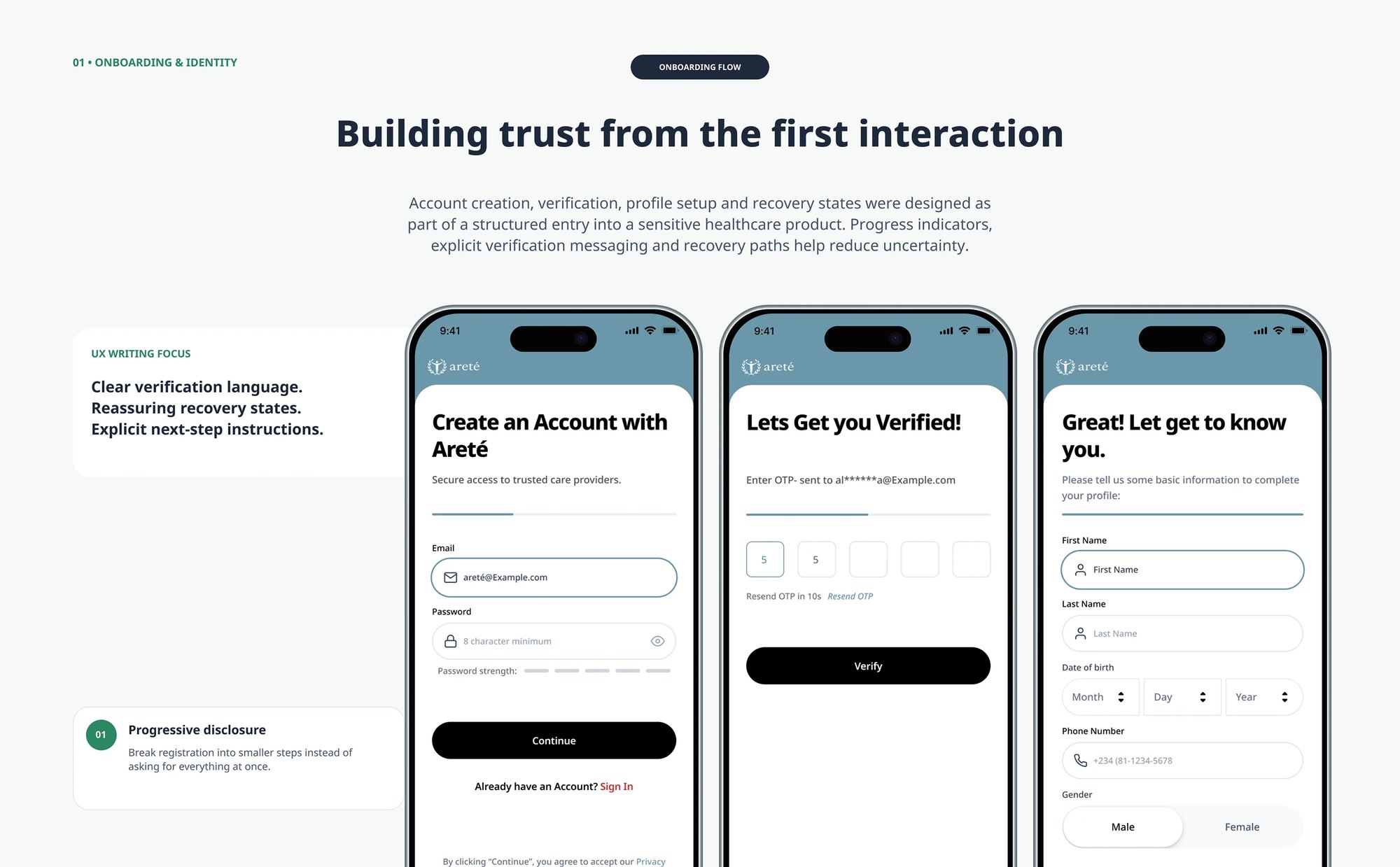
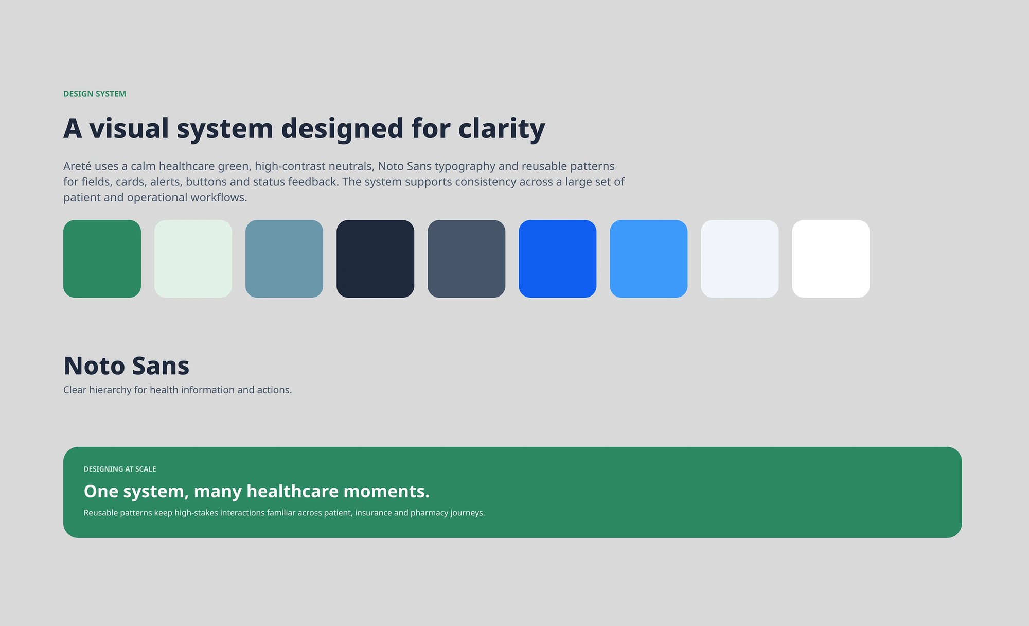
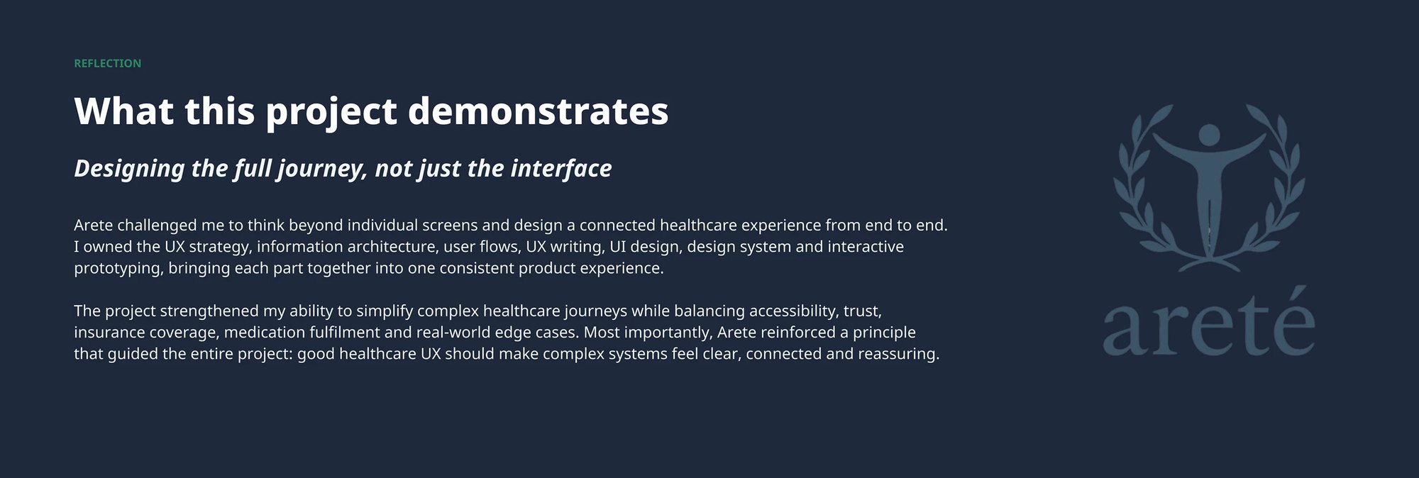
View full sizeThe problem stated as four jobs rather than one: reaching trusted care, understanding what coverage pays for, connecting a consultation to medication fulfilment, and continuing treatment afterwardsView full sizeThe actors the requirements had to serve, patient, doctor and nurse, community health worker, HMO, pharmacy and administrator, mapped around the product, because the design problem was how information and actions move between roles rather than how any single screen looksView full sizeThe four principles the requirements resolved into: simple first in high-stakes tasks, accessible through explicit rather than icon-only actions, localised for language and cultural context, and transparent about eligibility, status and next stepsView full sizeOnboarding as a structured entry into a sensitive product, account creation, OTP verification and profile setup broken into steps with progress shown, explicit verification language and recovery paths, rather than one long formView full sizeThe flagship journey end to end: need care, find provider, consult, check coverage, get prescription, find pharmacy, continue care, with the screens that carry it, including symptom capture, family-member selection and a profile review before a practitioner sees itView full sizeThe HMO module: membership verification with its own loading state, what the plan covers and its limits, eligible providers, and the plan card showing balance and validity, with Skip for Now kept available so an uninsured patient is never blockedView full sizePharmacy fulfilment as a chain rather than a hand-off: prescription, nearby stock on a map, reserve or deliver with pickup and rider options, then medication reminders per drug with dosage, timing and days remainingView full sizeThe non-happy paths designed as first-class: OTP errors, incorrect password, verification loading, plan removal with reason capture and an explicit warning that it cannot be undone, plus the full status vocabulary, error, loading, pending approval, success, unavailable, confirmationView full sizeThe system underneath: a calm healthcare green with high-contrast neutrals, Noto Sans set at four defined sizes, and reusable patterns for fields, cards, alerts, buttons and status feedback so high-stakes interactions stay familiar across patient, insurance and pharmacy journeysView full sizeThe closing reflection from the case study deck, owning UX strategy, IA, user flows, UX writing, UI, the design system and interactive prototyping, and bringing them into one consistent product experienceView full sizeThe project's positioning line, care should feel connected, over the disciplines the work covered
04What I can show, and what I would test
The case study’s evidence is the connected journey, state designs and component system. I would test coverage comprehension with patients, then validate insurer and pharmacy handovers. The interface alone cannot establish those services work.