06 — Digital Healthcare & Telemedicine Platform
Arete
Care that stays connected — from needing a doctor to actually holding the medicine.
- Role
- End-to-end product designer
- Year
- 2026
- Focus
- Healthcare UX, Service Design, UX Writing, Design Systems, Accessibility
- Status
- Concept exploration
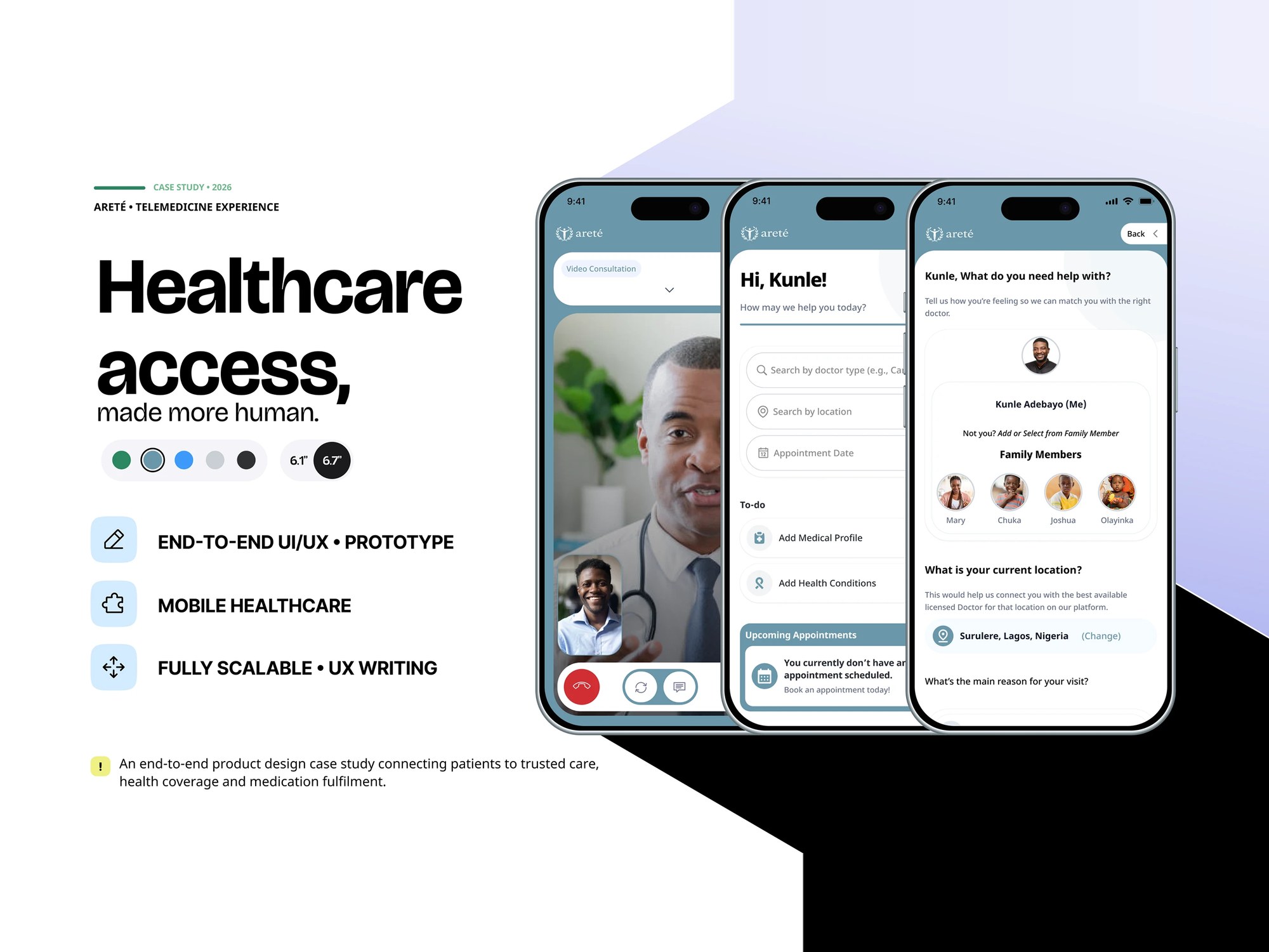 ARETE — 2026
Overview
Arete is a connected healthcare ecosystem rather than a doctor-booking app. It brings care discovery, consultations, medical records, insurance coverage, prescriptions and pharmacy fulfilment into one experience, designed for accessibility, localisation and low-connectivity environments. I was the end-to-end product designer, covering UX, UX writing, UI and prototyping across the patient, provider, HMO and pharmacy surfaces.
At a glance
- Role
- End-to-end product designer
- Ownership
- End-to-end ownership
- Product status
- Concept exploration
- Platform
- Mobile-first, across four surfaces — patient, provider, HMO and pharmacy
- Primary users
- Patients, doctors and nurses, community health workers, HMO teams, pharmacies
- Main focus
- Connected care journeys, coverage clarity, accessibility and low connectivity
- Product
- Arete — a connected healthcare and telemedicine ecosystem
- Team
- End-to-end product designer across the whole experience
- Scope
- UX strategy, information architecture, user flows, UX writing, UI design, design system and interactive prototyping
- Constraints
- Consultation, coverage and medication are separately operated services; multilingual users; low-connectivity environments
Deliverables
- Journey mapping across seven steps
- Information architecture
- Onboarding & identity flows
- HMO coverage experience
- Prescription & pharmacy fulfilment
- States, errors & edge cases
- UX writing
- Design system
- Interactive prototype
My contribution
I designed the connected healthcare ecosystem end to end — UX strategy, information architecture, user flows, UX writing, UI design, the design system and interactive prototyping. I designed the seven-step care journey, the onboarding and identity flows, the HMO coverage module, prescription and pharmacy fulfilment, and the status and edge-case system that holds the whole thing together.
The problem
Getting medical advice is only one part of a patient's journey. Someone also has to understand whether care is covered, find a provider their plan will accept, receive a prescription, locate the medication and keep taking it afterwards — and each of those steps usually lives in a different place, run by a different organisation. The product had to bring those disconnected steps into one understandable experience without hiding the detail that clinicians and insurers require, and it had to do it for patients, doctors and nurses, community health workers, HMO teams, pharmacies and administrators at once.
What made this hard
The four things a patient needs are run by different organisations with different systems and different obligations, so presenting them as one journey is a claim the underlying services do not make on their own — and the risk is a product that feels seamless right up to the moment it hands you off and stops helping. Coverage is where that hurts most: eligibility language has to be plain enough to act on and precise enough not to promise something an insurer will later refuse, and getting it wrong in either direction costs the patient. The context tightened it further. Multilingual users, low-connectivity environments and high-stakes tasks ruled out clever interactions and icon-only affordances, and writing for people who are unwell ruled out most of the reassuring tone a product designer reaches for by default — reassurance that overstates is worse than silence.
Research & discovery
Research status — Exploratory, product-design-led
- Who
- Patients moving between four separately operated services, and the clinical, insurance and pharmacy staff on the other side of each hand-off.
- Investigated
- Where a telemedicine product stops helping — the finding was that most stop at the booking, while the patient's problem continues into coverage, prescription and fulfilment.
- Learned
- Coverage is the point of highest risk: language has to be plain enough to act on and precise enough not to promise what an insurer will later refuse.
- Changed
- The journey was designed past the consultation, and Skip for Now was kept throughout so an uninsured patient is never blocked from reaching a doctor.
- Still open
- Whether patients read a coverage state as actionable — untested, and the most consequential unknown in the product.
- Next test
- Test whether patients understand insurance eligibility states and can act on them, with real patients rather than colleagues, and validate the hand-off points with an insurer and a pharmacy.
Key decisions
- 01
Framed the design around how information and actions move between roles rather than how individual screens look, because the requirements covered patients, doctors and nurses, community health workers, HMO teams, pharmacies and administrators sharing one product.
- 02
Resolved the requirements into four principles that could settle arguments later — simple first, accessible, localised, transparent — and held decisions against them rather than against taste.
- 03
Designed the journey past the booking, which is where most telemedicine products stop: need care, find provider, consult, check coverage, get prescription, find pharmacy, continue care. Each step is a place the journey can fail, so each got designed rather than assumed.
- 04
Broke registration into progressive steps with visible progress, explicit verification language and real recovery paths, because the first interaction with a health product is where trust is either established or lost.
- 05
Put coverage before commitment. The HMO module verifies membership, states what the plan covers and its limits, and surfaces eligible providers before a patient chooses care — and Skip for Now stays available throughout, so an uninsured patient is never blocked from reaching a doctor.
- 06
Treated a prescription as unfinished until the medicine is in hand: nearby stock, pickup or delivery, fulfilment confirmation, reminders, and explicit out-of-stock and alternative-medication paths.
- 07
Designed the non-happy paths as core UX rather than edge cases — OTP errors, verification loading, HMO approval states, plan removal with reason capture, availability signals and confirmations — and gave status its own vocabulary so error, pending, unavailable and success are never ambiguous.
- 08
Paired every action with legible text instead of icon-only interactions, and kept language and cultural context in the copy, so the interface holds up for multilingual users on poor connections.
- 09
Built the system underneath — a calm healthcare green with high-contrast neutrals, Noto Sans at defined sizes, and reusable field, card, alert, button and status patterns — so a high-stakes interaction feels the same whether it sits in the patient, insurance or pharmacy journey.
What changed
A healthcare product designed as a chain rather than a set of features: the patient journey continues past the consultation into coverage, prescription and fulfilment, and the moments where it could break — an unverified plan, an out-of-stock medicine, a failed OTP, a removed HMO — are designed states rather than dead ends. One system of colour, type and components holds the patient, provider, HMO and pharmacy surfaces together, and the whole experience is built for legibility, localisation and low connectivity rather than assuming ideal conditions.
Scope & context
- Product scope
7
Steps designed, from needing care to continuing it
- Product scope
6
Actors the requirements covered
Patients, doctors, nurses, community health workers, HMO teams, pharmacies and administrators
- Product scope
4
Surfaces — patient, provider, HMO and pharmacy
- Product scope
Offline-aware
Designed for low connectivity, localisation and accessibility
Evidence
The seven-step journey is designed end to end rather than stopping at the booking, where most telemedicine products stop. The status vocabulary and edge cases are specified alongside the happy paths, the HMO module keeps Skip for Now available so coverage never blocks access to care, and the design system defines a palette, four type sizes and reusable field, card, alert, button and status patterns across all four surfaces. The full case study is published on Behance.
What I would improve next
Eligibility comprehension is the thing to test first — whether a patient reads a coverage state as something they can act on rather than a status they have to interpret — and it needs real patients rather than colleagues. I would then validate the hand-off points with an actual insurer and pharmacy, since the journey's credibility rests on partners the design cannot control, and test the low-connectivity assumptions on real networks rather than on a design file.
With more time
I would design the care record as the spine of the product rather than a section of it. Continuity is the thing the ecosystem promises, and it only becomes real when a consultation, a prescription and a refill visibly belong to the same ongoing story.
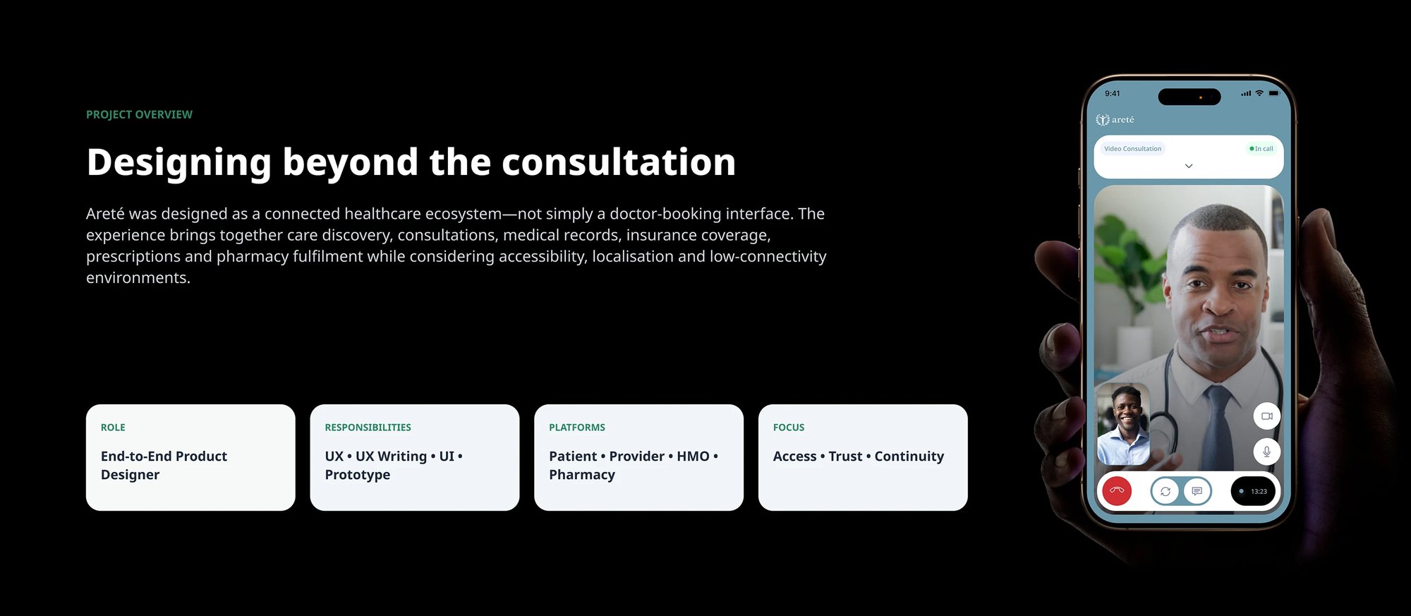
The project framing: an end-to-end product design role across the patient, provider, HMO and pharmacy surfaces, focused on access, trust and continuity 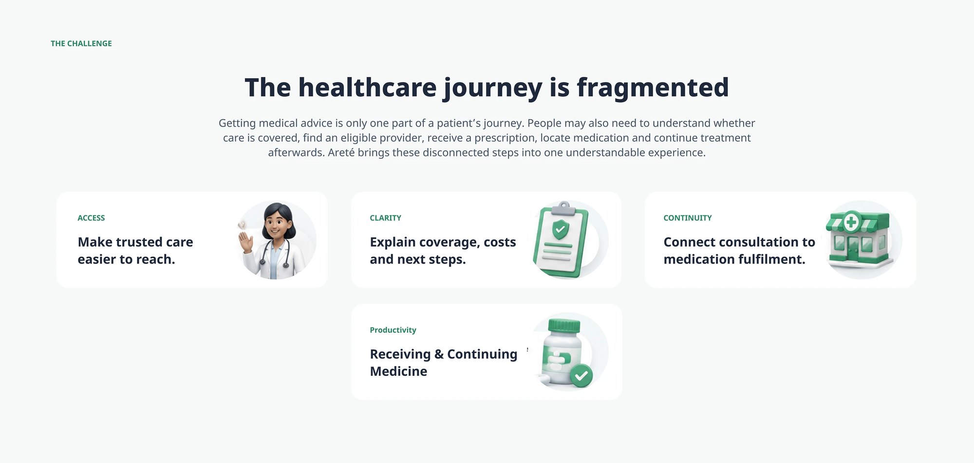
The problem stated as four jobs rather than one: reaching trusted care, understanding what coverage pays for, connecting a consultation to medication fulfilment, and continuing treatment afterwards 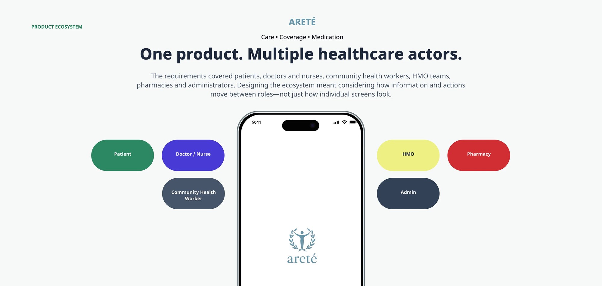
The actors the requirements had to serve — patient, doctor and nurse, community health worker, HMO, pharmacy and administrator — mapped around the product, because the design problem was how information and actions move between roles rather than how any single screen looks 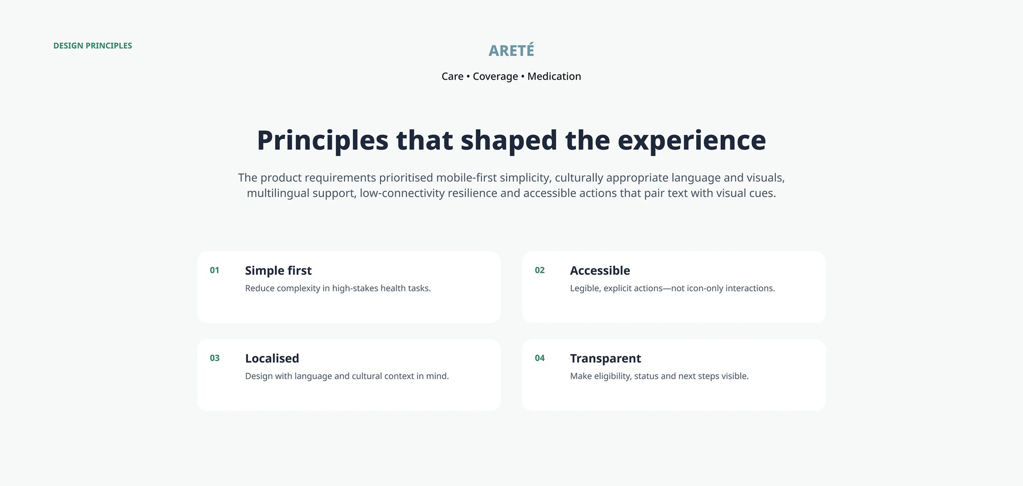
The four principles the requirements resolved into: simple first in high-stakes tasks, accessible through explicit rather than icon-only actions, localised for language and cultural context, and transparent about eligibility, status and next steps 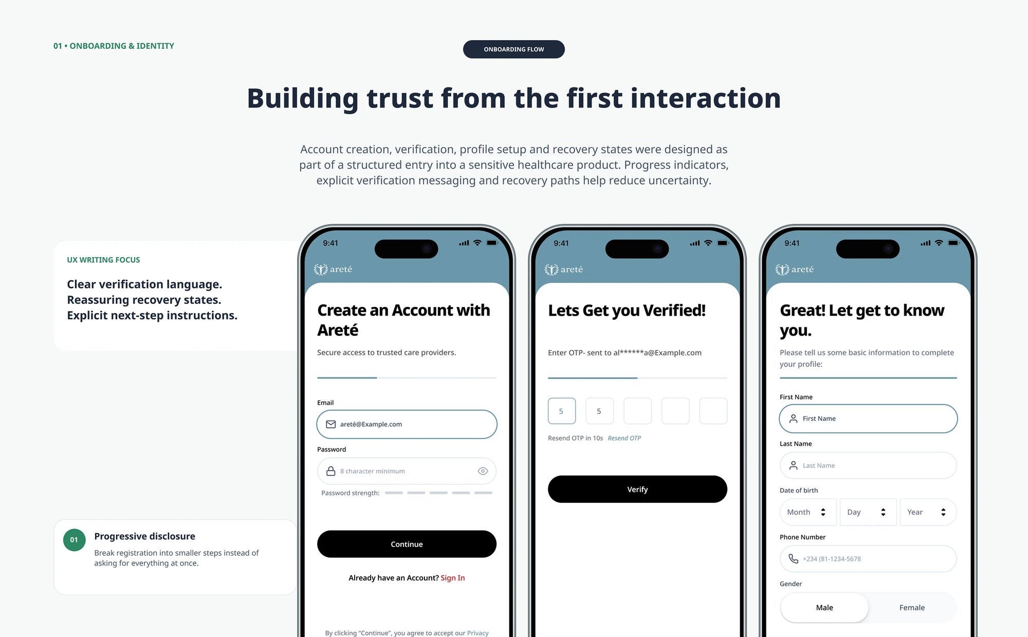
Onboarding as a structured entry into a sensitive product — account creation, OTP verification and profile setup broken into steps with progress shown, explicit verification language and recovery paths, rather than one long form 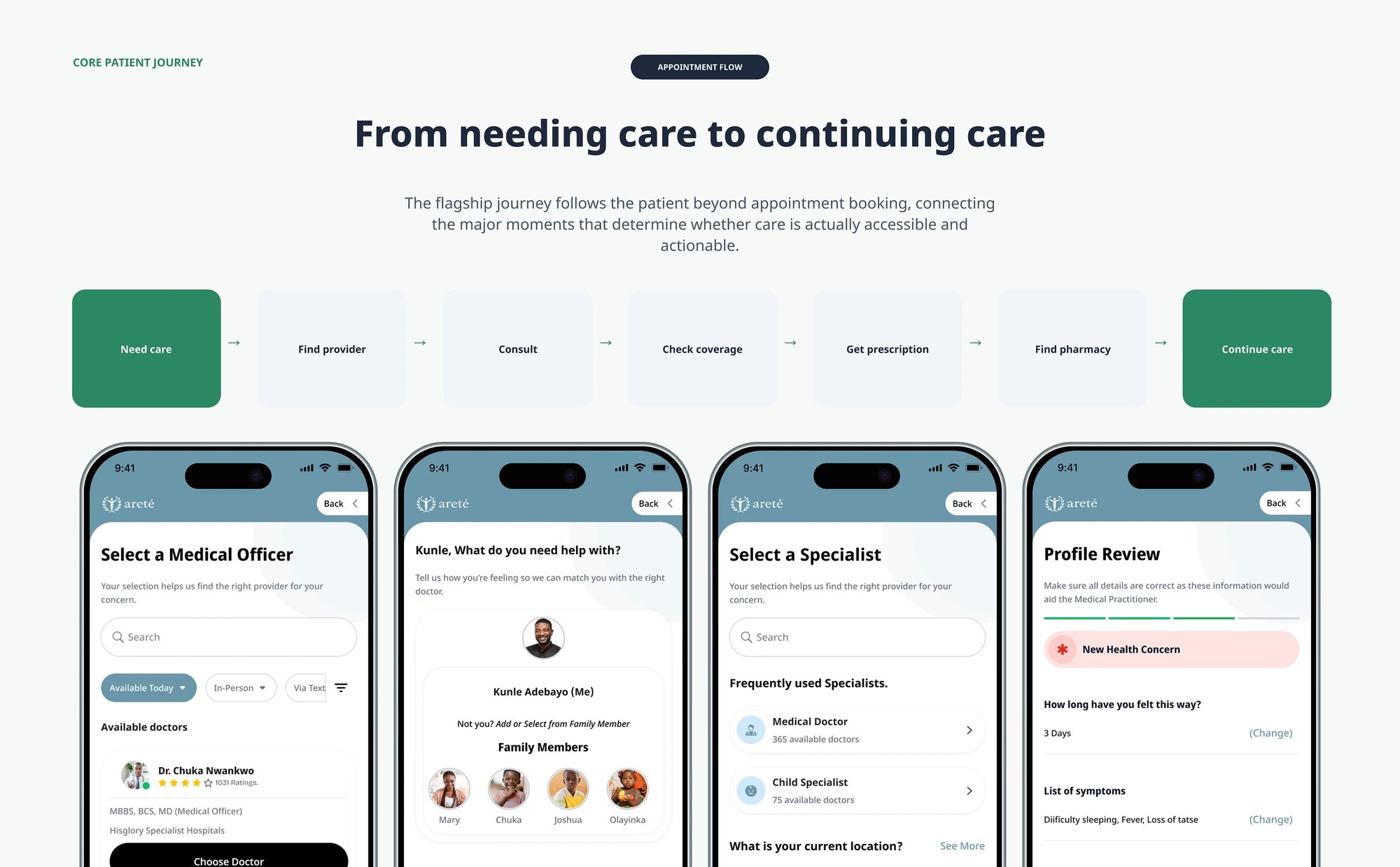
The flagship journey end to end: need care, find provider, consult, check coverage, get prescription, find pharmacy, continue care — with the screens that carry it, including symptom capture, family-member selection and a profile review before a practitioner sees it 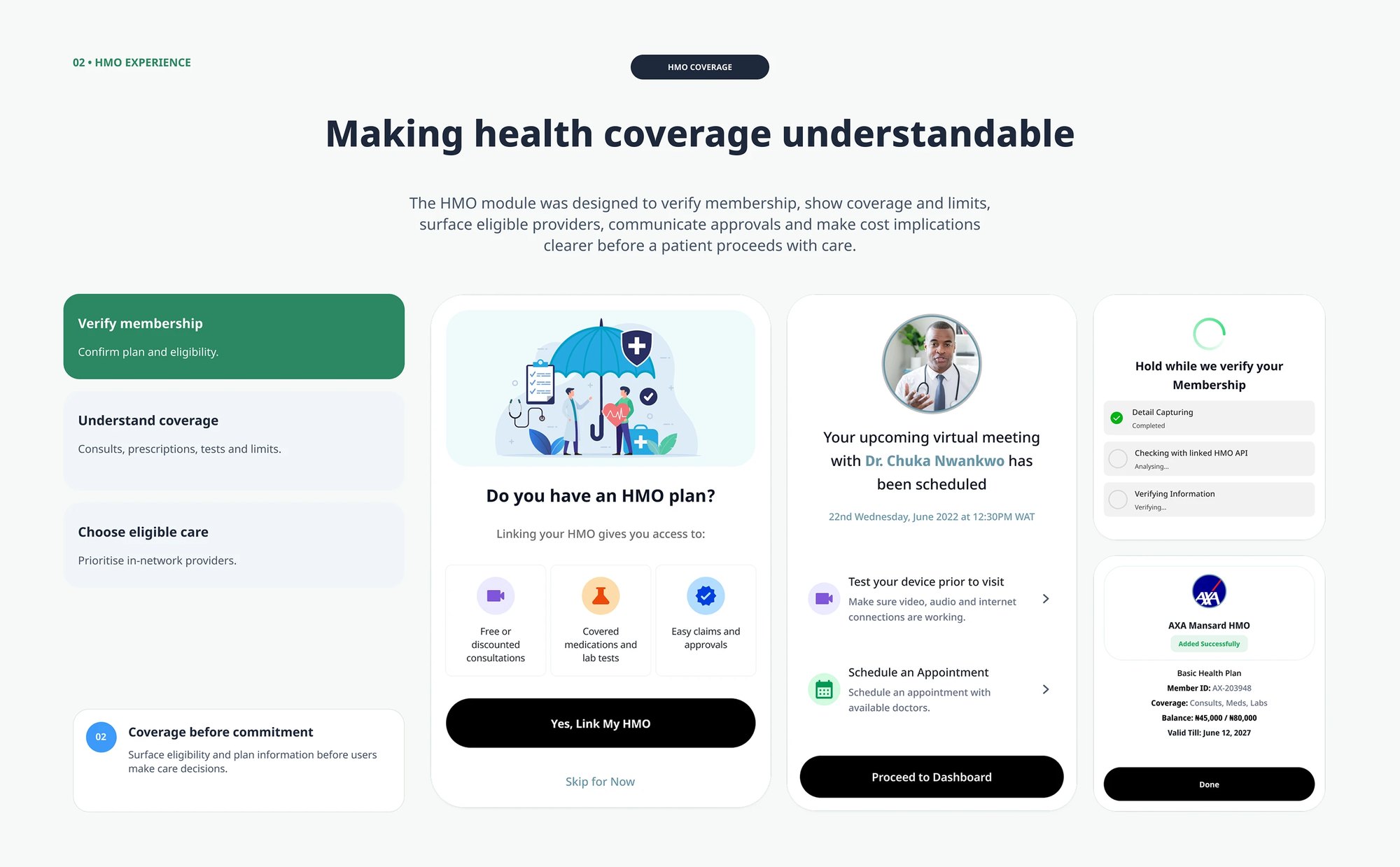
The HMO module: membership verification with its own loading state, what the plan covers and its limits, eligible providers, and the plan card showing balance and validity — with Skip for Now kept available so an uninsured patient is never blocked 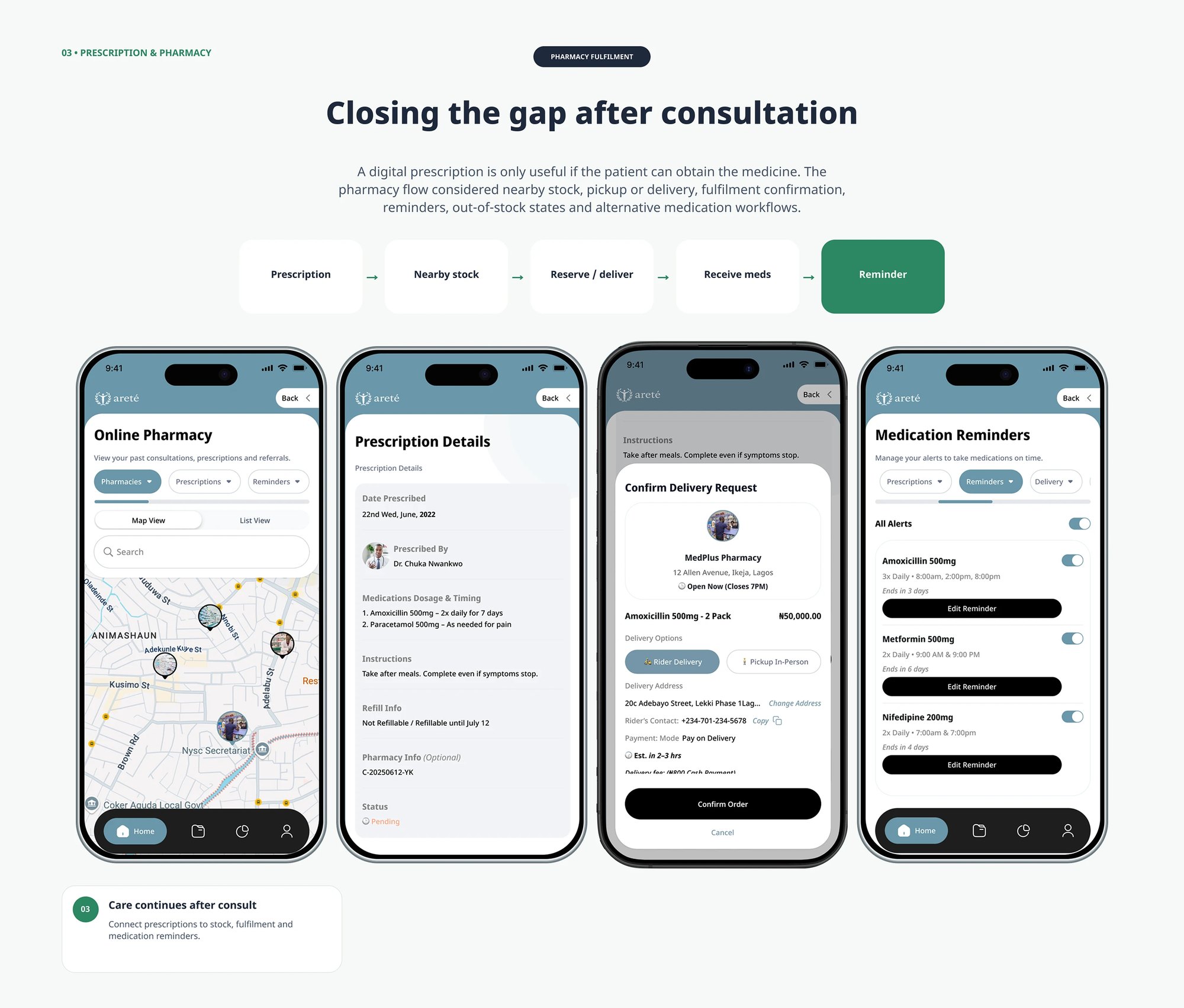
Pharmacy fulfilment as a chain rather than a hand-off: prescription, nearby stock on a map, reserve or deliver with pickup and rider options, then medication reminders per drug with dosage, timing and days remaining 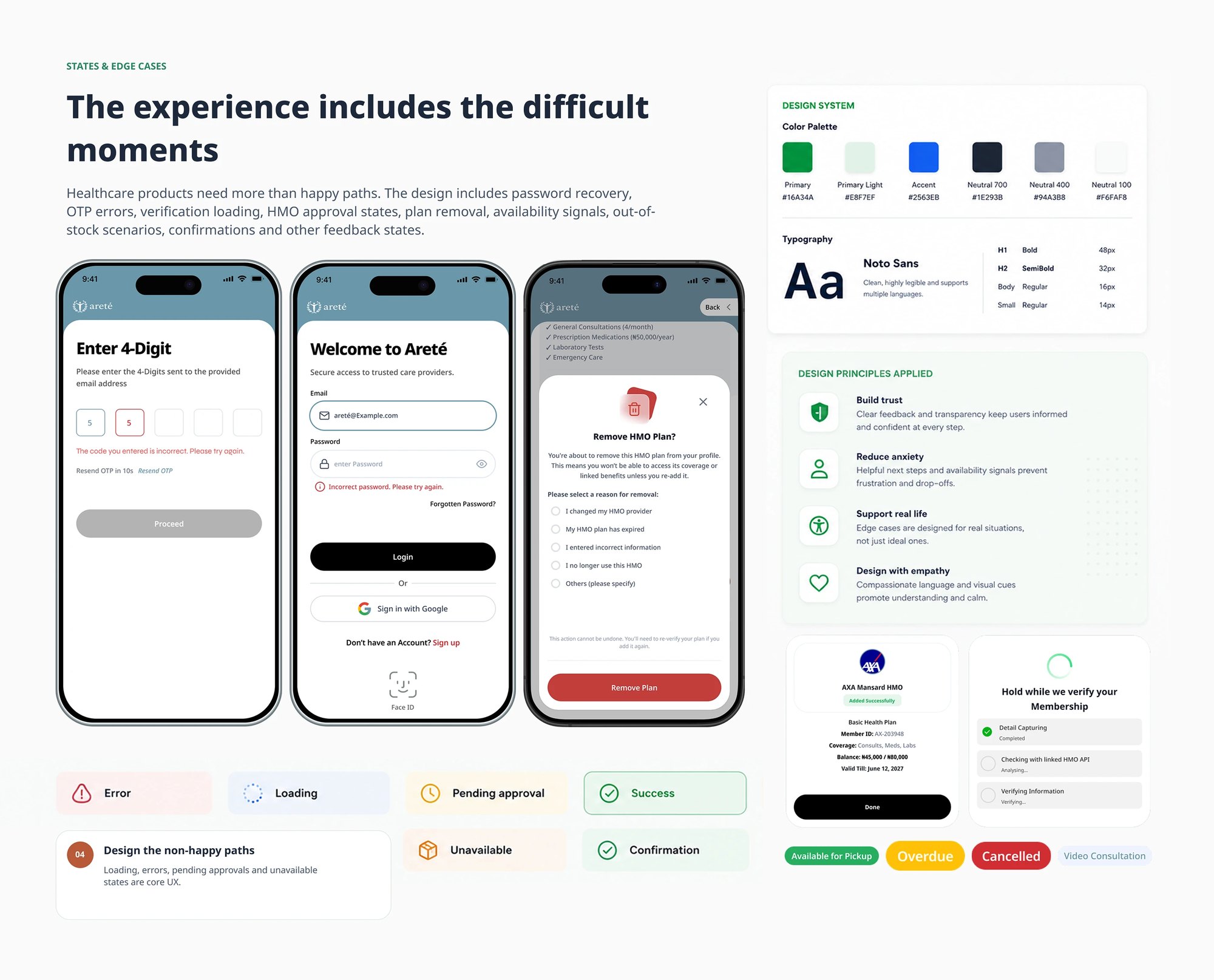
The non-happy paths designed as first-class: OTP errors, incorrect password, verification loading, plan removal with reason capture and an explicit warning that it cannot be undone, plus the full status vocabulary — error, loading, pending approval, success, unavailable, confirmation 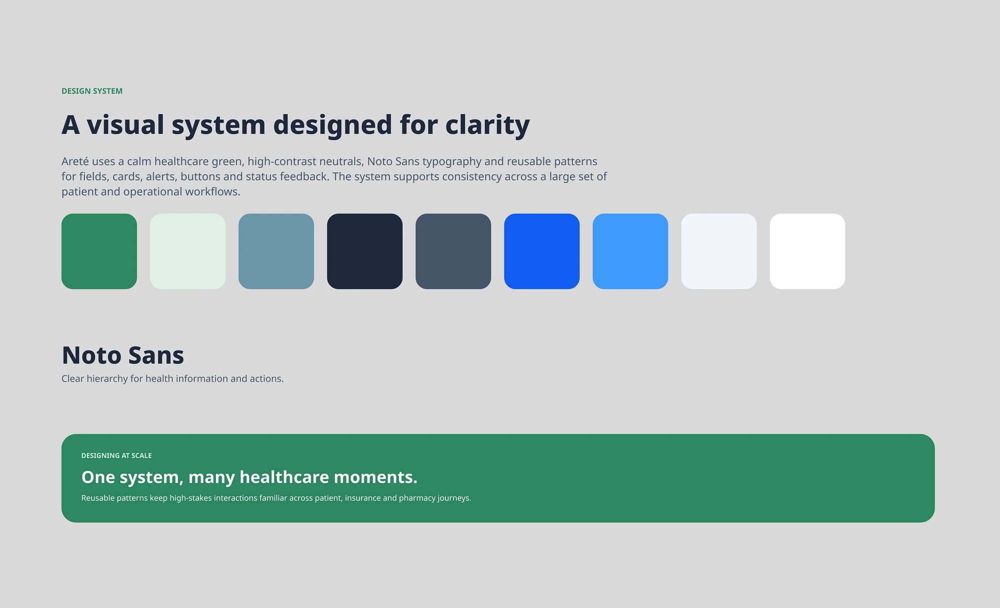
The system underneath: a calm healthcare green with high-contrast neutrals, Noto Sans set at four defined sizes, and reusable patterns for fields, cards, alerts, buttons and status feedback so high-stakes interactions stay familiar across patient, insurance and pharmacy journeys 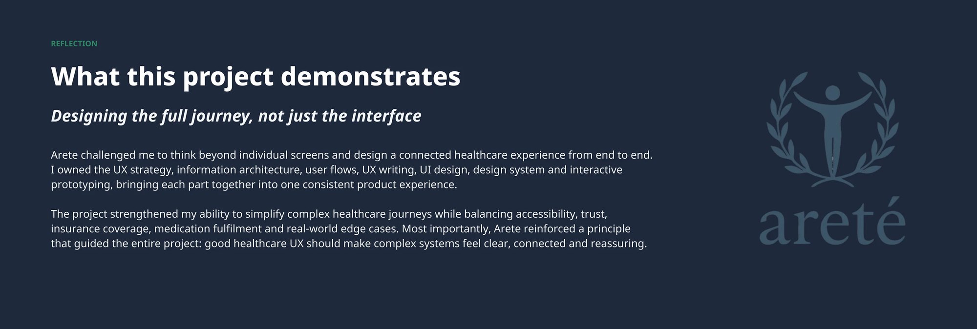
The closing reflection from the case study deck — owning UX strategy, IA, user flows, UX writing, UI, the design system and interactive prototyping, and bringing them into one consistent product experience 
The project's positioning line — care should feel connected — over the disciplines the work covered