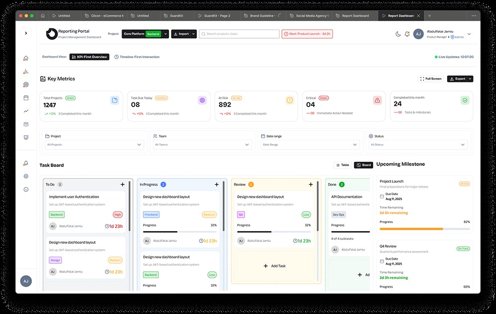
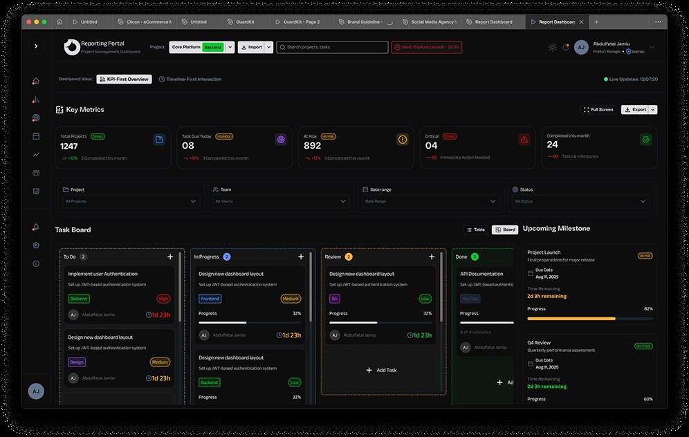
Lead with numbers someone can act on.
I prioritised tasks due, at-risk and critical items over a reassuring project count.
PRODUCT DESIGN CASE STUDY
MY ROLE · Dashboard information architecture and responsive UI
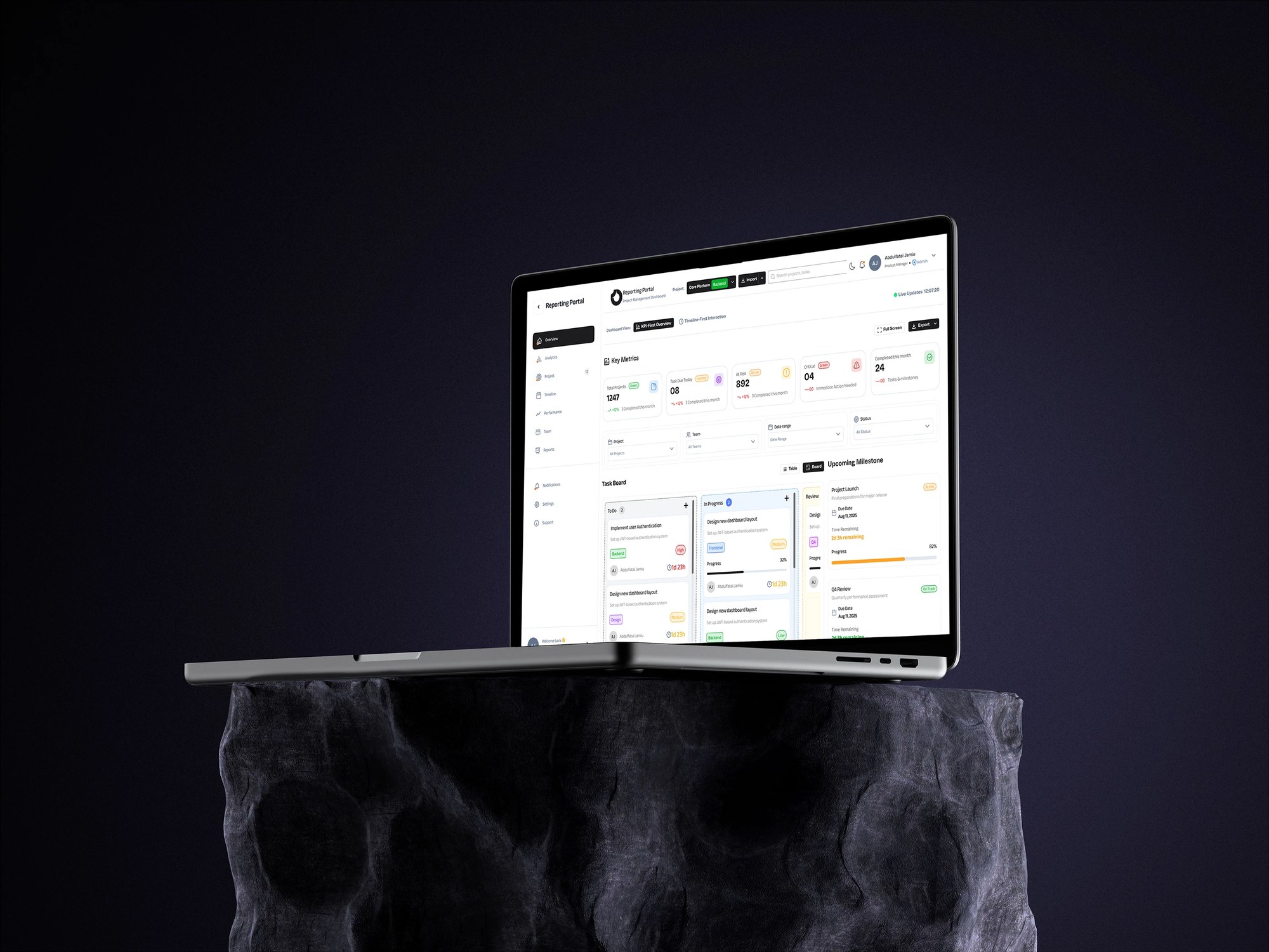
I designed Reporting Portal to help a manager see what needs attention before getting lost in project totals. The dashboard brings risk, tasks and milestones into one view.
I worked on the metrics row, filters, task board and responsive layout in light and dark themes. The main question was how quickly someone could identify the work that needed a decision.
I prioritised tasks due, at-risk and critical items over a reassuring project count.
I gave Review its own board column, alongside To Do, In Progress and Done.
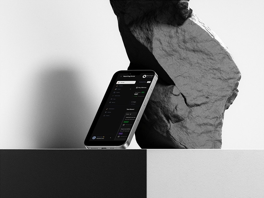
I reduced the mobile layout around the metrics and a single board column, with filters for project, team, dates and status.
The evidence is the dashboard design and its responsive states. I would test whether managers can find the day’s at-risk work quickly, and whether teams need a separate blocked state.