12 — Project Management Dashboard
Reporting Portal
A KPI-first reporting dashboard where the numbers that imply an action come before the ones that merely reassure.
- Role
- Product designer
- Year
- 2025
- Focus
- Dashboard Design, Information Architecture, Data Visualisation
- Status
- Shipped product
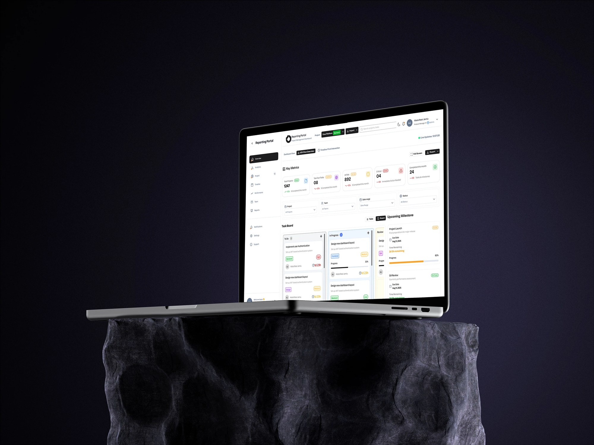 REPORTING PORTAL — 2025
Overview
Reporting Portal is a project management dashboard built around a KPI-first overview: a key-metrics row for total projects, tasks due, at-risk and critical items; a filter bar across project, team, date range and status; and a task board moving work through To Do, In Progress, Review and Done alongside upcoming milestones. It ships in light and dark themes and adapts down to mobile. This is a selected project rather than a full case study — the complete presentation is published on Behance.
At a glance
- Role
- Product designer
- Ownership
- Dashboard design and information architecture
- Product status
- Shipped product
- Primary users
- Project managers and delivery teams tracking work across projects
- Main focus
- KPI-first reporting, risk visibility, light and dark themes
Deliverables
- KPI dashboard design
- Information architecture
- Task board & milestone views
- Filter model
- Light and dark themes
- Responsive layout
My contribution
I designed the reporting portal's dashboard and information architecture: the key-metrics row, the filter model, the four-state task board, the milestone view and the responsive layout, in both light and dark themes.
The problem
A reporting dashboard is opened to answer one question — what needs attention today — but it is usually built to answer a different one: how much work exists. Totals are easy to produce and reassuring to look at, and they tell a manager nothing they can act on. The design problem was to decide what earns the top of the screen when the person reading it is scanning, not studying, and often doing it on a phone between meetings.
What made this hard
Prioritising risk means accepting an uncomfortable default: the dashboard opens by showing what is going wrong. That is the honest view and it is not the one a stakeholder demoing the tool tends to want, so the metrics row had to earn its order — total projects stays, because context matters, but tasks due, at-risk and critical sit alongside it rather than beneath it. The second constraint was breadth: four filter dimensions, four task states, milestones and two themes all had to survive being compressed onto a phone without becoming a stack of disconnected cards.
Research & discovery
Research status — Exploratory, product-design-led
- Who
- Managers who open a reporting tool to answer one question: what needs attention today.
- Investigated
- What belongs above the fold on a dashboard whose users are scanning rather than reading.
- Learned
- Totals are reassuring and useless; the useful figures are the ones that imply an action — what is due, what is at risk, what is critical.
- Changed
- The key-metrics row leads with tasks due, at-risk and critical items rather than a project count, and milestones sit beside the board rather than in a separate view.
- Still open
- Whether the four task states match how teams really move work, or whether they need a blocked state.
- Next test
- Test whether managers can identify the day's at-risk items within a few seconds of opening the dashboard, and whether the four states are sufficient in practice.
Key decisions
- 01
Led the metrics row with figures that imply an action — tasks due, at-risk and critical items — rather than with a project count, so the first thing read is the first thing to do.
- 02
Put the task board and upcoming milestones on the same screen, because the question 'is this on track' is answered by the two of them together and not by either alone.
- 03
Designed four task states — To Do, In Progress, Review and Done — with Review as its own column rather than a flag, so work waiting on someone is visible rather than buried inside In Progress.
- 04
Built filtering across the four dimensions a manager actually slices by — project, team, date range and status — and kept the filter bar in view, so refining never means losing the results.
- 05
Designed light and dark themes as equals rather than treating dark as an afterthought, with status colour tested for legibility in both.
- 06
Reduced the layout for mobile around the metrics row and a single board column, so the at-a-glance answer survives the smallest screen the tool is opened on.
What changed
A dashboard that opens on the work needing attention rather than on a summary of everything: risk and due-date pressure at the top, a four-state board that surfaces work waiting on a person, milestones in the same view, and a filter model that answers a manager's real questions. It holds up in light and dark and down to a phone.
Scope & context
- Product scope
4
Task states — To Do, In Progress, Review, Done
- Product scope
4
Filter dimensions — project, team, date range, status
- Product scope
2
Themes — light and dark, designed as equals
Evidence
The metrics row leads with tasks due, at-risk and critical items rather than totals; Review exists as its own column so blocked work is visible; and the layout survives both themes and a mobile breakpoint. The full presentation is published on Behance.
What I would improve next
Test whether managers can identify the day's at-risk items within a few seconds of opening the dashboard, and whether four task states are sufficient in practice or whether teams need a blocked state distinct from Review.
With more time
I would connect at-risk items to a reason. A red count tells a manager something is wrong but not what to do about it, and the useful version of this dashboard explains why an item slipped.
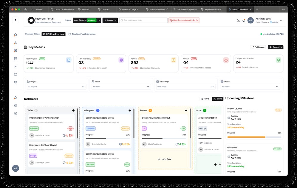
Reporting Portal in light mode: key metrics row, filter bar, and a four-column task board beside upcoming milestones 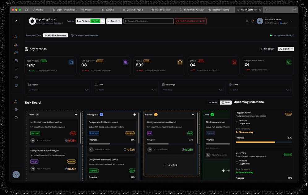
The same dashboard in dark mode, with the metric cards and task board colour-coded by status 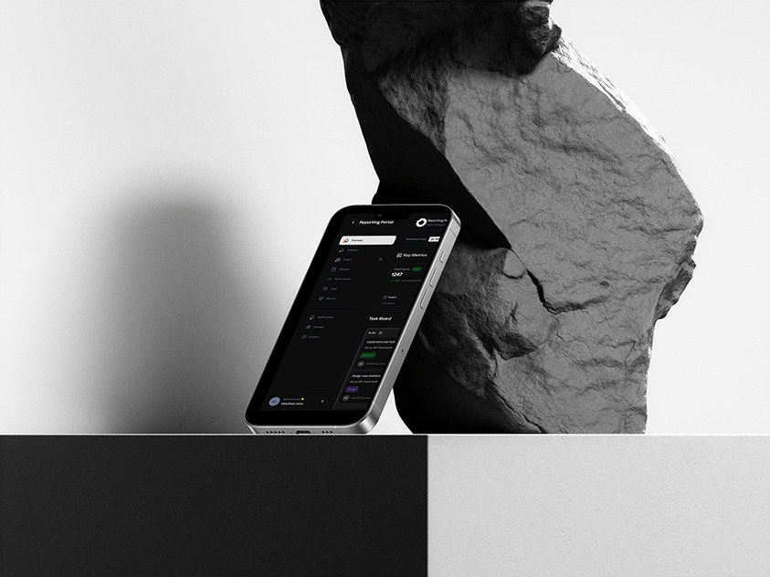
Reporting Portal's mobile layout shown on a phone