01 — Marketplace & Booking Platform
Bizinc
One platform where a business is found, booked and run — discovery on one side, operations on the other.
- Role
- UI/UX Intern → Product Designer → UI/UX Manager, BIZINC
- Year
- 2024 — 2026
- Focus
- Marketplace UX, Booking Flows, SaaS Dashboards, Design Systems, Responsive Design
- Status
- Live product
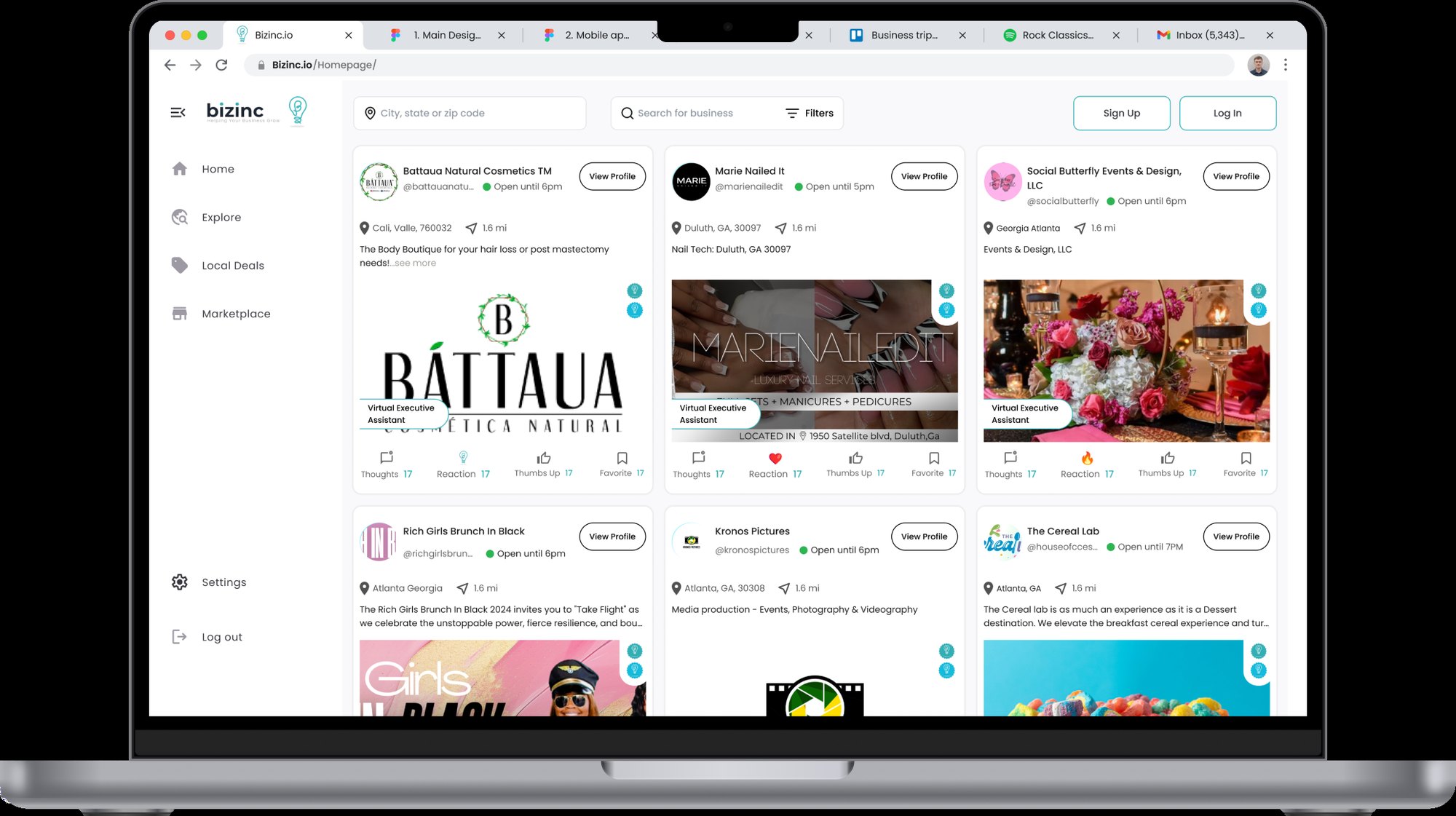 BIZINC — 2024 — 2026
Overview
Bizinc is an all-in-one marketplace platform: customers discover local businesses and book services, and those businesses manage their operations and grow their brand from the same account. Two products, two audiences and one account between them. I joined remotely in April 2024, two years before the engagement ended, and moved from intern to designer to UI/UX Manager over that time.
At a glance
- Role
- UI/UX Intern → Product Designer → UI/UX Manager, BIZINC
- Ownership
- End-to-end ownership
- Timeline
- April 2024 – May 2026
- Product status
- Live product
- Platform
- Responsive web — the customer side used mostly on a phone, the operator side at a desk
- Primary users
- Customers booking services; business owners running them
- Main focus
- Two-sided marketplace UX, booking flows, operator dashboards, design system
- Product
- Bizinc — an all-in-one marketplace platform, live at bizinc.io
- Team
- BIZINC design team; joined as an intern and progressed to UI/UX Manager, leading the junior design team of UI, UX and graphic designers alongside interns
- Scope
- User flows, site map, requirements, wireframes and UI across the booking, e-commerce and SaaS surfaces; component library; development handoff
- Constraints
- Two audiences in one platform, service categories that book differently, and a live product redesigned in place from v1.2 to v2.0
Deliverables
- User flows & site map
- Requirements specification
- Desktop & mobile wireframes
- Business dashboard
- Marketplace, deals & proximity discovery
- Lead-generation experience
- AI assistant interface
- Component library & design tokens
- Development-ready handoff
My contribution
I designed Bizinc from scratch. I framed the problem with the founding team, mapped the sign-up, business-owner and client journeys, reconciled them into one site map, wrote the Business Profile 2.0 requirements, wireframed at desktop scale, and designed the marketplace, booking, deals, services, products and dashboard surfaces in high fidelity. I built the component library the rest of the team designed against — Auto Layout, variants and design tokens — and versioned the file from v1.2 to v2.0 to a development-ready page.
The problem
A marketplace has to satisfy two people whose interests only partly overlap. Someone looking for a service wants to find a business, judge whether to trust it and book it in a few minutes, on a phone, without learning a system first. The business on the other side needs the opposite kind of product — somewhere to run those bookings, manage its listing and see whether any of it is actually bringing customers in. Building both into one platform, across service categories that book quite differently, risks two failures: a customer experience buried under operator tooling, or an operator experience reduced to a profile page no business would actually run on. The problem was to make one platform legible from both directions without maintaining two disconnected products.
What made this hard
The hardest part was Business Profile 2.0 — one profile serving an owner who edits it and a visitor who judges it. Deciding field by field what an owner controls, what a visitor sees instead, and what belongs to neither is the kind of thing that quietly becomes two disconnected products if it is never settled explicitly. Working it out as a written requirements list, business view beside client view, was slower than designing screens directly and it was the only way to make each difference deliberate rather than accidental. Redesigning in place added a second constraint: the platform was already live with businesses on it, so v2.0 had to be a version people could be moved to, not a fresh start.
Research & discovery
Research status — Product-design-led, with stakeholder discovery
- Who
- Two audiences whose interests only partly overlap — people looking for a service, and the businesses selling it.
- Investigated
- Where one profile has to serve an owner who edits it and a visitor who judges it, and which signals actually decide an enquiry.
- Learned
- The two views diverge field by field, and leaving that implicit was quietly producing two disconnected products.
- Changed
- Business Profile 2.0 was specified as a written requirements list, business view beside client view, before any screen was drawn.
- Still open
- Which parts of the redesign drove the activation and growth figures — the numbers are aggregate, not attributed.
- Next test
- Test whether business owners understand the difference between profile editing and customer-facing profile content, and instrument the discovery path to see whether the open-now, distance and category signals shorten the route to an enquiry.
Key decisions
- 01
Mapped the two audiences as separate flows before drawing a single screen — sign-up, business-owner and client journeys side by side — then reconciled them into one site map, so where the paths diverge and where they share a screen was a decision rather than an accident.
- 02
Specified Business Profile 2.0 as requirements in top-down order, business view beside client view. Laying the two lists against each other made every difference deliberate: what an owner can edit, what a visitor sees instead, and which fields belong to neither.
- 03
Wireframed at desktop scale before any visual design — profile, search, dashboard, marketing tools, listings and the community forum — so layout and hierarchy were settled while they were still cheap to change.
- 04
Designed discovery for people who are comparing, not browsing. Business cards lead with the signals that decide an enquiry — what the business does, where it is, how far away, whether it is open right now — so a shortlist forms without opening five tabs.
- 05
Treated the business dashboard as the product operators run on, not a settings screen: listing management, deals, services and products, and performance sit together, so being discoverable and being operational are not two separate tools.
- 06
Kept the marketing and lead-generation surfaces inside that dashboard rather than bolting them on, so the line from a listing to the enquiries it produces to what the owner does next stays visible in one place.
- 07
Designed the AI assistant as a way into the marketplace rather than a support widget, and tied it to the map: it asks what you need, reads where you are, and returns real businesses nearby with availability you can act on — so the conversation ends in a booking instead of a link, and a small local business becomes findable to someone who did not know its name.
- 08
Built the interface as reusable components with Auto Layout, variants and design tokens, and versioned the file from v1.2 through v2.0 to a development-ready page — so consistency survived the redesign and engineering had one place to build from.
- 09
Worked directly with stakeholders to turn business requirements into interface decisions, and kept every journey responsive from the first wireframe, since the customer side is used mostly on a phone and the operator side mostly at a desk.
What I explored
The working file carries the exploration rather than describing it. The v1.2 desktop and mobile pages sit alongside v2.0 instead of being overwritten, separate landing-page and marketplace directions from the designers on the team are kept as parallel frames, and an AI-integration direction was explored as its own branch before the assistant took the form it shipped in. The redesign was chosen against the version it replaced rather than in a vacuum.
What changed
A platform that works from both ends — customers discover and book services, businesses run those bookings and see where their customers came from — held together by one component library across booking, e-commerce and SaaS surfaces. Onboarding was smoothed so fewer people fall out before they have an account, discovery became proximity-aware rather than a flat directory, and the operator dashboard gave owners a reason to return between bookings. The product is live at bizinc.io.
Outcomes & scope
- Design impact
+45%
User activation on the dashboard
- Company-reported traction
+23%
Customer growth across the redesign period
Bizinc's own figure, measured over the redesign period
- Design impact
+12%
Customer-to-customer service activity
Evidence
The redesign moved the numbers the business tracks: a 23% increase in customers across the redesign period, a 12%+ increase in customer-to-customer service activity, and a 45% improvement in user activation on the dashboard and lead-generation experiences, alongside growth in profile creation and stronger retention. The product is live at bizinc.io, and Bizinc's CEO has written a reference describing the platform rebuild and the progression to UI/UX Manager, published in full on the credentials page.
See the design system behind this →What I would improve next
The headline numbers tell me the redesign worked; they do not yet tell me which parts did the work. I would instrument the discovery path specifically — whether the open-now, distance and category signals on a business card actually shorten the route to an enquiry — and test the AI assistant with people who have never used the platform, since its value depends entirely on a stranger trusting it enough to start the conversation. On the operator side, I would want to know whether owners find the marketing surfaces inside the dashboard or work around them.
With more time
I would take the operator dashboard further into daily use — a genuine at-a-glance view of the day's bookings and enquiries rather than a set of management surfaces — and give the AI assistant a proper first-run state, since its usefulness depends entirely on a stranger starting a conversation with it.
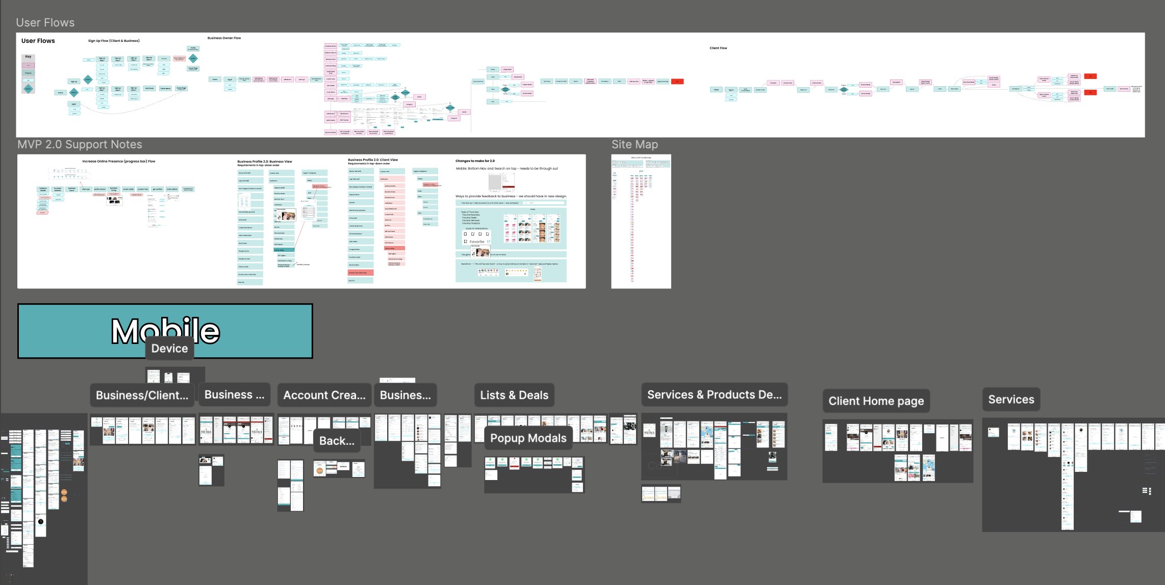
The structural work behind the product: sign-up, business-owner and client user flows mapped side by side, the MVP 2.0 support notes, the full site map, and the mobile screens grouped by journey — account creation, business and client profiles, lists and deals, services and products 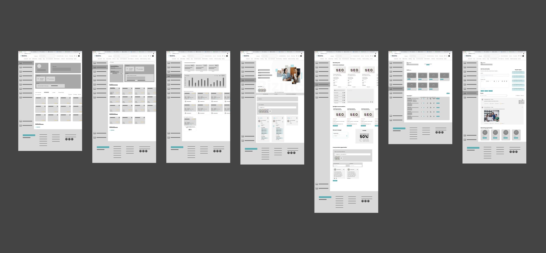
Seven desktop wireframes resolving layout before visual design — profile, search results, performance dashboard, business profile, marketing tools with spotlight recommendations and promotion opportunities, listings, and the community forum 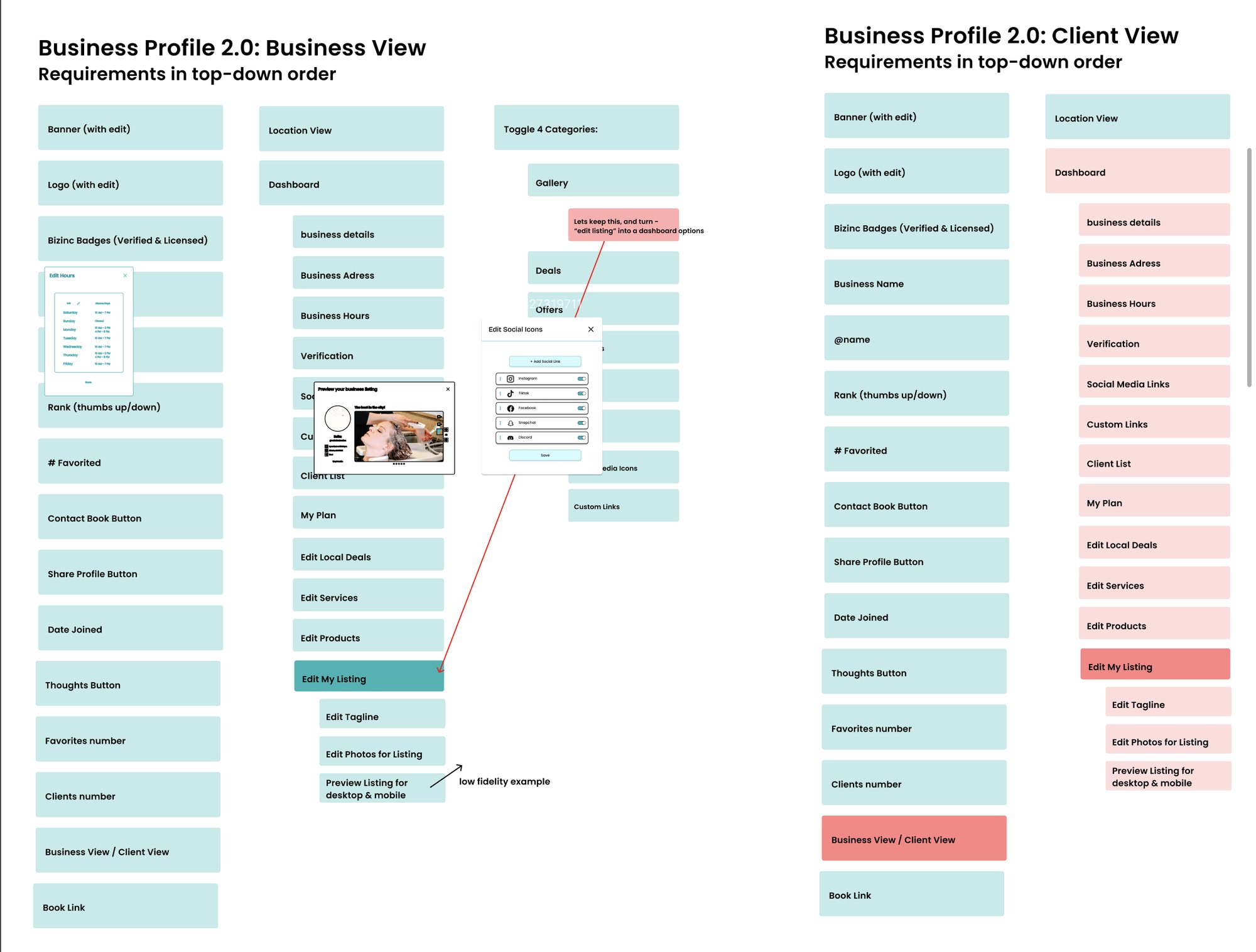
Business Profile 2.0 specified as requirements in top-down order, business view beside client view — so the two audiences could be compared field by field and the difference between them decided deliberately rather than by omission 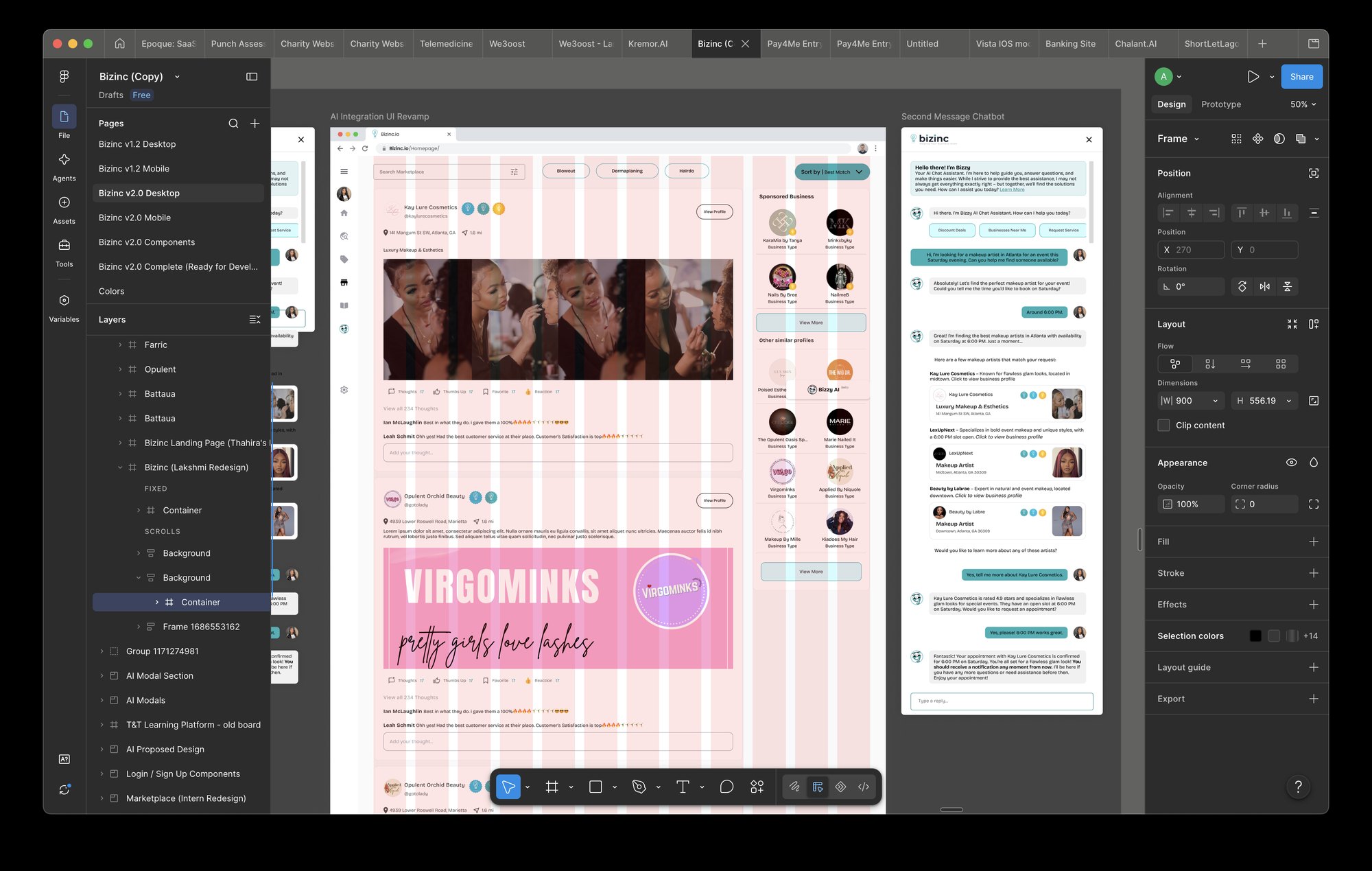
The working Figma file: v1.2 and v2.0 desktop and mobile pages, a components page and a development-ready page, with the AI integration revamp and the Bizzy assistant conversation open on the canvas