11 — Fintech Super-App
Loan & Investment App
Borrowing, investing, banking, insurance and bills in one app — without any of them losing their meaning.
- Role
- Product designer
- Year
- 2025
- Focus
- Fintech UX, Transaction Design, Mobile UX, Trust and Clarity
- Status
- Prototype
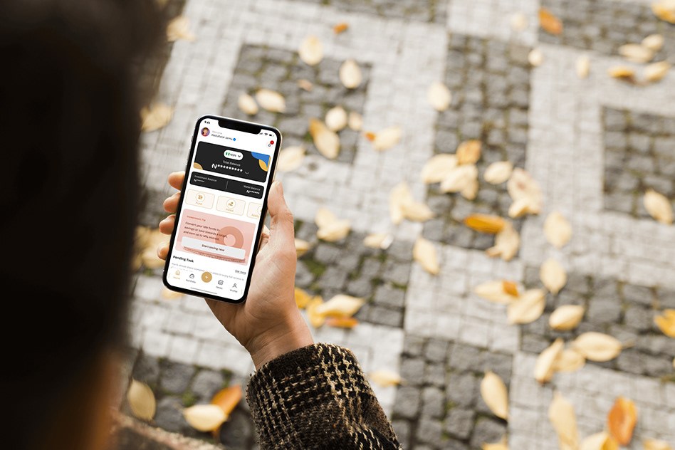 LOAN & INVESTMENT APP — 2025
Overview
A Nigerian fintech super-app that combines lending, investing, everyday banking, property insurance and bill payments in a single product. I designed the mobile experience across those journeys — the home dashboard, the loan flow, and the investment and transaction surfaces — with an emphasis on stating plainly what money is doing at every step.
At a glance
- Role
- Product designer
- Ownership
- End-to-end mobile product design
- Product status
- Prototype
- Platform
- Mobile app
- Primary users
- Retail customers borrowing, saving, investing and paying bills in one app
- Main focus
- Responsible simplification — clarity without hiding risk
- Product
- A Nigerian fintech super-app spanning lending, investing, everyday banking, property insurance and bill payments
- Scope
- Home dashboard, loan request flow, investment and equity purchase, transaction and payment design, empty and error states, mobile design system
- Constraints
- Five financial products with different risk profiles and different regulatory language, in one interface
Deliverables
- Home dashboard
- Loan request flow
- Investment & equity purchase flow
- Transaction and payment design
- Empty & error states
- Mobile design system
My contribution
I designed the mobile experience across five financial products — the home dashboard and single balance, the loan request flow and its empty states, the investment and equity purchase journey, transaction and payment design, and the mobile design system that holds them together as one institution rather than four bolted-together apps.
The problem
Most people end up running their financial life across four or five apps: one to borrow, one to save, one to invest, another for bills and insurance. Consolidating them is easy to propose and difficult to design well. Each product carries its own risk profile, its own regulatory language and its own vocabulary, and stacking them tends to produce one of two failures — a dashboard so dense that nothing is findable, or an interface so friendly that it quietly obscures what a decision actually costs. Investing raises the stakes further: a product that makes buying equities feel as frictionless as ordering food has not removed complexity, it has hidden risk. The problem was to hold five financial products in one app while keeping each one legible enough to be trusted with real money.
What made this hard
Making investing feel as easy as ordering food is the obvious way to grow the product and the fastest way to do harm — friction removed from a risk decision does not remove the risk, it hides it. Every simplification had to be checked against whether it made the money clearer or merely made the screen calmer. That is why a projected return is labelled indicative value at maturity and stated gross of withholding tax at the moment of commitment rather than in a footnote, and why the minimum investment and the wallet balance appear before the button instead of arriving as an error after it. The competing pull was consolidation itself: five products in one app tends to produce either a dashboard too dense to navigate or a friendliness that flattens the difference between borrowing and investing, which are not the same kind of decision at all.
Research & discovery
Research status — Exploratory, product-design-led
- Who
- People running their financial life across four or five separate apps, using a phone in public rather than at a desk.
- Investigated
- Where consolidation helps and where it harms — specifically whether simplifying an investment decision makes it clearer or merely calmer.
- Learned
- Friction removed from a risk decision does not remove the risk, it hides it. Borrowing and investing are not the same kind of decision and should not feel identical.
- Changed
- Projections are labelled indicative value at maturity and stated gross of withholding tax at the point of commitment, and constraints like the ₦100,000 minimum appear before the button rather than as an error after it.
- Still open
- Whether people read those labels as estimates rather than promises.
- Next test
- Test whether users distinguish projected returns from guaranteed returns, and measure comprehension, error rate and successful completion on the equity purchase flow.
Key decisions
- 01
Anchored the home screen on one balance rather than five. Everything else — quick actions, savings prompts, pending tasks — arranges itself around that single number, so the first question the app answers is always the one people actually open it to ask.
- 02
Designed for use in public. The balance masks by default behind a reveal control, because the realistic context for this app is a phone held on a street or in a queue, not a desk.
- 03
Turned empty states into the teaching moment. With no active loan, the screen does not simply report ₦0.00 — it explains what borrowing here is for (daily expenses, personal goals, business growth) before offering a single Request Loan action, so a first-time user learns the product at the point they are considering it.
- 04
Surfaced every constraint before commitment, not after it. The ₦100,000 minimum sits under the amount field as you type, and the wallet balance appears beside the payment method, so the two most common causes of a failed transaction are visible before the button is pressed rather than reported as an error afterwards.
- 05
Wrote the investment language to be honest rather than flattering. A projected return is labelled indicative value at maturity and stated gross of withholding tax — the interface tells you the number is an estimate and that tax has not yet been taken out, at the exact moment you are deciding how much to commit.
- 06
Kept transactions in context using bottom sheets over the instrument's own price chart, so committing money never fully hides the performance data the decision rests on.
- 07
Unified five products under one restrained visual system — a warm gold accent on near-black and white — so moving from a loan to an equity purchase to a bill payment feels like one institution rather than four bolted-together apps.
What changed
A super-app that earns the breadth it claims: five financial products sharing one balance, one visual language and one standard of disclosure. Constraints appear before commitment, projections are labelled as projections, and empty states teach rather than stall — so consolidation makes the user's financial picture clearer instead of merely shorter.
Scope & context
- Product scope
5
Financial products in one app
Lending, investing, banking, insurance and bill payments
- Product scope
₦100,000
Minimum investment, surfaced before commitment rather than after
- Product scope
1
Balance anchoring the home screen, not five
Evidence
One balance anchors the home screen rather than five. Constraints are surfaced before commitment rather than reported as failures afterwards, projections are labelled as estimates with tax status stated at the point of decision, and empty states explain the product rather than reporting zero. The full presentation is published on Behance.
What I would improve next
I would test whether people actually read indicative value at maturity as an estimate rather than a promise — that phrase is carrying a lot of weight, and its comprehension is testable in minutes. I would also check whether masking the balance by default helps or irritates in daily use, since it trades a small constant cost against a privacy benefit that only matters occasionally.
With more time
I would design the portfolio view properly. The app is good at the moment of purchase and thin afterwards, and holding an investment is where confidence is either built or lost.
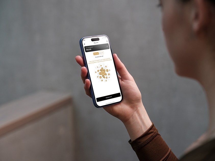
The loan screen with no active loan: rather than an empty balance, it explains what a loan can be used for — daily expenses, personal goals, business growth — above a single Request Loan action 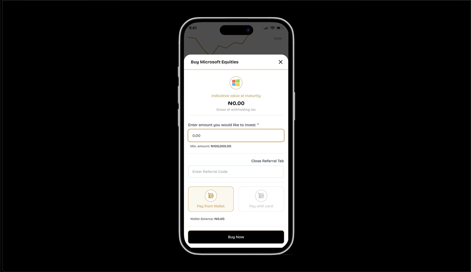
Buying equities: indicative value at maturity stated gross of withholding tax, the minimum investment shown beneath the amount field, and wallet balance surfaced beside the payment method before Buy Now