03 — Cross-Border Payments — formerly Pay4Me App
Radius
Paying tuition, SEVIS and visa fees across borders — for students whose admission depends on the transfer clearing.
- Role
- Product designer
- Year
- 2025
- Focus
- Fintech UX, Cross-Border Payments, Trust & Credibility, Mobile UX
- Status
- Live product
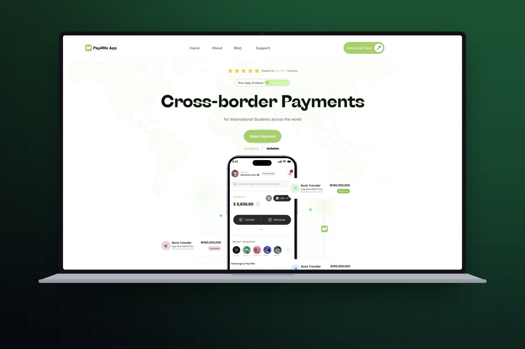 RADIUS — 2025
Overview
Radius — the product I designed as Pay4Me App, since rebranded — is a cross-border payments platform for international students and immigrants, covering tuition, SEVIS, I-20, visa and credential-evaluation fees paid to institutions and government agencies abroad. I designed the mobile product and the marketing site that has to earn a stranger's trust before they will download it.
At a glance
- Role
- Product designer
- Ownership
- Mobile product design and marketing site
- Product status
- Live product
- Platform
- Mobile app and responsive marketing site
- Primary users
- International students and the families who fund them
- Main focus
- High-stakes cross-border payments, sponsored payments, trust before install
- Product
- Pay4Me — cross-border payments for international students and immigrants
- Scope
- Mobile app design, sponsored and cross-border payment flows, multi-currency balance, marketing site, trust and credibility system
- Constraints
- High-value payments against hard deadlines, where the person paying is frequently not the person benefiting
Deliverables
- Mobile app design
- Sponsored & cross-border payment flows
- Multi-currency balance & transfers
- Marketing site design
- Trust & credibility system
- FAQ and support experience
My contribution
I designed the mobile experience for international students and families making high-stakes cross-border payments — payment journeys, sponsored payments where the payer and the beneficiary are different people, verification and tier status, transaction tracking, currency visibility and support. I designed the marketing site that has to earn a stranger's trust before the app is installed, and worked on making payment language plainer and more credible at the moment someone commits a family's savings.
The problem
For an international student, a payment is not a transaction — it is a deadline. Miss a SEVIS fee and the visa appointment goes with it; miss a tuition instalment and the admission can lapse. Yet the money usually has to travel the hardest possible route: from a family in one currency, through a banking system with limited access to dollars, to a university that only recognises payments arriving in a particular form. Traditional wires are slow, expensive and opaque, and the person waiting has no way to see where their money is. Two design problems follow from that. The sums are often a family's savings, sent by someone who has never heard of the company — so credibility has to be established before the app is even installed. And the person paying is frequently not the person benefiting, which breaks the assumption almost every payment app is built on.
What made this hard
The product has to earn trust in the wrong order. Someone judges a payments company on a laptop, at the point where they know least and have most at stake, then pays on a phone — which forced the credibility work into the marketing site, where reassurance can arrive before the decision, rather than into the app, where it would arrive too late to matter. The second difficulty is structural rather than emotional: the account holder is often a parent or relative and the beneficiary is the student, which breaks the assumption almost every payment app is built on. Sponsored payment had to become a first-class transfer type rather than a personal wallet bent into a shape it was never designed for.
Research & discovery
Research status — Product-design-led, grounded in the category's real deadlines
- Who
- Students paying tuition, SEVIS, visa and credential-evaluation fees, and the parents and relatives who actually send the money.
- Investigated
- Why a payment in this category is a deadline rather than a transaction, and where credibility has to be established relative to where the payment happens.
- Learned
- The person paying is frequently not the person benefiting, and judgement about the company happens on a desktop before the app is ever installed.
- Changed
- Sponsored payment became a first-class payment type rather than a personal wallet bent into shape, and the credibility work moved into the marketing site with a QR handoff to the phone.
- Still open
- Completion behaviour for first-time sponsors, which needs instrumentation rather than inference.
- Next test
- Test payment completion with first-time sponsored payers — a parent sending for a student — and measure drop-off between the marketing site and app install.
Key decisions
- 01
Designed for the sponsor, not just the account holder. Parents and relatives fund most of these payments, so the product treats sponsored payment as a first-class type alongside seamless and cross-border — rather than bending a personal wallet into a use case it was never shaped for.
- 02
Made recipients people instead of account numbers. Recent transfers appear as faces and first names, and the search field asks you to find a friend or family member to send money to — matching how these transfers are actually described out loud, and removing a common source of costly typos.
- 03
Put currency where the money is. The balance carries its own currency switcher rather than burying conversion in a settings screen, because holding and thinking in more than one currency is the normal state for this user, not an edge case.
- 04
Surfaced verification status as identity. The account tier sits beside the user's name and verified badge, because in this category tier determines transfer limits — so what would otherwise be buried compliance state becomes information the user needs before starting a large payment.
- 05
Named the real jobs rather than generic ones. The site speaks in SEVIS, WES, I-20, visa applications and credential evaluations, not payments and services — using the exact vocabulary of the immigration journey, which both signals competence and lets people recognise their situation instantly.
- 06
Built the marketing site as trust architecture, layered by kind of doubt: payment processors and named universities answer is this real, a world map answers do you work where I am, video testimonials from students answer has this worked for someone like me, and an FAQ given two full columns answers the rest.
- 07
Bridged desktop research to mobile action with a QR code. People investigate a payments company on a laptop but pay on a phone, so the site closes that gap directly rather than asking them to search an app store later.
- 08
Kept everyday utility in the app between the big moments. Airtime top-up and bill payment give people a reason to open it in the months between tuition instalments, so the product is already familiar when the payment that matters arrives.
- 09
Made support a destination, not a dead end. It sits in the bottom navigation as one of four primary tabs — appropriate for high-value, high-anxiety transfers where being unable to reach a human is itself the failure.
What changed
A payments product shaped around the real unit of work — a family funding someone else's education across a border, against a deadline. Sponsored payments are designed for rather than tolerated, verification and currency are treated as everyday context instead of settings, the interface speaks the immigration journey's own vocabulary, and the site does the credibility work before the download rather than after it.
Scope & context
These figures are public product and company metrics reported by Radius on withradius.com. They are included to show the scale and context of the product I designed for, not as outcomes of my design work.
- Company-reported traction
100K+
International students using Radius
- Company-reported traction
1,500+
Five-star reviews for speed and reliability
- Company-reported traction
6h
Average payment processing time
- Company-reported traction
96+
Countries served for tuition and fee payments
Evidence
Payment types are modelled around a sponsor rather than a single account holder, so the person paying and the person benefiting are both first-class rather than one being bent into the other's shape. Verification tier and currency sit in the interface as everyday context instead of buried settings. The marketing site is layered by kind of doubt — payment processors and named institutions, a coverage map, video testimonials from students, then a two-column FAQ — and a QR code closes the desktop-to-mobile gap at the exact point the decision is made.
What I would improve next
Two numbers would tell me whether this works: the completion rate of a first sponsored payment by someone who has never used the app, and the drop-off between the marketing site and the app install. I would also usability-test the fee and timing disclosure with families sending money abroad for the first time, since that is the moment trust is either earned or lost.
With more time
I would design the waiting period properly. Between submitting a payment and the institution confirming receipt, the user has nothing to do and everything to worry about; that window deserves status, expected timing and a route to a human more than any other screen in the product.
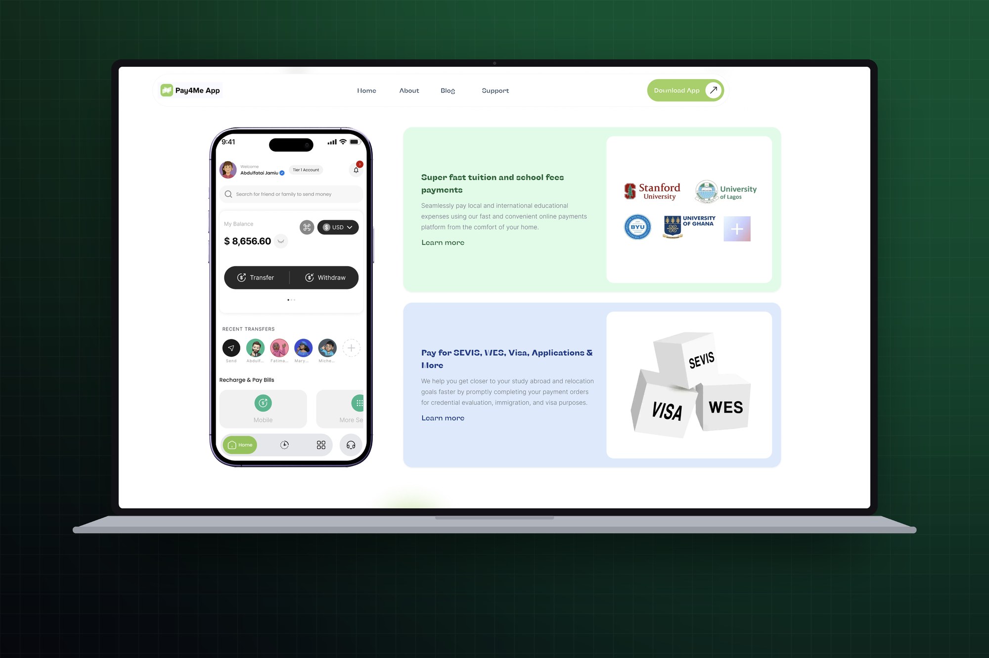
The product named in the vocabulary of the journey: tuition and school fees paid to named institutions, and a separate block for SEVIS, WES, visa and credential-evaluation payments 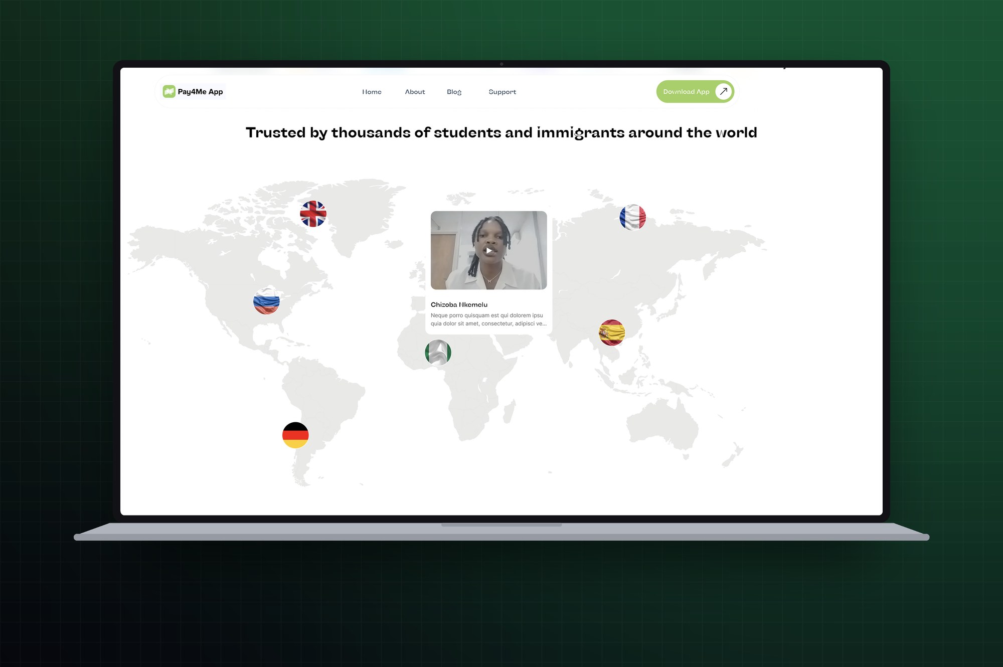
Trust built through evidence — a world map of the countries served, with video testimonials from students rather than written quotes 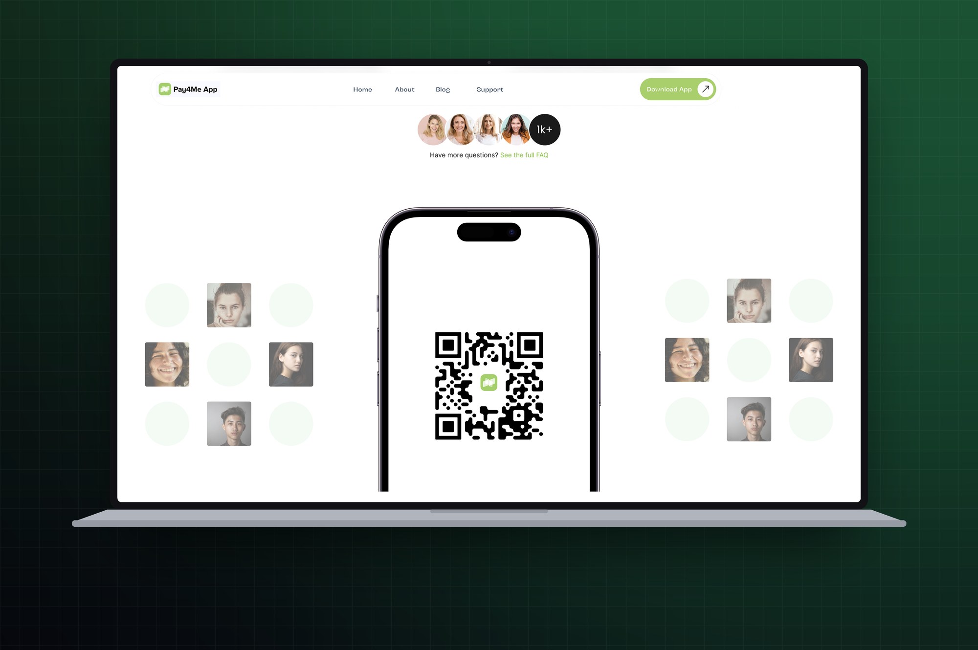
The FAQ handoff: a QR code that carries the visitor from desktop research to the app on their phone, where the payment actually happens 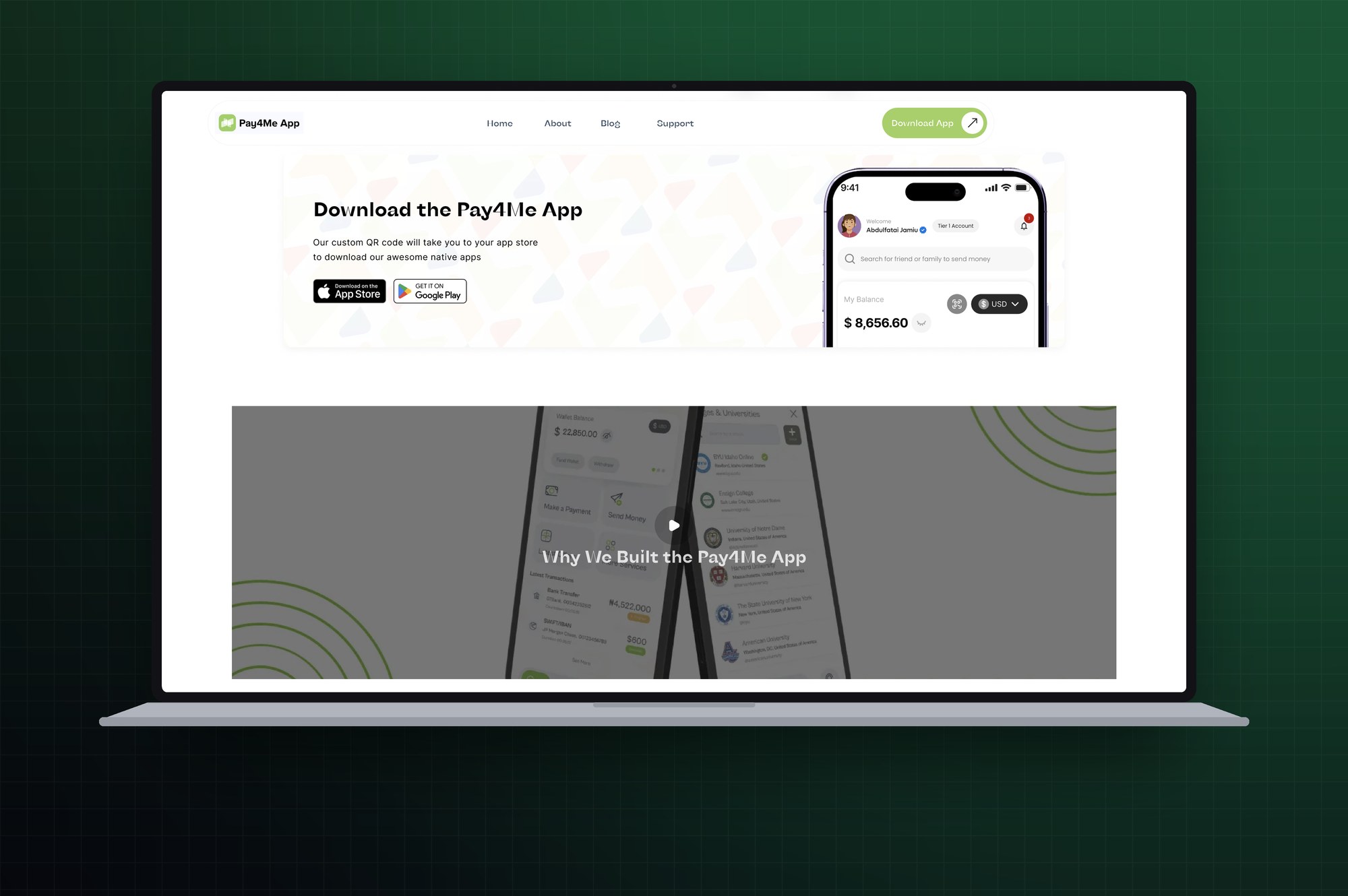
Download section pairing the app-store routes with the in-app home screen, so the product is visible before installation