09 — Web3 Partnership & Collaboration Platform
Synqit
Business partnerships that work like friend requests — sent, reviewed, accepted or declined, with the conversation unlocked only once both sides say yes.
- Role
- Lead product designer, end to end
- Year
- 2026
- Focus
- Product Design, Matchmaking UX, Trust & Verification, Information Architecture, Responsive Design
- Status
- Shipped product
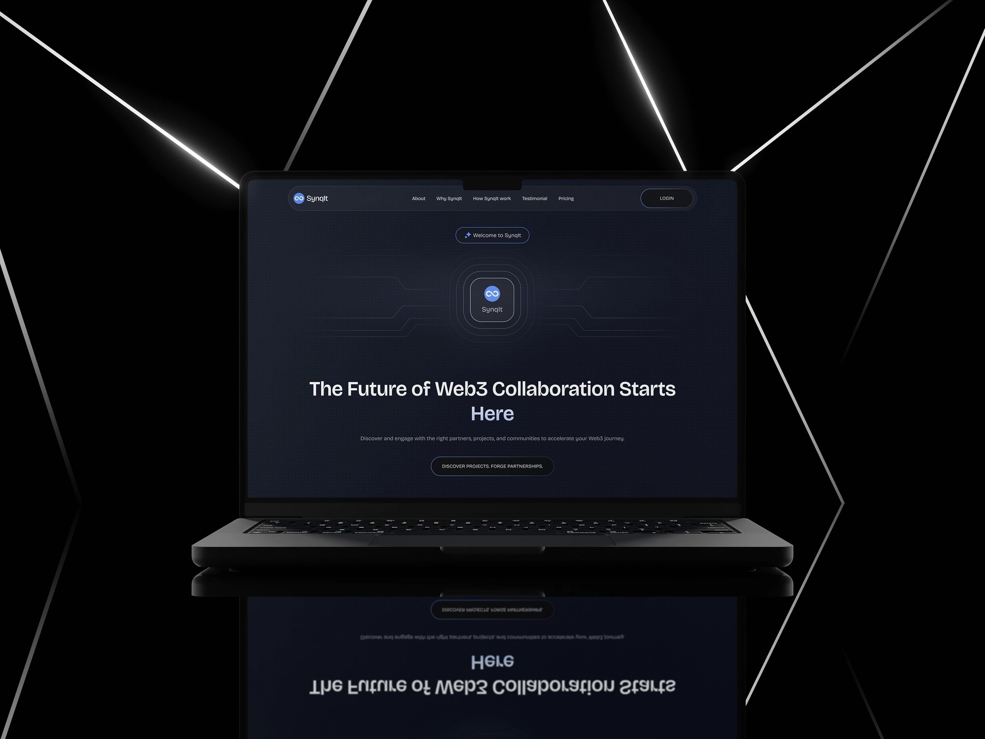 SYNQIT — 2026
Overview
Synqit is a business-driven partnership platform for startups, investment platforms, Web3 projects and crypto companies — a structured way to find, vet and form strategic partnerships instead of cold-messaging across Twitter, Discord, Telegram and LinkedIn. I led the entire design process across three user roles: businesses and startups looking for partners, investors and project owners looking for opportunities, and the teams and executives who manage the resulting collaborations. The pitch deck the product was raised on is on the brand page.
At a glance
- Role
- Lead product designer, end to end
- Ownership
- End-to-end ownership as lead product designer
- Product status
- Shipped product
- Platform
- Responsive web, mobile-first — business owners manage deals on the go
- Primary users
- Businesses seeking partners, investors, and Web3 project teams
- Main focus
- Trust-gated matchmaking, partnership requests, controlled access
- Product
- Synqit — a partnership and collaboration platform for the Web3 ecosystem
- Team
- Lead product designer, working with the founding team
- Scope
- User research and journey mapping, personas, information architecture, wireframes, high-fidelity UI, prototyping and usability testing
- Constraints
- Three user roles with different intents in one product; a category where fake projects and rug pulls make trust the first problem, not the last
Deliverables
- User research & personas
- User journey & information architecture
- Partnership request system
- Business profile system
- Matchmaking recommendations
- Post-acceptance messaging
- Partnership dashboard
- Responsive mobile-first UI
- Usability testing & iteration
My contribution
I led the entire design process. I interviewed founders, Web3 teams and investors, built personas for the three roles, defined the partnership request as the core object of the product, and designed the matchmaking, business profile, request-approval and messaging systems around it. I mapped the information architecture, designed the dashboard and mobile-first interface, and ran usability testing with real businesses to refine the trust signals that shipped.
The problem
Startups, Web3 projects and investment platforms struggle to find and connect with the right partners for three reasons that compound each other: there is no basis for trust in a partnership with an unknown company, communication is scattered across multiple channels, and negotiations drag because nothing is structured. Existing networking products treat a connection as a one-sided act — anyone can message anyone — which is precisely why they fill with noise and why credible teams stop answering. The product had to give businesses control over who they partner with, make credibility visible before a request is accepted, and move the conversation somewhere structured once it is.
What made this hard
The hard part was deciding what a partnership is, mechanically, before anything could be designed. A follow is too weak — it commits nobody. An open inbox is too weak in the other direction — it makes the credible party do the filtering. The model that held was the friend request: a partnership is proposed, the other side reviews the proposer's profile and history, and only an acceptance unlocks messaging. That one decision shaped the whole architecture, and it came with a cost: it adds a step and a wait to every connection, in a space where founders are used to firing off a DM. The tension was to keep that deliberate friction — because it is the product's entire answer to the trust problem — while making everything around it fast. The three roles pulled against each other too: a startup wants to be found, an investor wants to filter, and an executive wants to see the state of every partnership at once, and they all share one dashboard.
Research & discovery
Research status — Primary research — interviews, personas and usability testing
- Who
- Startup founders, Web3 teams and investors, developed into personas for the three roles the product serves.
- Investigated
- Why business networking fails in this space: no basis for trust, communication scattered across channels, and negotiations that drag because nothing is structured.
- Learned
- An open inbox makes the credible party do the filtering, which is why credible teams stop answering. Control over who you partner with is the product.
- Changed
- The partnership request became the core object — reviewed against a real profile — and chat was made a consequence of acceptance rather than a starting point.
- Still open
- How the accept rate moves as profiles get richer, which is the real test of whether visible credibility works.
- Next test
- Track the accept rate on partnership requests against profile completeness, and test whether the three roles genuinely want one shared dashboard or three tailored ones.
Key decisions
- 01
Interviewed startup founders, Web3 teams and investors to understand where business networking actually breaks, then built personas for the three roles the product had to serve — businesses seeking partners, investors scouting startups, and teams managing partnerships.
- 02
Defined the partner request as the core object. Users send, review, accept or reject partnership requests, and the dashboard is organised around that state — pending, accepted and declined — so the status of every relationship is legible at a glance.
- 03
Made messaging a consequence of acceptance rather than a starting point. The built-in chat activates only once a partnership request is approved, which keeps inboxes free of cold outreach and makes every conversation one both sides chose.
- 04
Designed the business profile as the thing a request is judged against: industry, expertise, past collaborations and key details, visible before anyone sends or accepts — so the review step has something real to review.
- 05
Designed the matchmaking layer to suggest partners on industry, interests and investment focus, so discovery is a recommendation rather than a search box, and the platform does the first pass of relevance.
- 06
Mapped the full user journey and information architecture — homepage into sign-up or login, then dashboard, profile setup, account functionality and partnership search — so every role lands somewhere useful on first login rather than in an empty state.
- 07
Built the interface mobile-first, because the people managing these deals are rarely at a desk when a request arrives.
- 08
Tested the request and messaging features with real businesses and iterated on what they needed to trust it — verified business profiles, transparent partnership histories, and notifications that keep both sides informed on requests, messages and milestones.
What I explored
The central alternative was an open model — anyone can message anyone, with filtering left to the recipient — which is how most networking products work and which the research pointed away from: it is the reason credible teams stop responding. The request-approval model was chosen over it deliberately, accepting the extra step in exchange for control. The pitch deck also records where the product was headed beyond the MVP — on-chain logging of partnerships, event sync, a job board — which shaped what the architecture had to leave room for.
What changed
A partnership-driven platform rather than another networking feed: requests are reviewed against a real profile before anything is accepted, chat exists only between partners who both said yes, matchmaking does the first pass of relevance, and a structured dashboard keeps every active partnership visible. Trust signals — verified profiles and transparent partnership histories — became part of the product rather than something users had to establish for themselves on other channels.
Outcomes & scope
- Design impact
3x
Improvement in partnership discovery and onboarding
Against the previous scattered, manual process of finding partners across Twitter, Discord, Telegram and LinkedIn
- Product scope
3
Role groups in one product — businesses, investors, project teams
- Product scope
Gated
Messaging unlocks only once a partnership request is accepted
Evidence
Testing the request and messaging flows with real businesses shaped the trust signals that shipped. Partnership discovery and onboarding improved threefold against the scattered, manual process the platform replaced. The MVP shipped with AI-powered matching, verified requests, premium visibility and direct messaging, and the full presentation is on Behance; the pitch deck it was raised on is readable on the brand page.
What I would improve next
The request-approval model is the product's bet, so the number I would watch is the accept rate on requests and how it moves as profiles get richer — if credibility is visible, acceptance should rise. I would also test whether the three roles actually want one dashboard or three, since the shared layout was a decision made for coherence and it deserves to be checked against how an investor and a founder really use it.
With more time
I would design the partnership after the handshake — milestones, shared documents, a record of what was agreed — because acceptance is where the platform currently stops and where the actual collaboration begins.
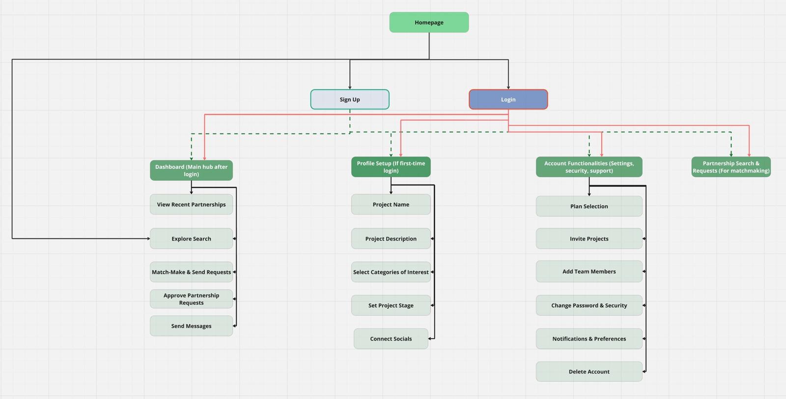
The user journey and information architecture: from homepage into sign-up or login, then four destinations — the dashboard as the main hub with recent partnerships, explore search, match-make and send requests, approve requests and messages; first-time profile setup; account functionality; and partnership search for matchmaking 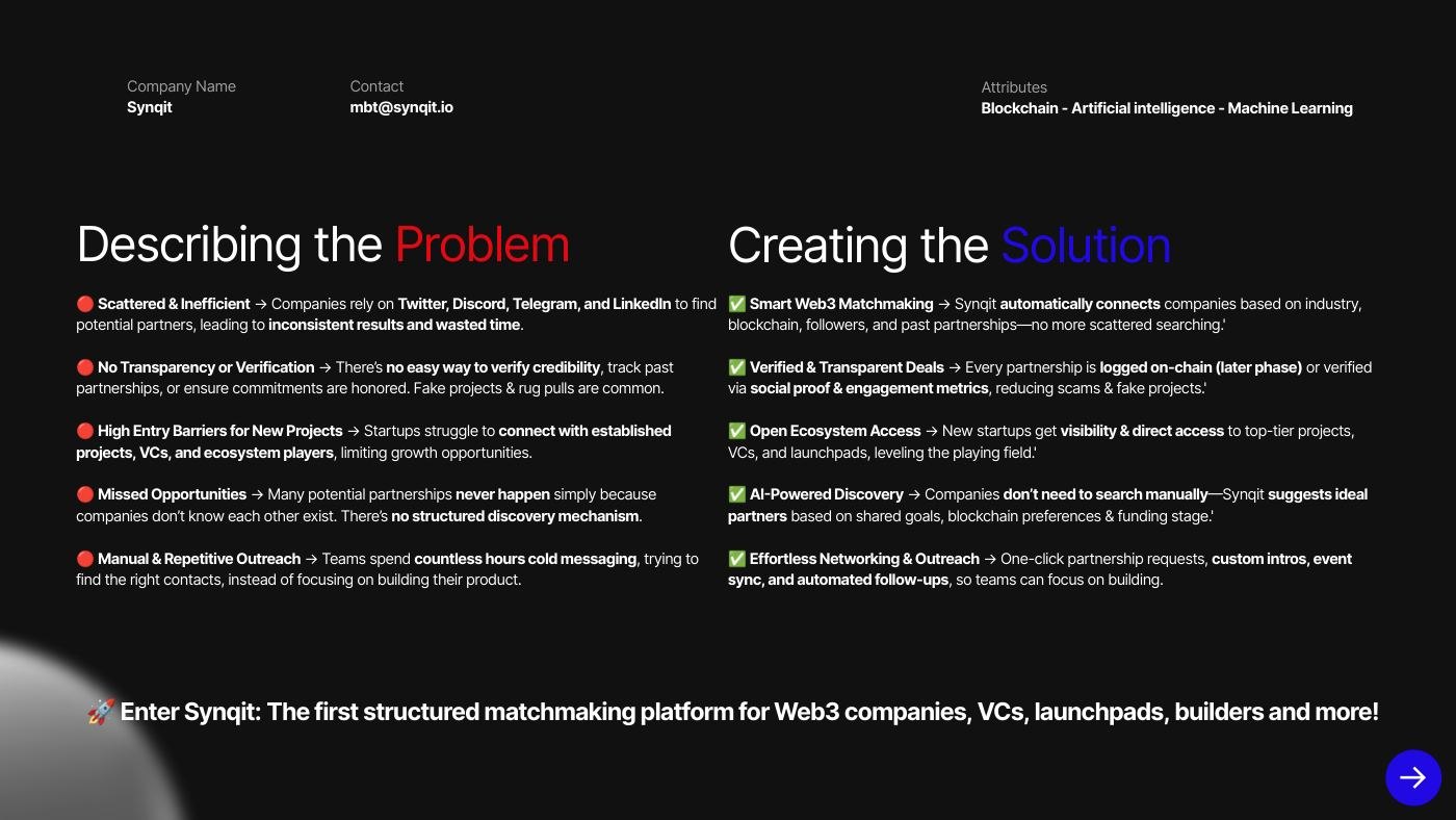
The problem and the solution side by side, as the company framed them: scattered outreach across Twitter, Discord, Telegram and LinkedIn, no verification, high entry barriers and missed partnerships — answered by smart matchmaking, verified requests, open ecosystem access, AI-powered discovery and one-click outreach 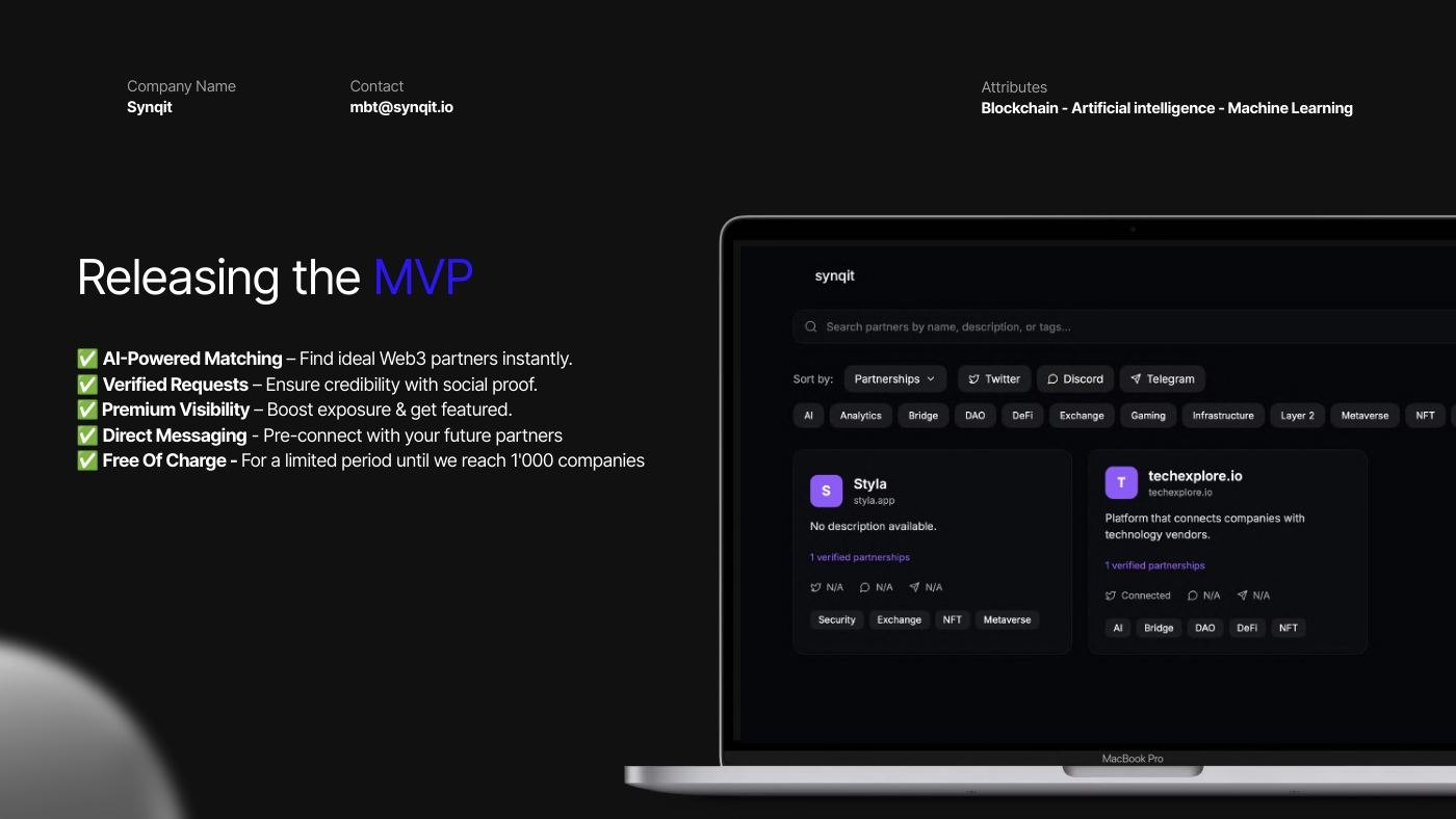
The MVP release — AI-powered matching, verified requests, premium visibility and direct messaging — with the dashboard as shipped 
Synqit's mobile experience shown on a phone alongside a laptop on a desk